Parclo
Sans
VERSION No. 1.062


Like the humanist fonts that paved the way, Parclo Sans is easy to read, from fine print to roadside signage. And coming fully-loaded with three widths and nine weights, Parclo Sans is always ready to hit the road.
3 Widths
9 Weights
Matching Italics
54 Total Styles
Companion Serif Typeface
Stylistic Alternates
Case Punctuation
Lining & Old Style Figures
Tabular Figures
Math & Currency
Dynamic Fractions
Circled Figures
Directional Arrows
Supports 200+ Languages
Roman
Italic

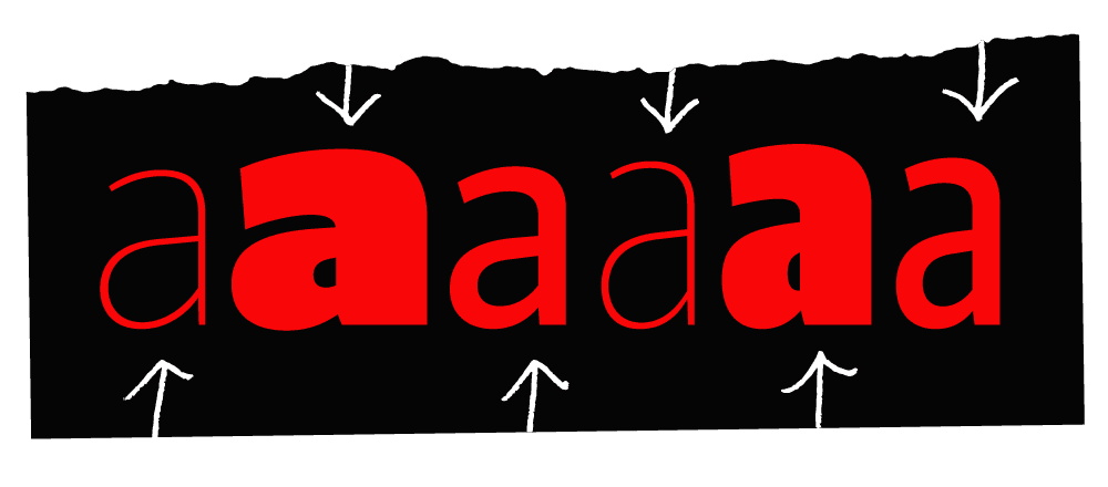
Parclo Sans has a wide variety of voices. These are all examples of the letter ‘a’ from different fonts in the Parclo Sans family.

Parclo Sans Ultra is quite a bit bolder than most fonts you will have seen. Pretty intense, eh?

Parclo Sans has a system of widths, and you’ll get to use all of them. That way you can always find the one that is right for your design.

Parclo Sans has ‘open terminations.’ These let the negative shapes ‘breathe,’ which helps with legibility at smaller sizes.

Here’s a fun detail: the tops of the capital R, B, and P have a slight bow to them. It adds a bit of energy to the texture of all caps words.
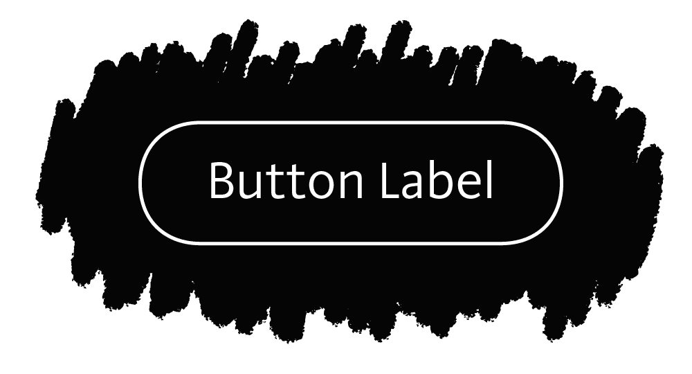
Parclo Sans was made with mobile app interfaces in mind, amongst other uses. Try using it on buttons and labels!

Parclo Sans was designed in tandem with Parclo Serif, and the two designs share some qualities.

We like the design of this capital German Double S, or Eszett, in Parclo Sans Ultra.
GÂDILĂTURĂ
Székesfehérvár
ŽIVLJENJSKO
allerøstligste
GÂDILĂTURĂ
eċċentriċità
äußerlichkeit
All Lettermatic Typefaces support 200+ Languages – Learn More
Features
Roman & Italic Styles

Companion Serif Typeface — Check Out Parclo Serif

Oldstyle & Lining Figures

Tabular Figures & Math

Dynamic Fractions

Directional Arrows

Decorative Quotes

Circled Figures
Ultra Bold Styles

Alternate Punctuation

Case Punctuation

Buckle Up
No matter the destination, Parclo Sans can help get you where you’re going.
We made this for you.