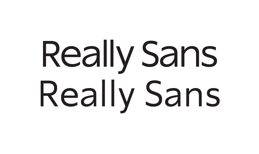
Really
Sans
VERSION No. 1.042


Designers like to use sans serifs at large sizes. Designers also like to use sans serifs at small sizes. We made you a type family that does both; we call it Really Sans.
Large & Small Optical Sizes
9 Large Weights
5 Small Weights
Matching Italics
28 Total Styles
Stylistic Alternates
Case Punctuation
Lining & Old Style Figures
Tabular Figures
Math & Currency
Dynamic Fractions
Circled Figures
Directional Arrows
Supports 200+ Languages
Roman
Italic

There are two versions of Really Sans, meant to be used at different point sizes. They are drawn differently in very purposeful ways.
Really Sans Small has a lower x-height, designed specifically for running text and small point sizes. Really Sans Large, in comparison, has a larger x-height that provides a charming and eye-catching tone.

The space between letters in Really Sans Small has been set specifically for running text and small point sizes. In comparison, Really Sans Large has much tighter spacing, suited well to headlines and large point sizes.
Really Sans has ‘open terminations’ that are cut vertically.

These open terminations let the negative shapes breathe, which helps with legibility at smaller sizes.

Really Sans uses round dots on the ‘i’ and ‘j’. Some people say this is more friendly than the square ones. What do you think?
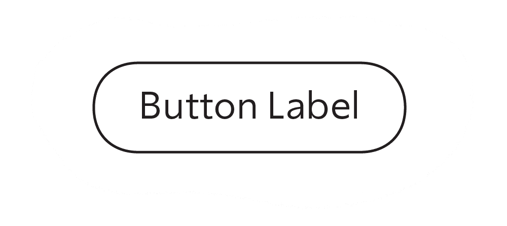
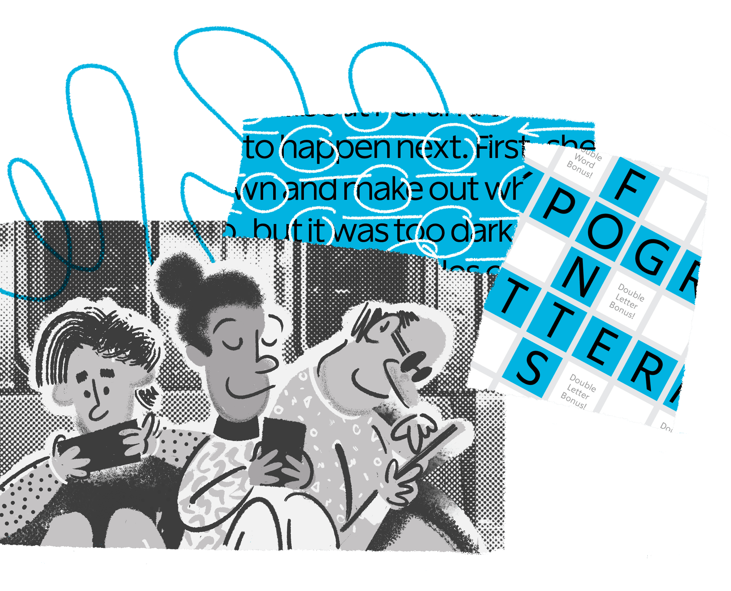
Really Sans was made with mobile app interfaces in mind, amongst other uses. Try using it on buttons and labels!
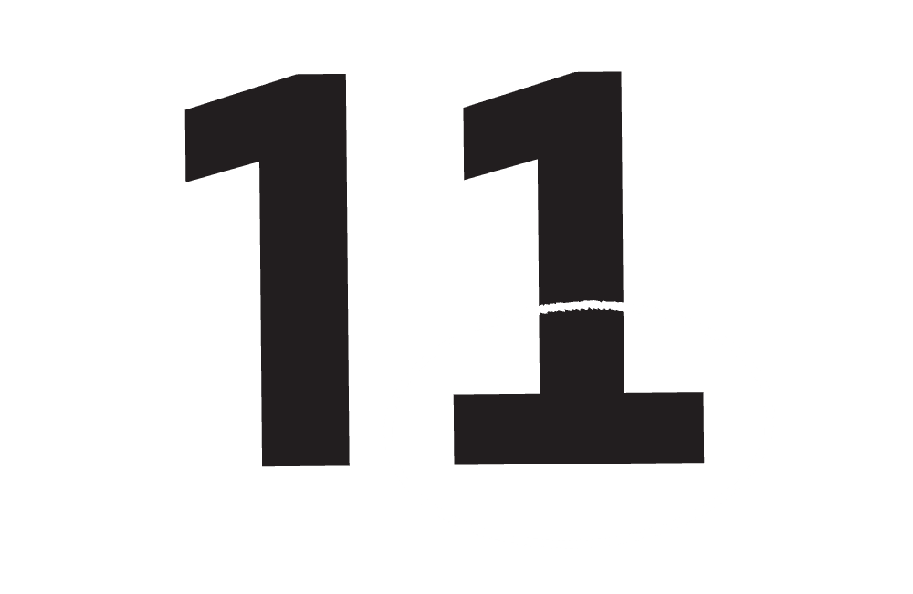
Really Sans has proportional figures (that vary in width as necessary), and tabular figures (which are all the same width). The tabular ’1’ gains a serif to help fill the space.
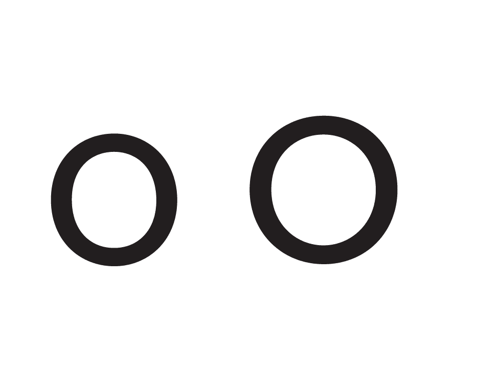
Really Sans Large is more geometric than Really Sans Small. For instance, the ‘o’ is a round shape, and it is simply more round in Really Sans Large.

As the fonts get bolder, some glyphs change in construction. For instance, when the ‘bar’ of the dollar sign would ‘clog up’ the glyph, parts of the bar are omitted to allow the glyph to breathe.
alþjóðleg
amphithéâtre
alþjóðleg
osvětlovačů
fließfähigkeit
All Lettermatic Typefaces support 200+ Languages – Learn More
Features
Large & Small Optical Sizes

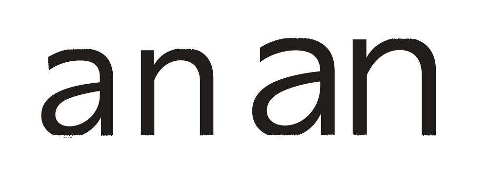
Alternate Lowercase "a"

Alternate Ampersand

Decorative Quotes

Circled Figures

Oldstyle & Lining Figures
Tabular Figures & Math

Case Punctuation
Alternate Punctuation Style

Directional Arrows

Dynamic Fractions

Roman & Italic Styles