custom fonts for


A LETTERMATIC CASE STUDY: A FULL BRAND SOLUTION
By Riley Cran

Starbucks Coffee is older than I am. Some of my favorite Christmas Ornaments from my childhood were kept in a Starbucks box, which had held some other merchandise in the past. Starbucks' design has permeated the landscape of North America (and beyond), and I literally grew up seeing their brand everywhere, as many of us have.
I didn't really drink coffee much at all until I met my future wife, Heather, and the two of us would enjoy walking to a local Starbucks in the morning as a moment of fresh air before a day of drawing. I began texting my friend Marisol Ortega, a designer at Starbucks at the time, as I stood in line for coffee, telling her about times I had seen her beautiful illustration work in the store. Eventually, knowing I would be visiting Seattle soon, she asked me to visit and do a brief talk in their design offices about the sort of work I was doing. I visited, spoke for a half hour or so about the type I had been drawing, shook many hands, and had some good conversations.
Information
- Released:2017-2019№ of Fonts:92Lead Designer:Riley CranClassification:Sans + Serif№ of Families:4Language Support:Dave BaileyContributing Designers:Dan Gneiding, Heather Cran, Dave Bailey, Danelle Cheney
Around this time, Rob Stanton was an Associate Creative Director at Starbucks, working in digital marketing with the Starbucks Creative Studio. He had been looking at the various typefaces used in the brand, and in the website and mobile application, and had begun asking his colleagues about the prospect of a custom typeface. One of them remembered me, and I got a phone call from Rob which set in motion a multi-year design process that is amongst the most interesting I've ever been involved in. I got on a plane at 6am, the first flight of the day, to make the short trip from Vancouver BC to Seattle Washington. At 8am I was sitting in the offices of Starbucks HQ in the Sodo industrial district south of downtown Seattle, and the short 2-hour trip felt more like teleportation than any I'd done before. The multiple on-site Starbucks locations filled the building with the delicious smell of coffee. Jen Sinconis, a Producer there at the time, quickly became a strong ally of mine, helping me navigate the notoriously complicated interior layout of their HQ, which was full of 45 degree angles, similar looking hallways, identical staircases, track lighting, and vast bullpens of desks. But unlike most office buildings in America, these desks were full of talented designers and illustrators, some with digital tablets or pen and ink (drawing illustrations), some with dual screen setups laying out brochures, others proofing print materials and examining them with loupe magnifiers. At the time the Unicorn Frappuccino had recently debuted and caused a social media sensation, and as I walked the bullpen I saw a cart littered with the materials of its creation; glitter, whipped cream canisters, illustrated mockups, etc.

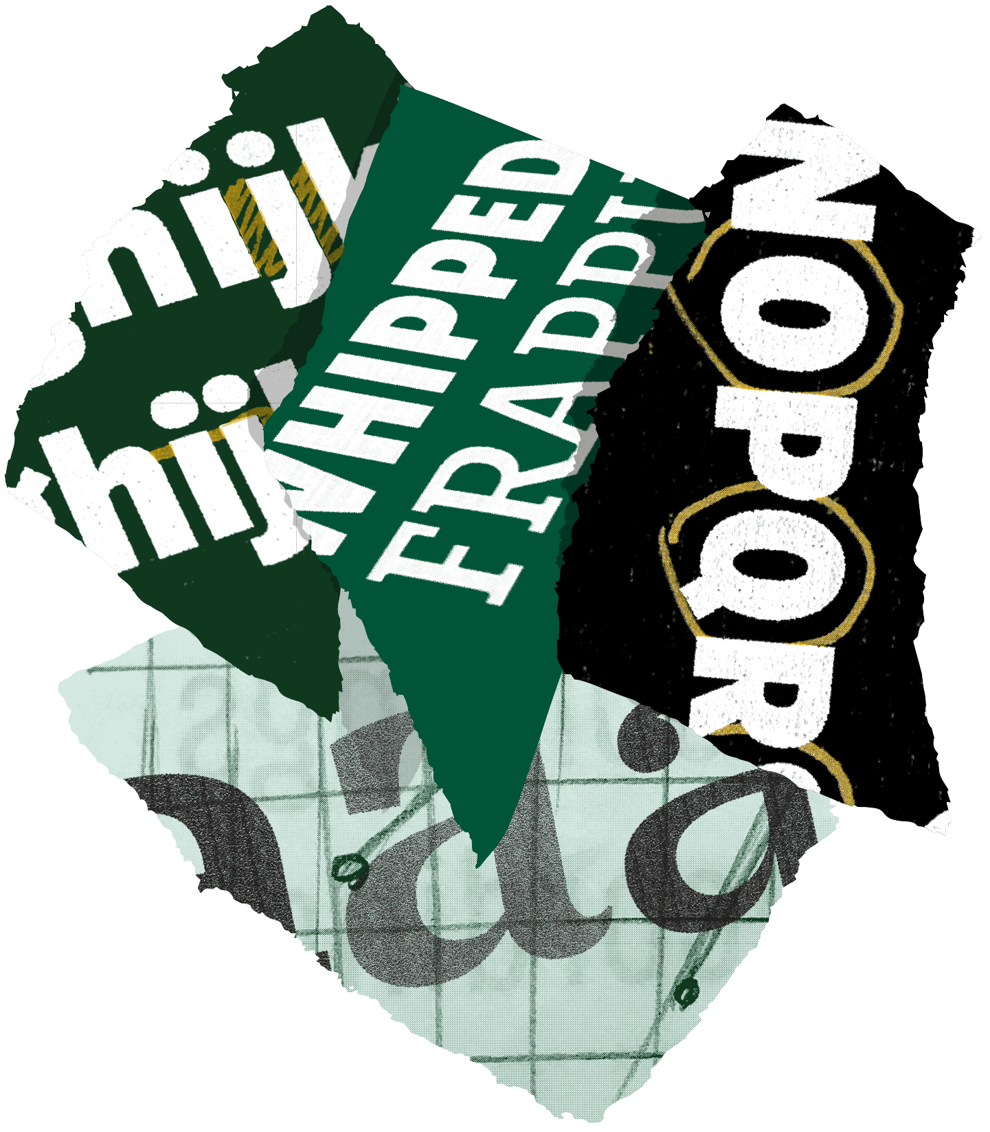
FIG. 1 — Early proofs of SoDo Sans and SoDo Serif.
Rob Stanton understood the typographic needs of Starbucks in a way that made this entire process easier. He was excellent with communication, spent the time to read through the materials I provided during the process, and had invaluably good taste. And just as she had helped me navigate the literal hallways of Starbucks, Jen Sinconis was a top-tier Producer, helping me navigate the landscape of information-gathering and approvals during the journey. The core of the project was to be a sans serif, which eventually came to be known as SoDo Sans. Looking at the history of Starbucks, they had always used a sans serif in some way, usually a geometric sans, going all the way back to the 1970s. It was natural, both reviewing their history and thinking of the contemporary expectations of corporate typography, that the project involve a Sans. SoDo Sans is essentially the 'new normal' for the palette of Starbucks, and I referred to it this way in conversation before I'd drawn a single shape, to help make it clear to everyone involved that as far as I was concerned this design would underpin the entire typographic voice of Starbucks. Amongst the specific design choices we made for SoDo sans are the double storey lowercase 'g' which helps with legibility at small sizes (a more disambiguated drawing than the single storey versions seen in some geometric sans typefaces), and a symmetrical lowercase 'u' which seemed particularly appropriate given our tendency to see the symmetrical capital 'U' in the STARBUCKS logotype.

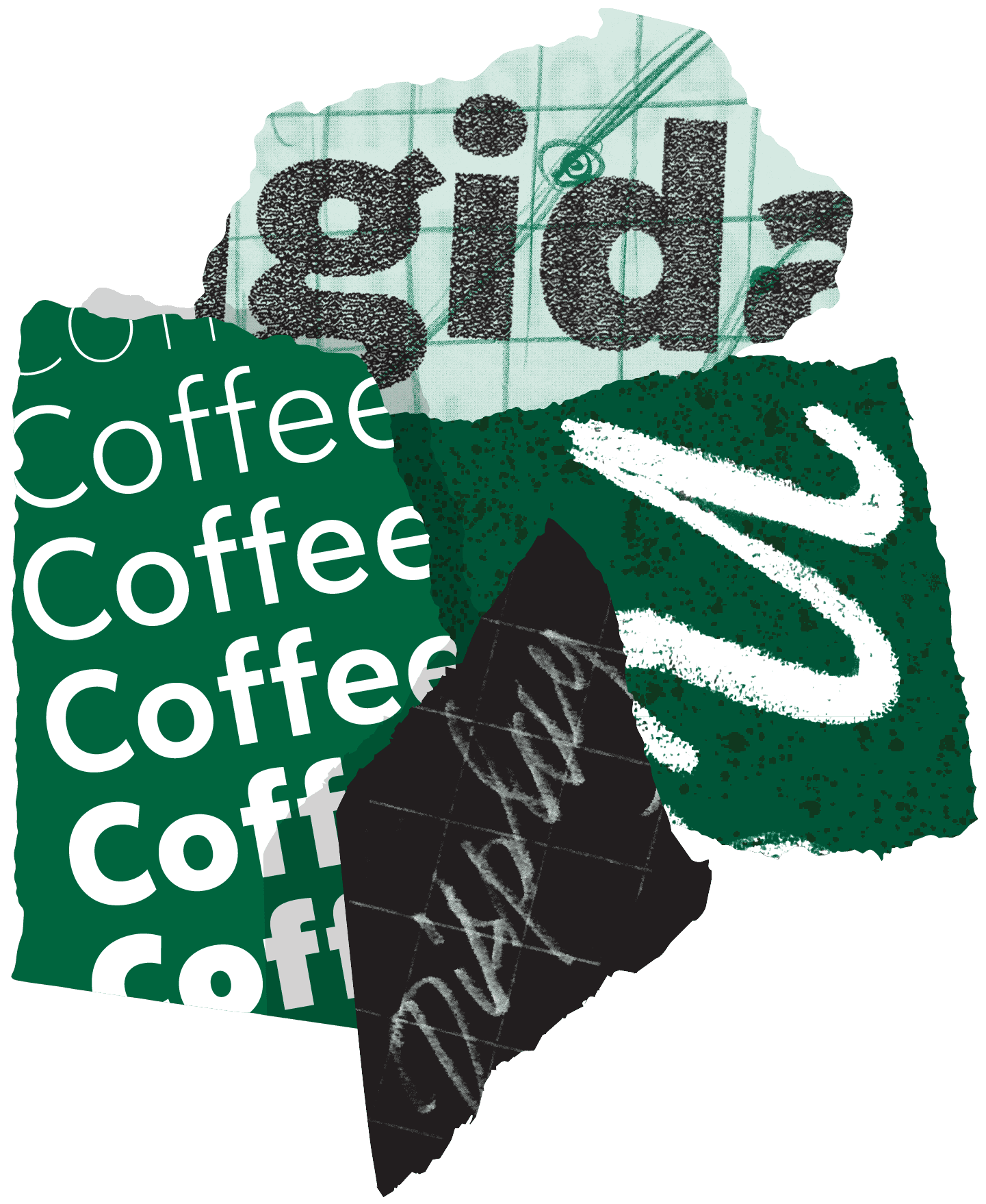
FIG. 2 — Snippets of sketches and proofs from the design process.
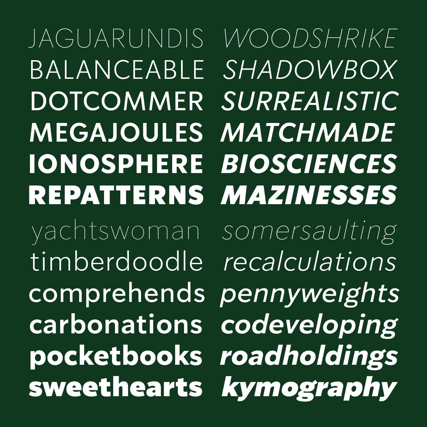
FIG. 3 — SoDo Sans.
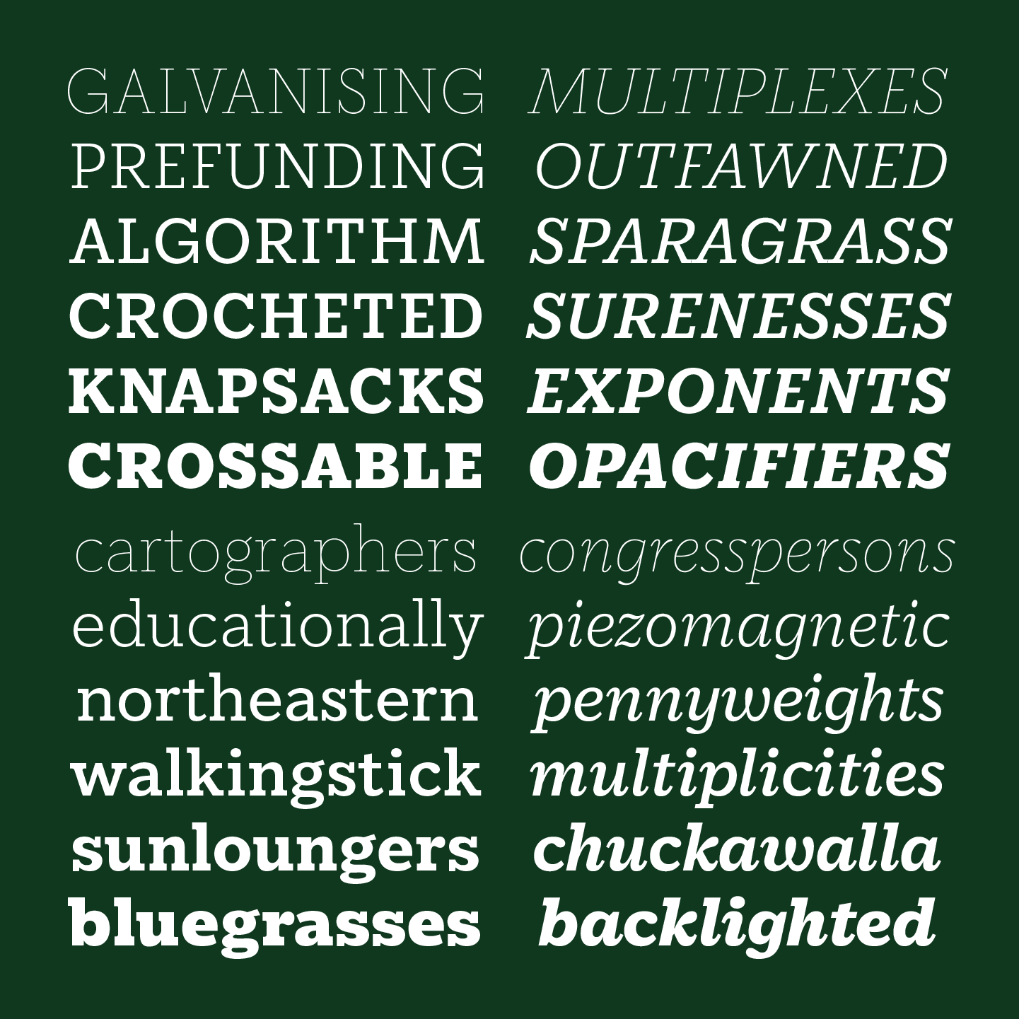
FIG. 4 — SoDo Serif.
Additionally, Rob and I discussed fascinating phenomenon in the UX/UI work at Starbucks, with questions like: "If every button and every ad are typeset in the same typeface, how does the user know what to read, and what to tap with their finger?". As a result, the scope quickly broadened to include SoDo Serif, the geometric slab companion to SoDo Sans. The two designs were linked at their core by a system of proportion, as if their various details were draped across the same skeleton. As I completed drafts, Rob and Jen would deftly explain my work to their coworkers, and soon enough there were copies of SoDo Sans and SoDo Serif ready to implement in sample typesetting. We mocked up menus, advertisements, packaging, and other uses in these new fonts. Quickly the fonts were finding a home in more and more design at Starbucks, just as Rob and I had discussed on our call months prior. On our walk back from lunch one day, I looked up to see SoDo Serif letters 5 feet tall on a massive billboard across the street from their HQ.
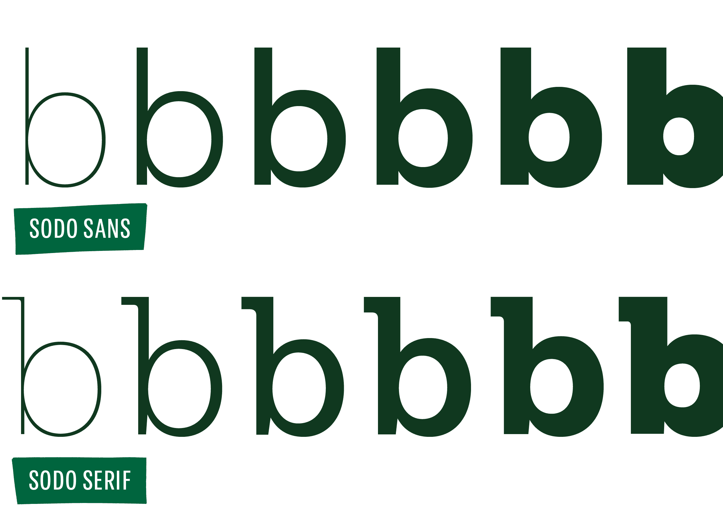
FIG. 5 — A comparison of details in SoDo Sans and SoDo Serif.

Around this time, Starbucks began to roll out digital menu boards in their locations, and Rob and I spent an afternoon sitting inches away from a prototype digital menu screen, making notes of how the fonts behaved on screen, and changing details in real time to make the fonts better suited to that environment. I would regularly send Rob proofs via email, and he would provide feedback. To describe these designs with the same specificity and analogy that a coffee taster might use, I get a friendly feeling from SoDo Sans. It doesn't try to be mathematically literal, or overly systematic, its various decisions produce a charming result that performs well in context. In the same way that picking up the phone and hearing 'it's me' connects a voice we're familiar with to a person in our heads, SoDo Sans plays the role of 'corporate identity sans serif' with enough differentiation that a customer can say 'ah yes, hello Starbucks' when they see this typographic voice in an advertisement or menu.
FIG. 6 — EXTREME CLOSEUP.
Early drafts of SoDo Serif were more literally connected to the sans, with the occasional 'sans' termination in the Serif. Over time, via the feedback of Rob and his colleagues, the serif design took on these 'tear drop' terminations for a bit more warmth and differentiation. SoDo Serif sits tonally somewhere between a classic Clarendon, and a geometric slab like Lubalin Graph. It has bracketed serifs, but it also has a more geometric sense of proportion, with round things being quite round. We treated the design process as if the Serif design was a lens, through which the ideas of SoDo Sans were translated into SerifLand®. I also took the opportunity to design a true italic for SoDo Serif, for a punch of rhythmic contrast against the roman in running text, and for its display aptitude. The italic is much more expressive details, and leans heavily on the teardrop forms found in the roman.

FIG. 7 — Every design process involves testing ideas, and trying out variations.
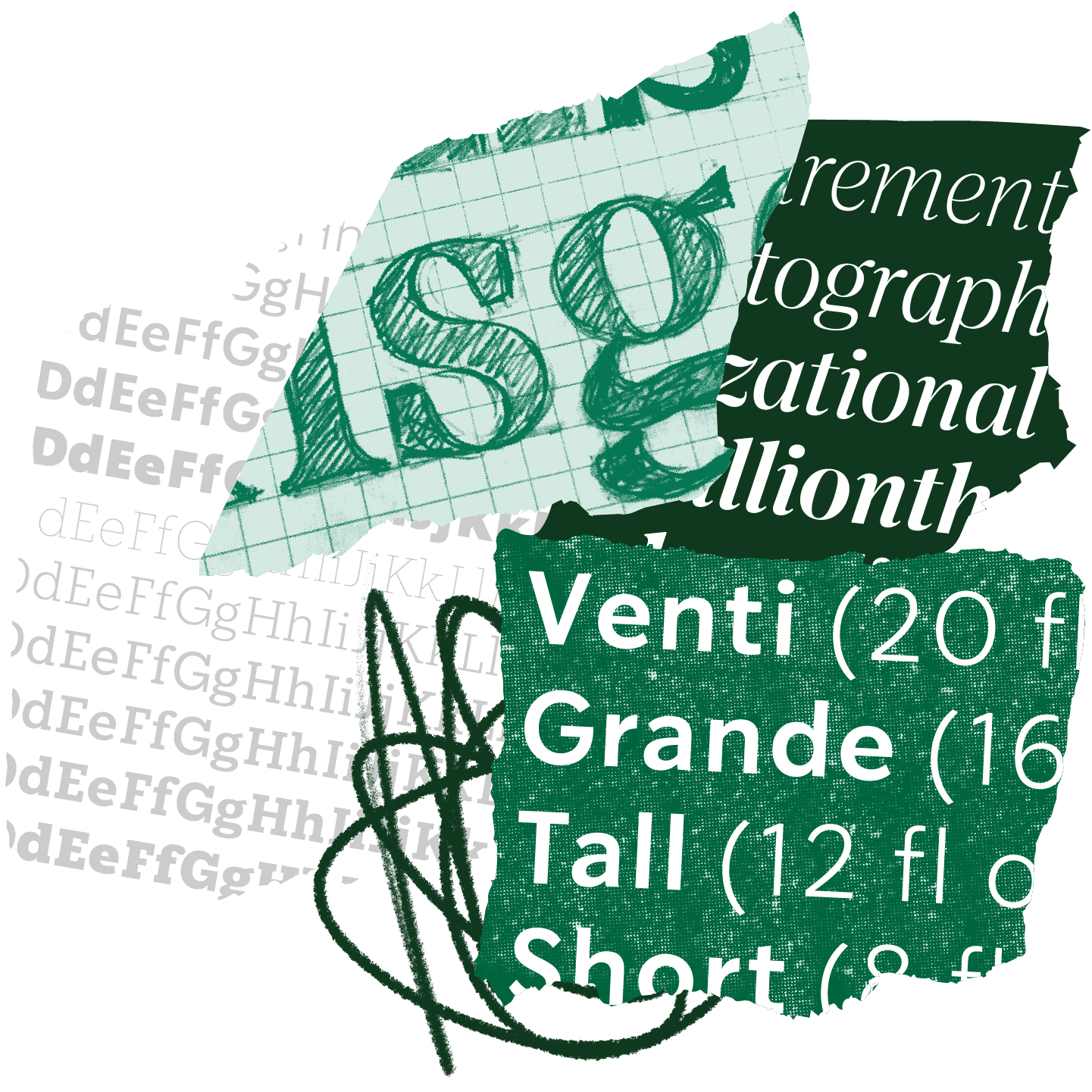
The opportunity to design custom typefaces often unlocks, within the creative team I am working with, an insight into new typographic needs. On a follow-up visit to the coffee-aroma-filled HQ of Starbucks, designers Trevor Basset and Dana Deininger sat down with Rob and I, and we all discussed their goals for a new serif typeface; something reminiscent of the 1970s, with a bit more expression and character, that could be used in advertising. Rob produced a binder of 1970s phototype specimens, and we thumbed the pages together pointing out details. Once home, I consulted my library for samples of 1970s phototype designs, and found one in particular, the tone of which I really enjoyed, an obscure design called Gesh Ortega by Gerhard Schwekendiek. We also spent a lot of time looking at 1970's interpretations of Caslon such as Ed Benguiat's famous interpretation. From this meeting a new typeface called Lander was born, a serif typeface with the charm of the 1970s inspiration, drawn in 3 optical sizes. Jumping at the chance to reference Starbucks' own description of sizes, we labelled them Grande (large point sizes), Tall (headlines), and Short (text).
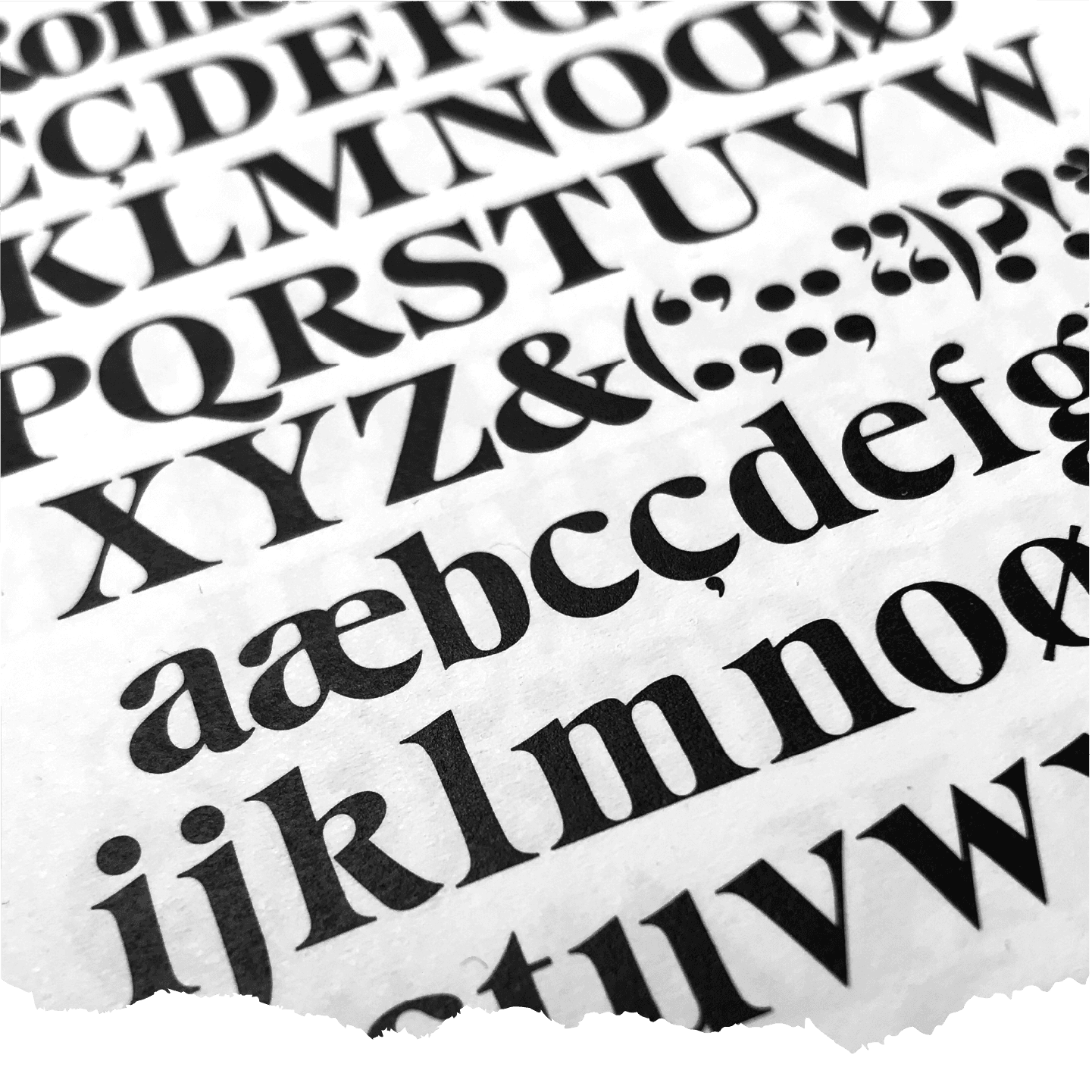
FIG. 8 — Gesh Ortega by Gerhard Schwekendiek.
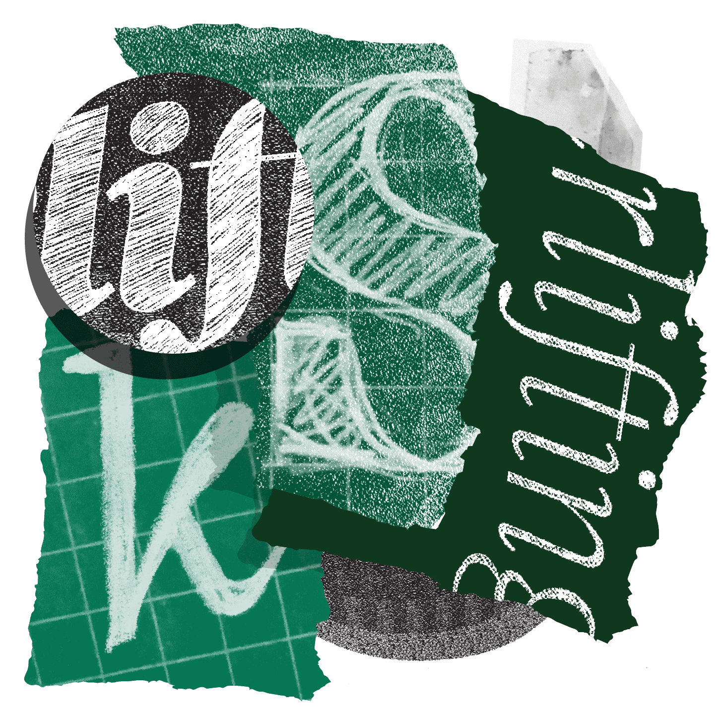
FIG. 9 — Riley's sketches from the design of Lander.
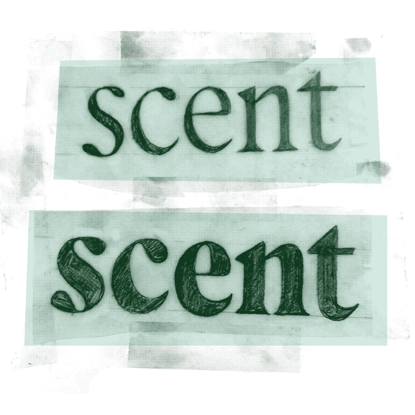
FIG. 10 — Riley's quick pencil and vellum sketches of Lander.

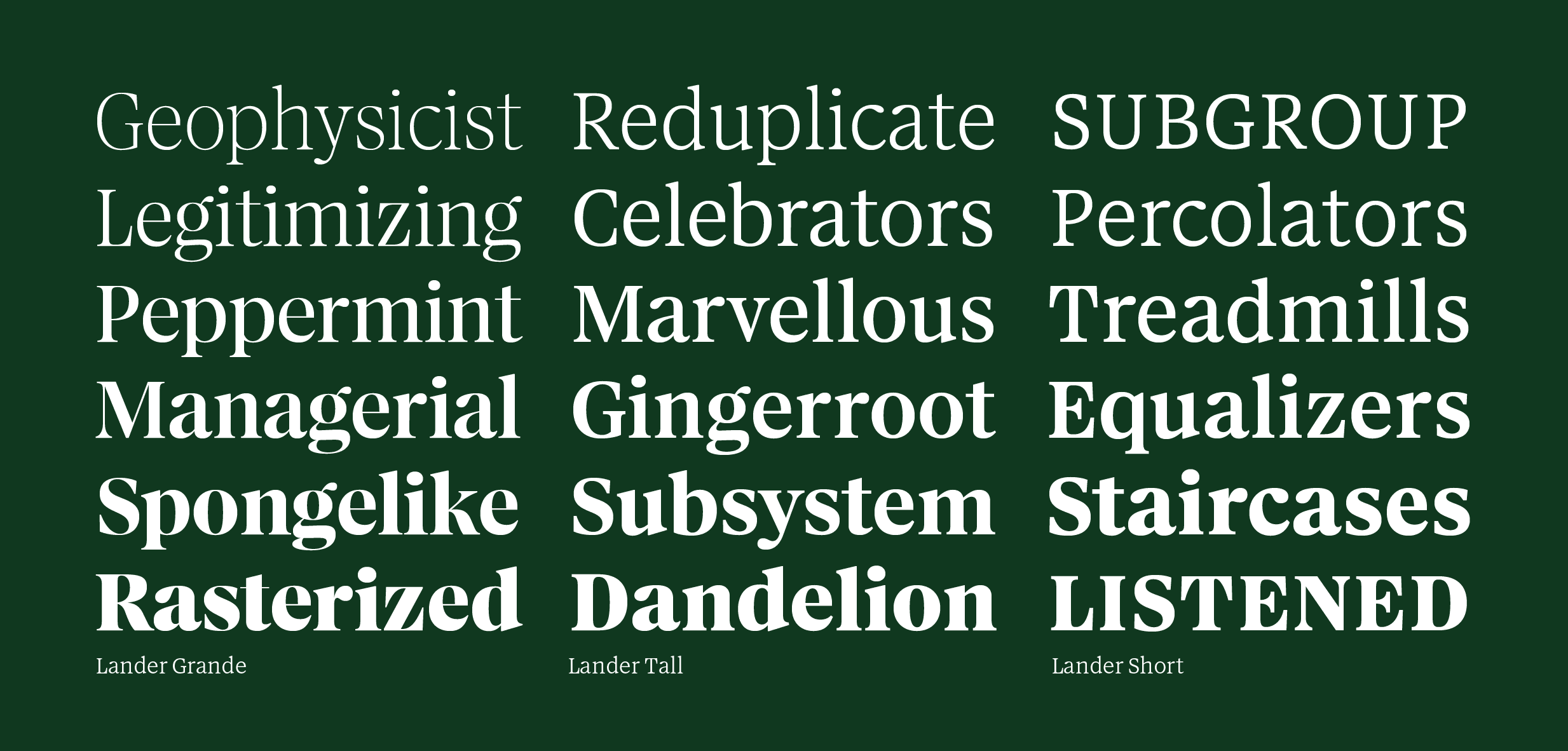
FIG. 11 — The three optical sizes of Lander.
The thin hairlines of Lander Grande help the design to feel sparkly and fancy at large sizes. In text, the 'Short' optical size translates the same letterforms to smaller sizes via thicker hairlines, wider proportions, and other small adjustments. Then you've got the 'Tall' optical size, splitting the difference, for the uses in-between. For every roman style, Lander has an italic companion. I am very fond of the true italic I drew for Lander, and the way the roman and italic get along. The italic has much more expressive details, and retains the double storey 'g'. One of my favorite details is the way that the 'v' and 'w' make use of the teardrop in the italic. Particularly with a project of this scale, it takes a team. In order to get every glyph drawn and in its right place, I enlisted help from Danelle Cheney (who worked on intricate oblique corrections for the italics), Dan Gneiding (who worked on punctuation/symbol drawings for SoDo Sans and SoDo Serif), and Dave Bailey (who contributed production work to all of the typefaces we would eventually design for Starbucks).

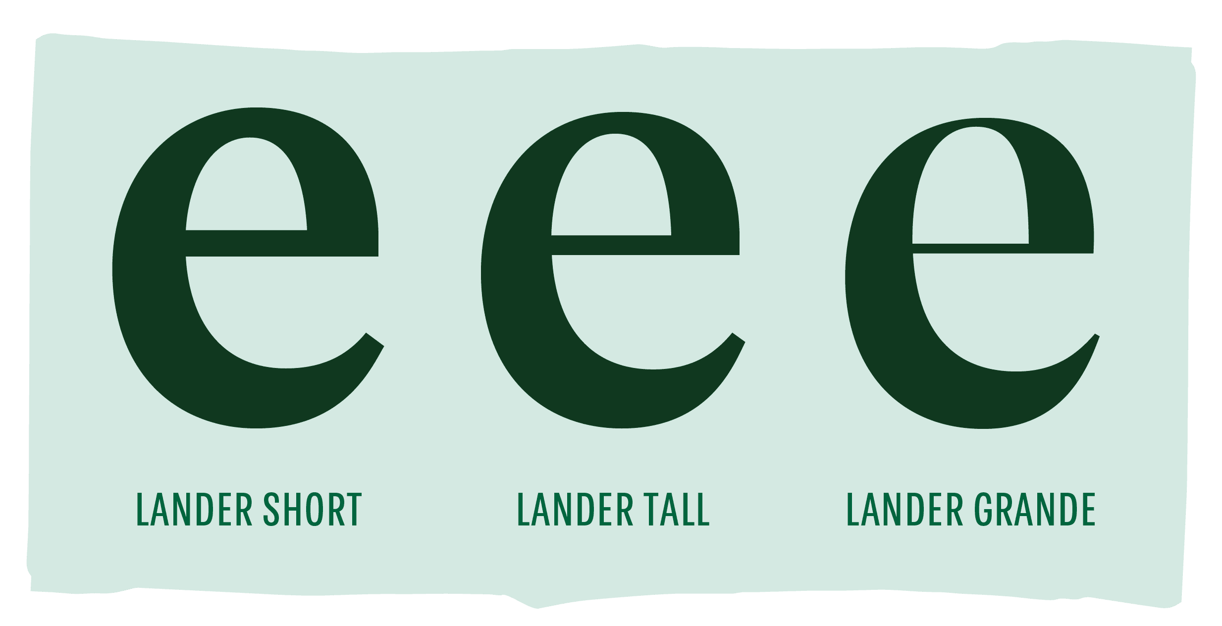
FIG. 12 — A comparison of the three optical sizes, showing the change in hairline thickness, amongst other details.

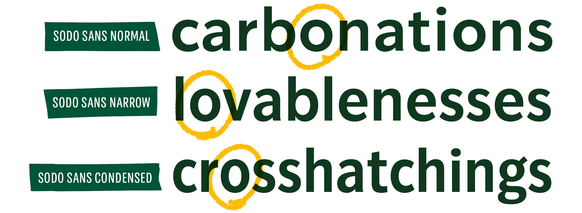
FIG. 13 — The changing proportions of 'o' across the three widths of SoDo Sans: Normal, Narrow, and Condensed.
On one particularly memorable morning, Dave and I finished the italics for Lander, both of us sick with a flu, both of us in the Bay Area (me visiting at the time), and both of us unable to leave our apartments to see each other because we were just too damn sick. We pushed 'send' on the email with the final Lander font files for Starbucks, and went back to sleep to rest up. Early on in the process I had set up a plan for the Sans fonts to eventually have a system of progressively narrower widths. Seeing this need themselves, Starbucks approved the expansion of SoDo Sans, to 3 widths. SoDo Sans has a 'normal' width which is used most often, a width that we perceive to be typical. The next progressive width narrower is 'narrow', which provides an extra sense of economy on a line, making it easier to fit text onto a mobile screen for instance. And a step narrower than that is SoDo Sans Condensed, which is even more economical still. Ideally all of these widths 'feel like SoDo Sans', and they are designed to be used for a finer degree of control in typesetting, by the talented designers at Starbucks.
FIG. 14 — Snippets of sketches and proofs from the design of Pike.
And for the narrowest fonts of them all, we drew a 4th family, called Pike. Pike shares many details with SoDo Sans, but it has its own stance and intended use, where it can be found today; at the top of Starbucks menu boards, for instance. Heather Cran (having since elected to take my name following our wedding), worked on a huge portion of the drawing for Pike, creating drawings that felt comfortable even at the very narrow proportion Starbucks had requested. Letters like these are a typesetting tradition with staying power in America, particularly from the turn of the century when American Type Founders was formed, merging many wood and metal type foundries from the USA into a conglomerate. Designs that originated in that merger are still around today, such as Franklin Gothic, News Gothic, and others. But these designs originated prior to the invention of the modern type family, and they often are not arranged in a series of consistent harmonious weights and italics, as we might expect from the structure of a contemporary typeface.
FIG. 15 — A comparison between Pike and SoDo Sans.

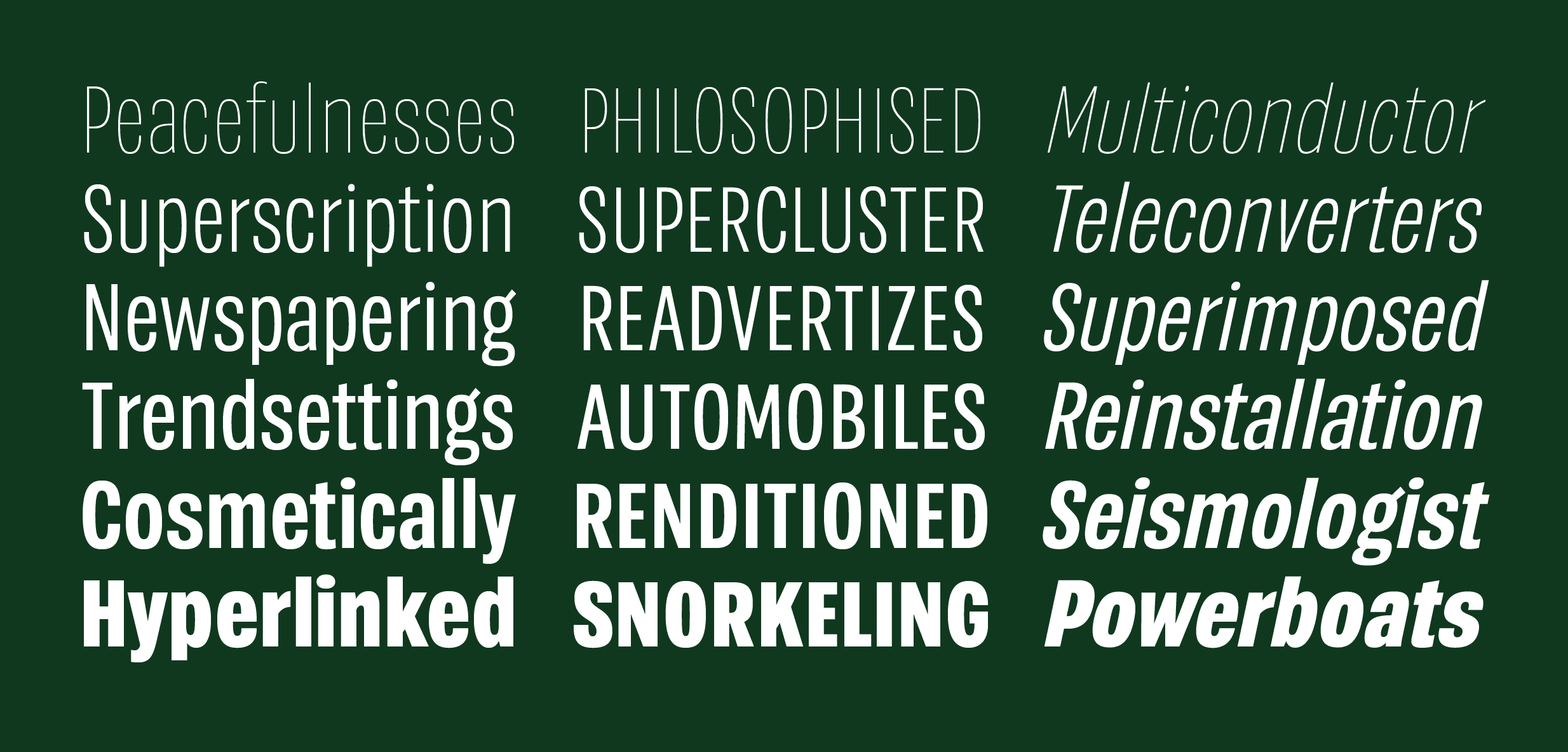
FIG. 16 — A specimen of the various Pike fonts.
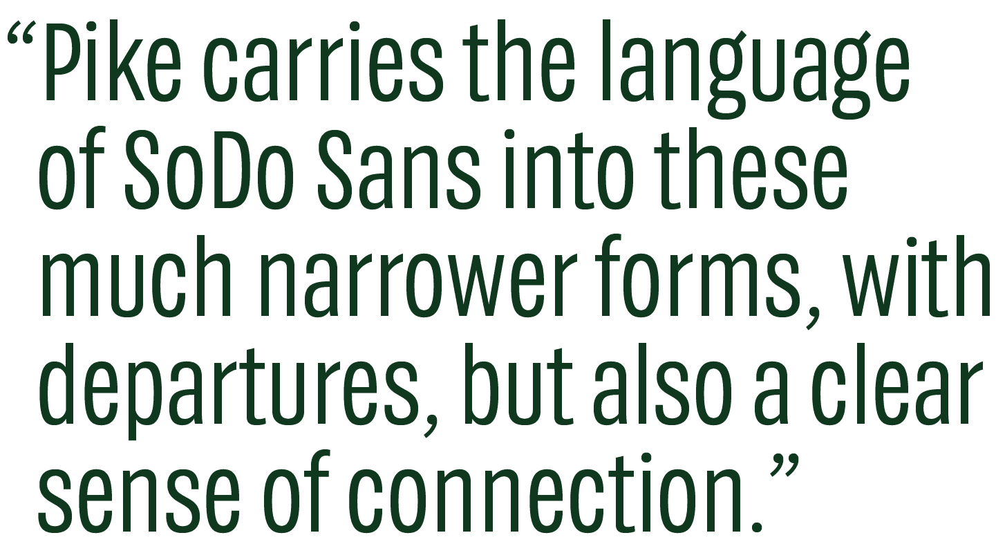
Pike carries the language of SoDo Sans into these much narrower forms, with departures, but also a clear sense of connection. Forms like the stem-less lowercase 'u' and double-storey 'g' are directly related in the two designs, as aesthetic callouts that help bring consistency to the typographic voice of Starbucks as a whole. Pike has the same number of weights as SoDo Sans, and so it's easy to switch back and forth between the two families as needed. We also increased the x-height of the lowercase in Pike, so that words could be set more like rectangular bricks than they otherwise would. This helps headlines to take up the right amount of space optically, to avoid large pockets of air trapped above the lowercase letters in posters and packaging. Starbucks sets a lot of headlines in all caps, with tracking, so we proofed the fonts this way during the design process.


 and its UK/Canada counterparts. Design: Starbucks](/_next/image?url=https%3A%2F%2Fimages.ctfassets.net%2F6codctr6znjr%2F5qjbmaFMi4zMkYTwgwWmYl%2F6bf245ffd75fcaabc2790864d5480c0c%2F18-SoDoSocialMedia-_2x.png&w=3840&q=75)
FIG. 17 — Instagram Stories content from the @starbucks instagram account and its UK/Canada counterparts. Design: Starbucks
Through this design process, Heather and I would walk to Starbucks each morning to fuel up for a day of drawing periods, commas and question marks. One day I loaded up the Starbucks mobile app to pay for my morning coffee, to find the fonts staring back at me from the various app screens. Soon enough Heather and I started finding samples of Pike on the packaging and signage of our local Starbucks store. That winter, I arrived in line one day to see the 2019 holiday campaign in full swing. I waited in line and watched each customer read the menu with the type on it, then pay (some using gift cards with the type on them), then receive their coffee in a cup covered in the fonts. The entire experience was permeated with this type, which had once not existed at all, and now felt like it was truly part of the core brand expression. That Christmas, visiting Heather's parents in Toronto, I sat with Heather in a subway station waiting for the Go Train. As I looked over, I saw a Starbucks kiosk closed for the evening, with a metal gate drawn across, and the lights turned out. From the darkness, through the bars of the gate, I could see the letters we had been drawing peering back at me. Moments like this really helped me grasp what phrases like 'the fonts will be used everywhere' really meant. Flying to cities I'd never been to before, I'd get off the plane to find familiar letters on a Starbucks location in the airport itself, before I'd even jumped in a taxi.

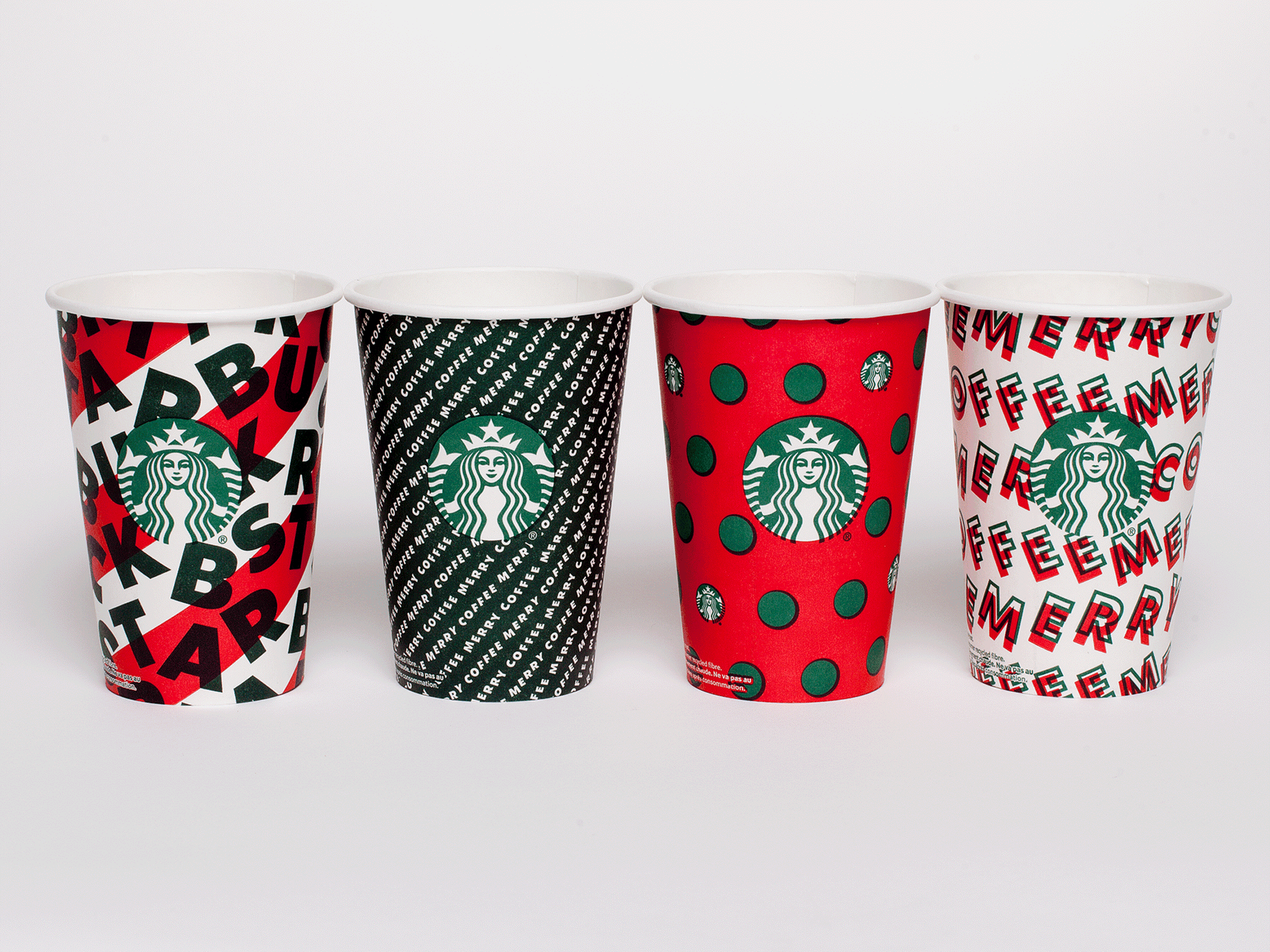
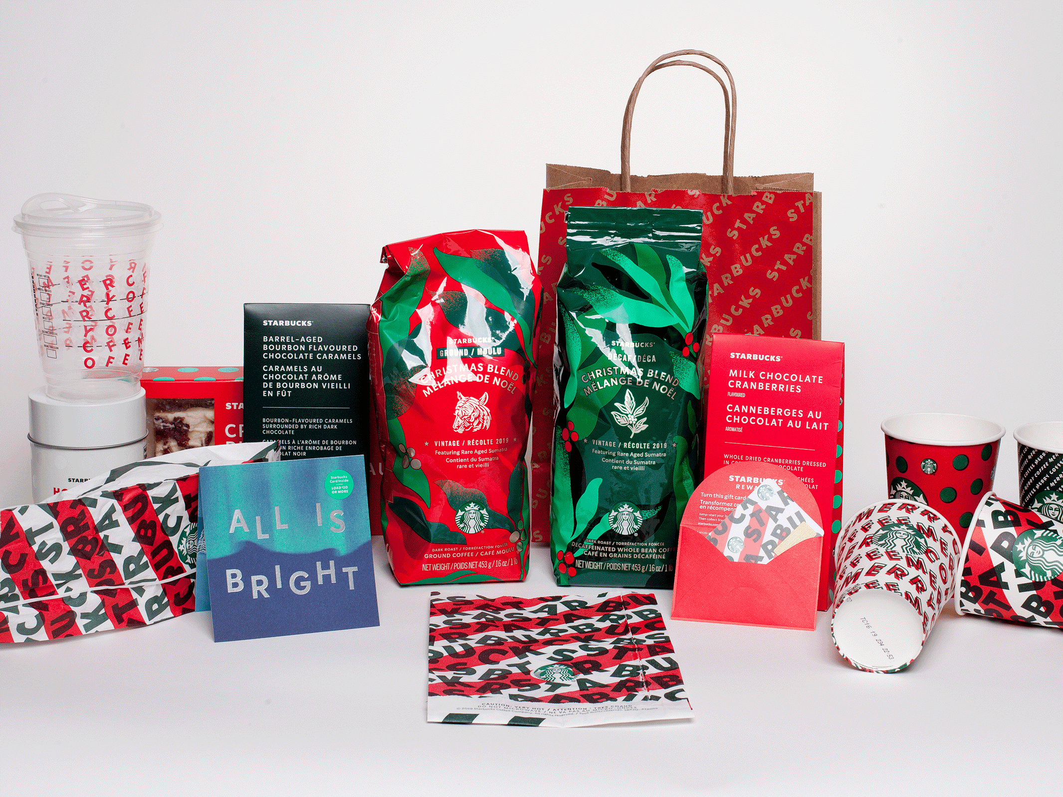
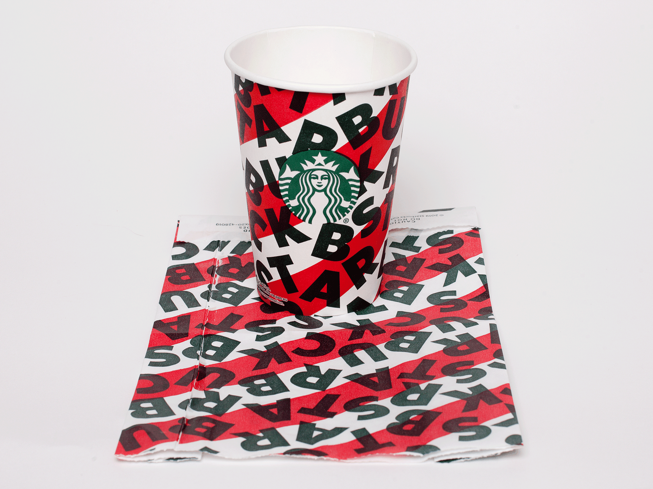

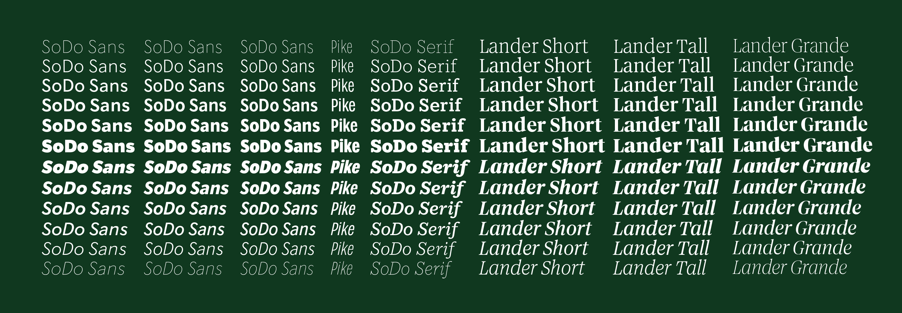
FIG. 18 — The exclusive Starbucks fonts, designed by Lettermatic.
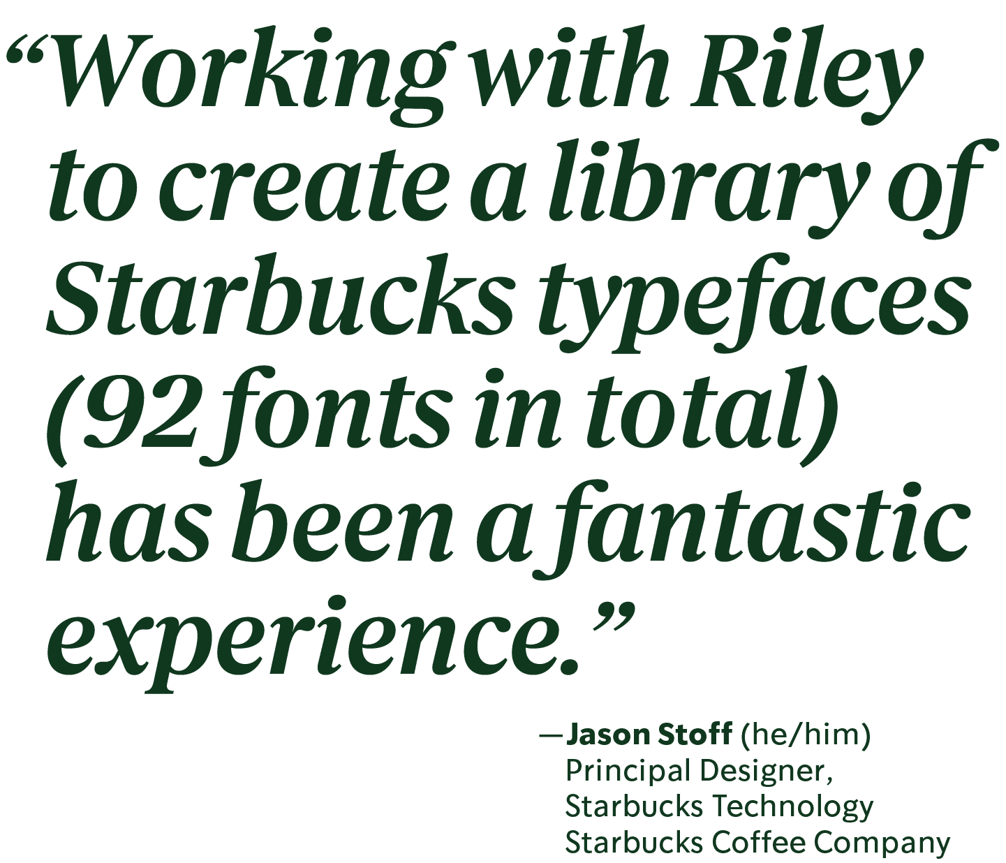
Jason Stoff (Principle Digital Product Designer) and I would email back and forth, adapting the fonts to their mobile design workflow, and making sure everything was functioning as planned. Eventually they found their way to the primary Starbucks website. Shortly after that, Starbucks themselves debuted a website about their new look, including examples of the various font families they would be using, all of which were drawn by Lettermatic. In 2020 when the COVID-19 pandemic took effect, the Starbucks fonts we had designed at Lettermatic became the voice with which Starbucks explained their new policies, helped their valued customers learn how to deal with the changing circumstances, and kept 'in touch' with the world through social media. With the rise of 'stories' in social media, I started seeing lots of instagram content from Starbucks featuring the fonts. Including a recent use that I found fascinating: setting their custom fonts on fill backgrounds to mirror the 'default' typesetting available within the Instagram app, while adding their own typographic voice to the communications. This kind of consistency, created by the team at Starbucks, is one of the most impressively thoughtful and subtle uses of a custom corporate typeface that I've seen in some time.
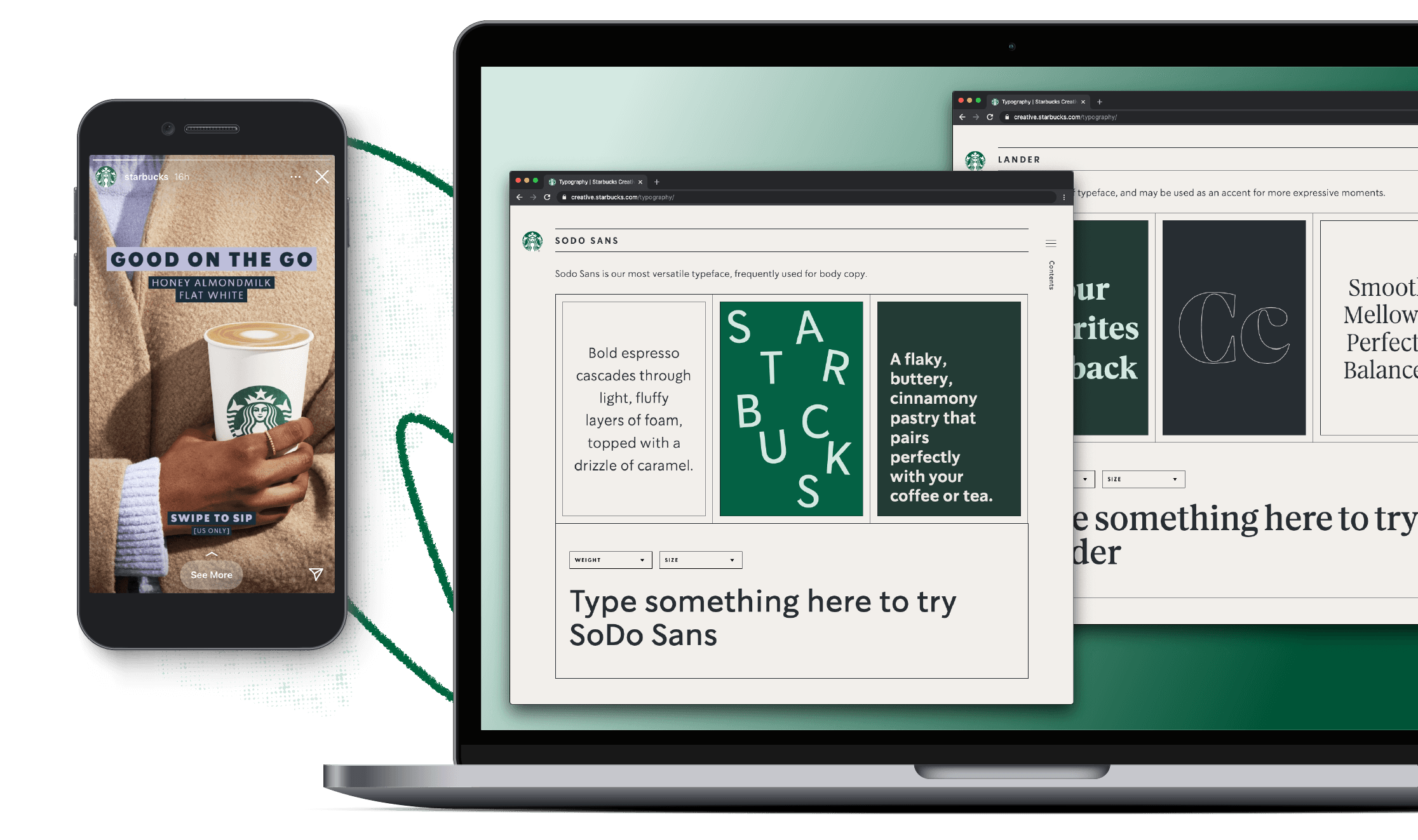
FIG. 19 — Instagram Stories content, and the Brand Expression Website, designed by Starbucks using the new fonts.

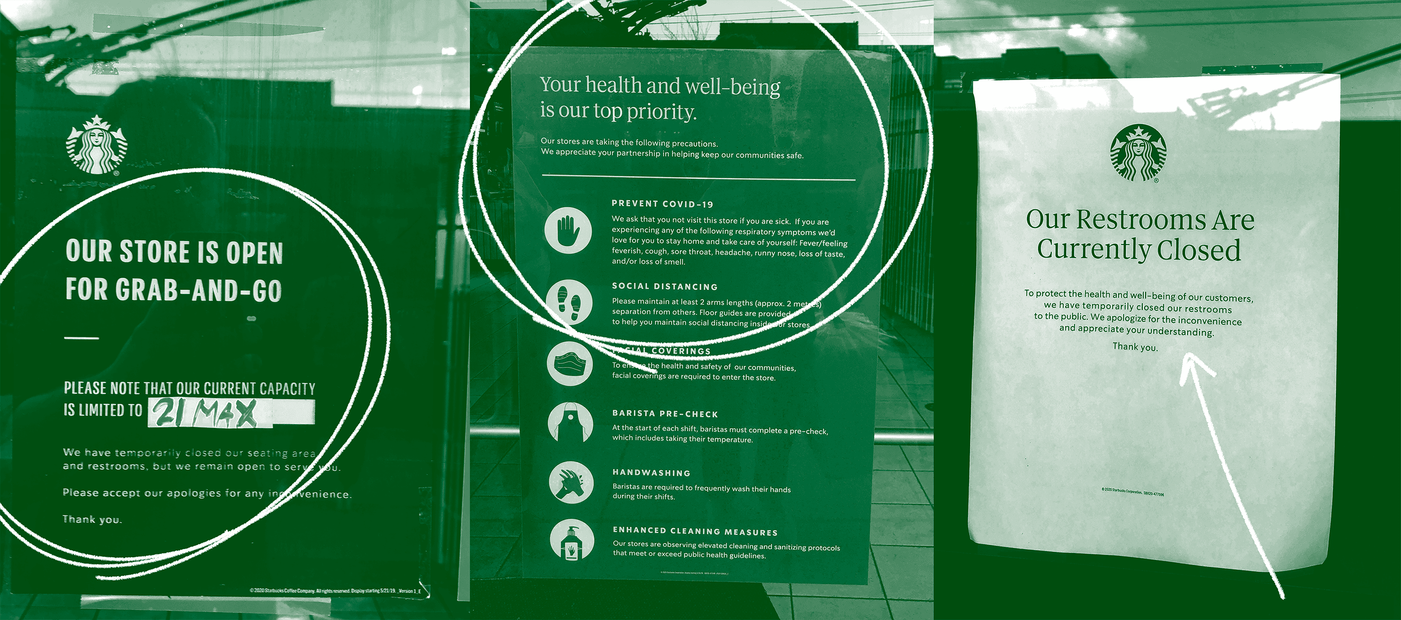
FIG. 20 — Signage placed in the window of a Vancouver, BC Starbucks location. Set entirely in the new fonts.
When talking about the fonts with designers, I've often been asked questions like 'is SoDo Sans based on the Starbucks logotype?' I find this a very flattering question, mostly because the answer is... in a literal sense? No. In a subliminal, indirect sense, absolutely yes. I think that even as someone who draws letters all day, I still have a 'person who reads letters' part of my brain. I still have a part of my brain that takes in the visual presence of a brand like Starbucks, and have all my life. There was never a time in my communication with Starbucks where we decided to base a detail upon the logotype, it was something more than that. Like we were channeling our internal understanding of the many visual decisions that had comprised the brand over the last 30 years, and used that to gauge what 'was Starbucks' or 'wasn't Starbucks.' These 4 families of type are brand new, and hadn't existed before, but in context they feel as if they had always been part of the brand. These days I see communications from Starbucks, and I recognize the typefaces more as 'the Starbucks letters' than I do 'the letters we drew.' They are now part of a brand voice seen all over the world. Someone is reading them right now, in a store, on their phone, in an airport, on television.
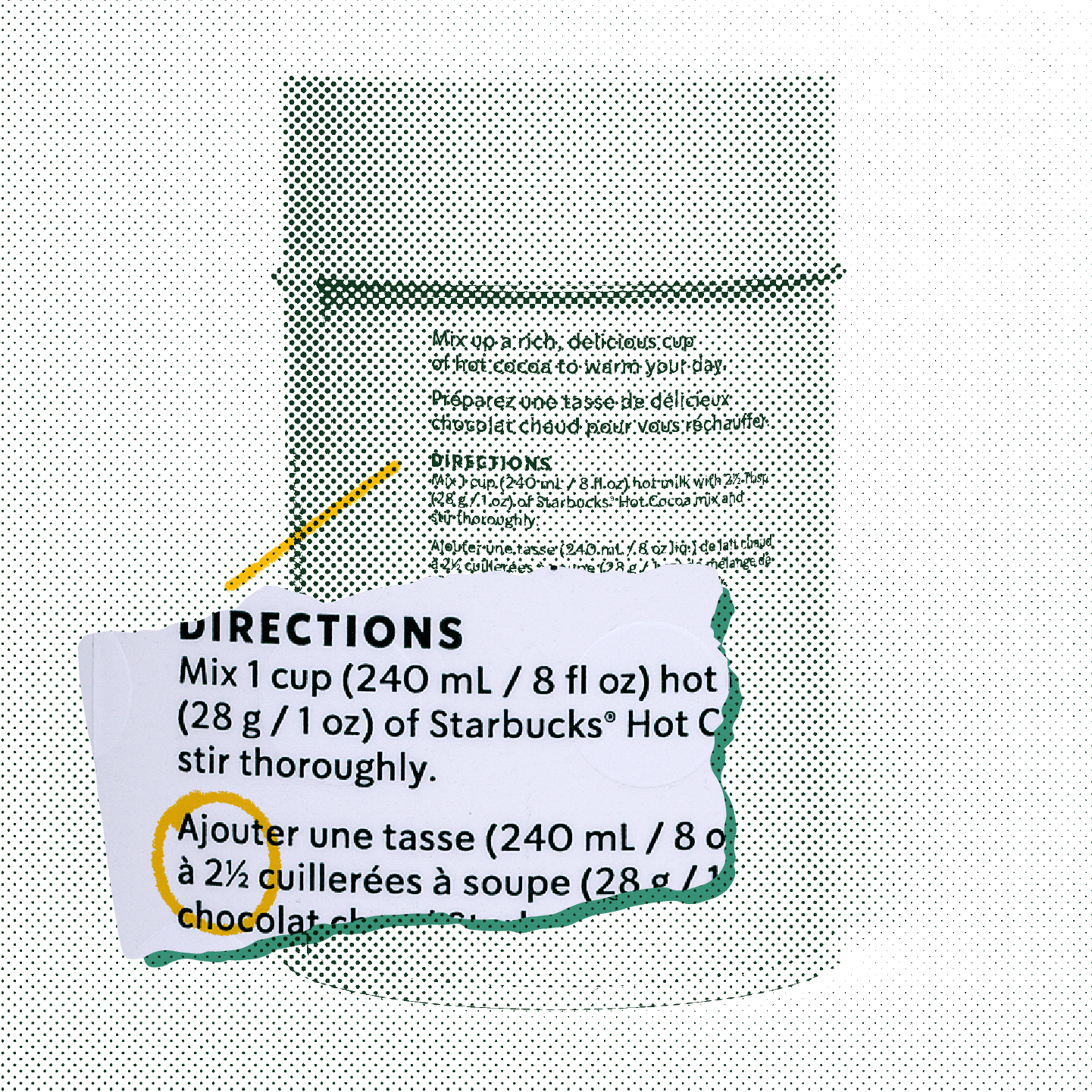
FIG. 21 — A SoDo Sans fraction in use, on the back of a Canadian retail market hot chocolate package. Design: Starbucks. Photo: Janis Brass

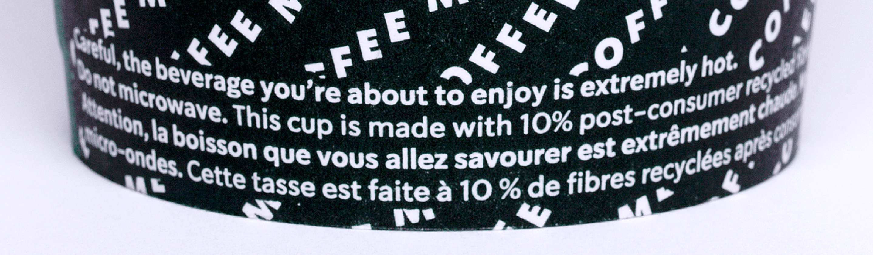
FIG. 22 — The fine print warning at the bottom of a Starbucks cup, set in SoDo Sans. Design: Starbucks
It was truly an honour to be asked to contribute to this project. I am particularly thankful for the contributions of Rob Stanton, Jen Sinconis, Jason Stoff, Trevor Basset, and Dana Deininger, without whom I can't imagine how the process might have gone. The journey was full of excellent lessons, amongst which was the true joy of working with wonderful people, and seeing work go out into the world. Starbucks was a client that put trust into toolmaking, and then leveraged those tools into a wide variety of contexts. As a typeface designer, this is the pinnacle of what we can hope to contribute: good tools for good design. I'll never see the 'be careful this beverage is hot' warning at the bottom of a Starbucks cup quite the same way.