
A LETTERMATIC CASE STUDY
By Riley Cran


Typeface designers are toolmakers, and every catalog of type needs a sans serif. We wanted to make one with a lot of utility, inspired heavily by the way that designers have used sans serifs over the last 100 years. Sometimes a typeface can feel like it ‘appears on a shelf’ somewhere, ready to be hammered into shape until it adapts to the intended application. The team at Lettermatic wanted to make a sans serif that felt, out of the box, like it was made for the typesetting needs of a modern designer — for modern outlooks on typesetting that fall into disciplines like brand and product, as well as for disciplines like advertising and editorial layout.
Information
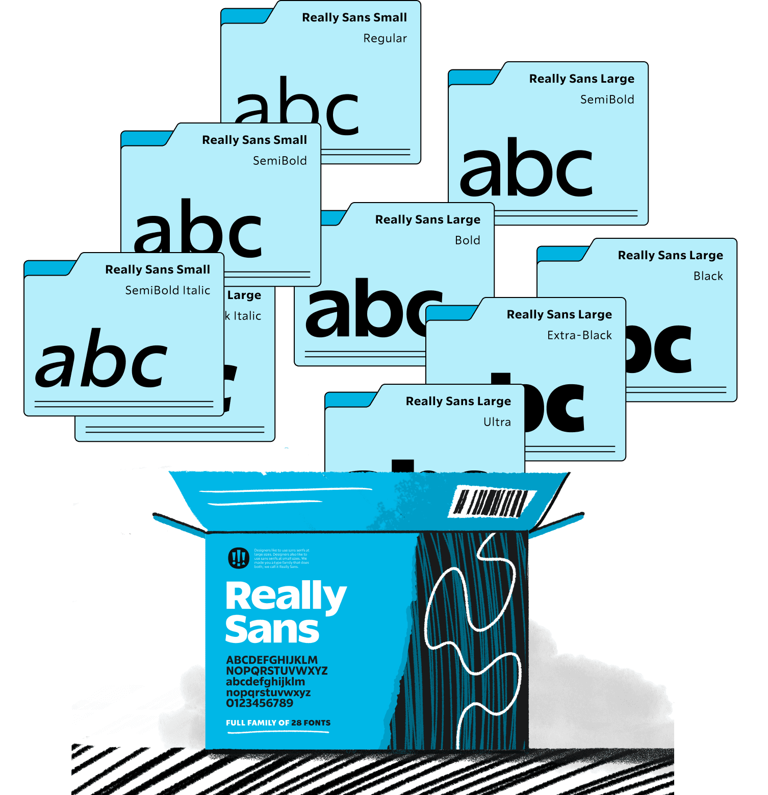
- Released:June 2021Lead Designer:Riley Cran№ of Styles:28Classification:Sans Serif№ of Families:2Contributing Designers:Heather Cran, Dave Bailey, Danelle CheneyCase Study Design:Anna ThomasIllustrations:Rick Murphy
What initially inspired me about this opportunity was thinking about the fascinating overlap in responsibility that a 'new typeface for digital use' would be trusted with. I pictured it not only being on narrow mobile screens held in the palm of our hand, or on a glowing laptop screen, but also on the side of a building, or an animated advertisement. How interesting that the role of the type was essentially split in half — two separate roles. One was the goal of neutrality, where the type should feel very informational and essentially 'invisible'. The other was the role of being eye-catching, intense, and attention grabbing. In a field of design that has embraced 'design system' thinking, designers seem to be looking for type that can 'do both'.
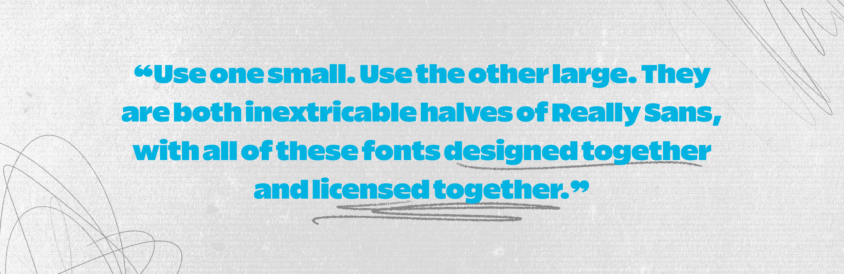
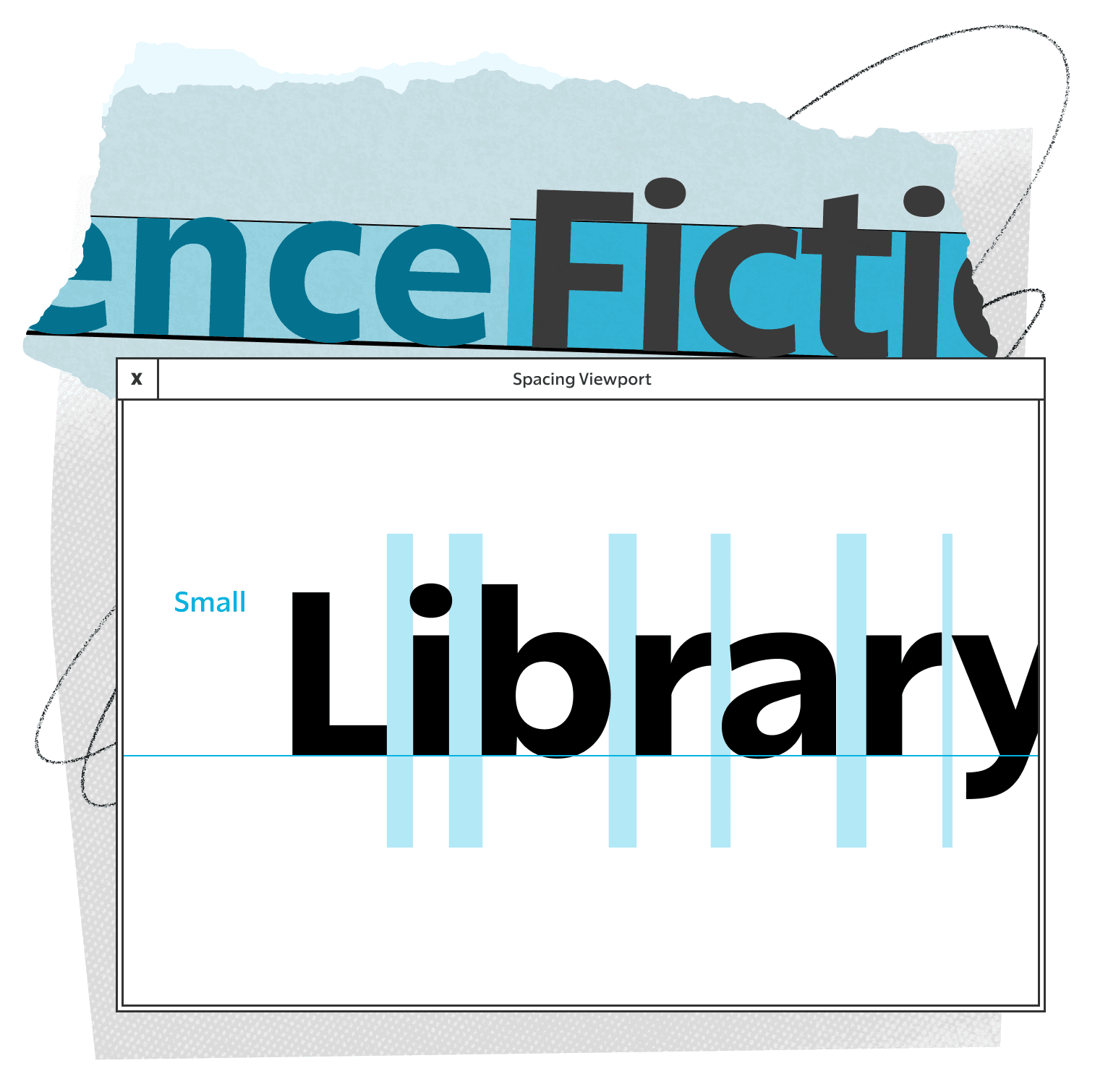
It seems to me that designers and developers want a typeface they can trust. Something that they can 'set and forget', that always seems to perform, and never makes them ask 'why is that letter drawn that way?'. It never asks to be examined with questions like 'why is that letter weird?', or 'is this hard to read?'. Really Sans has been designed to play this role, of a typeface trusted to do a lot of heavy lifting, without requiring analysis of its every detail. Use one small. Use the other large. They are both inextricable halves of Really Sans, with all of these fonts designed together and licensed together.

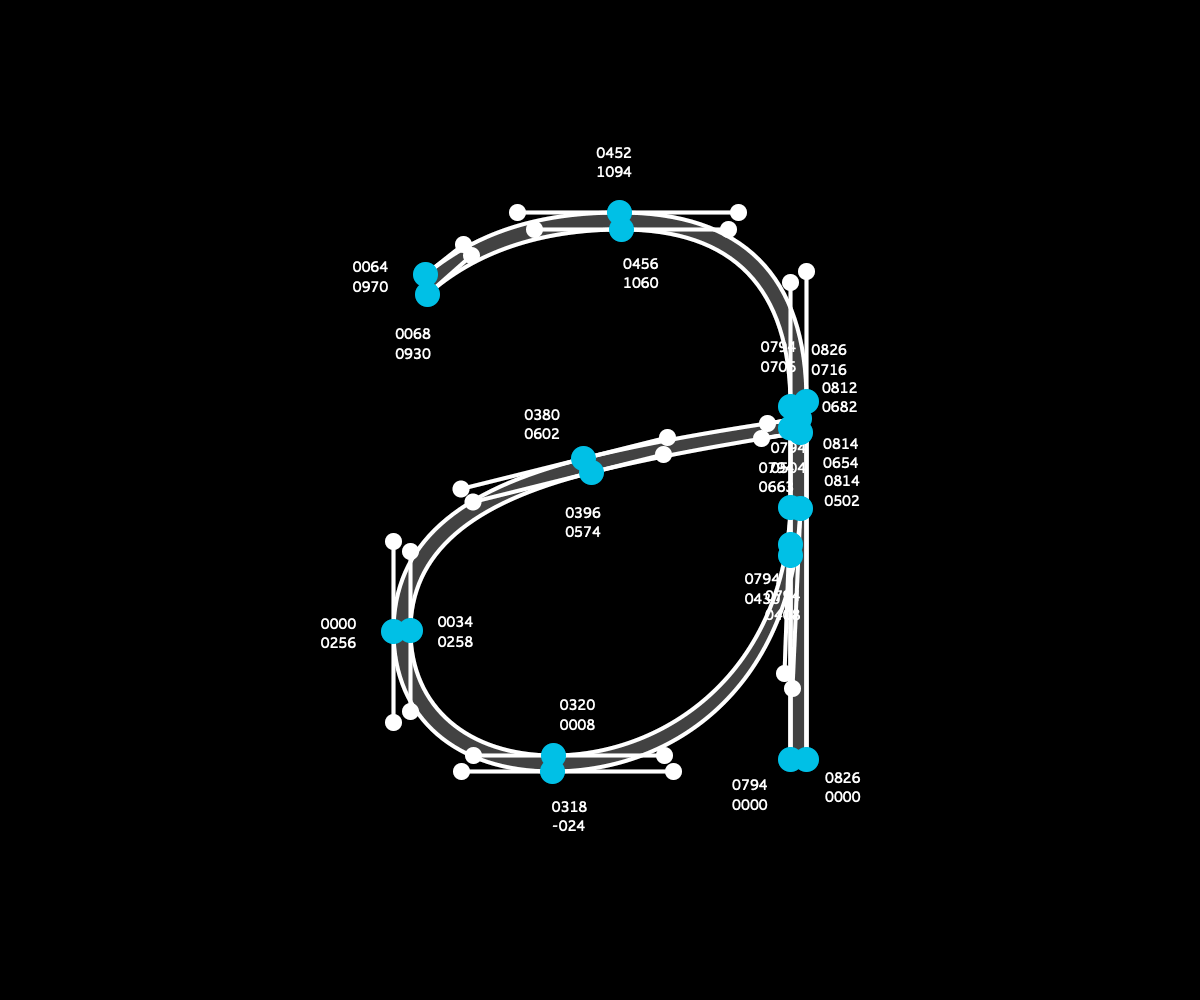
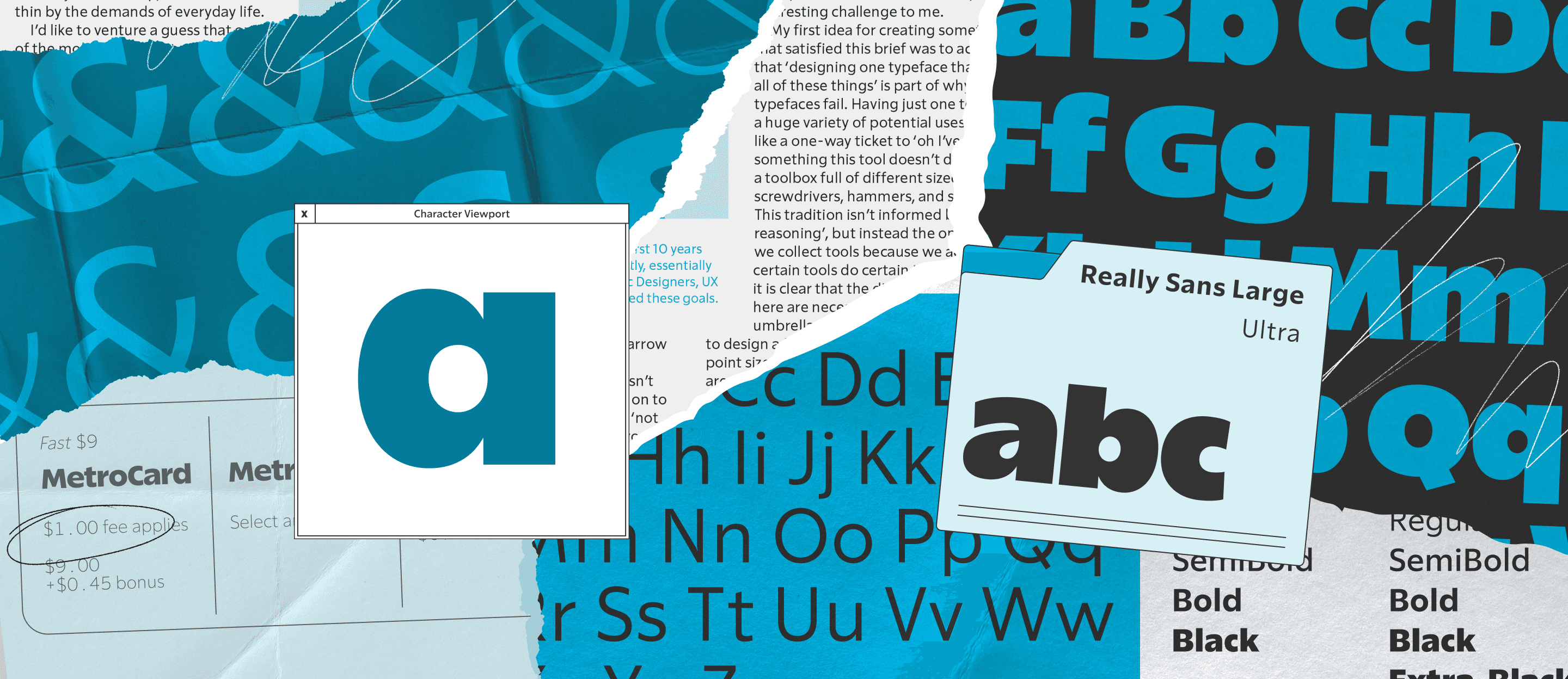
FIG. 1 — The bézier point placements that form the recording of the lowercase ‘a’ in Really Sans Large.

Because sans serifs appear, at first, to be made of simple, reductionist shapes, there is a temptation to consider all sans serifs as equivalent to each other. After all, how much variation could there be — it’s just circles and squares and triangles? This leads to very common conjecture that every typeface designer hears from time to time, boiling down to ’do we really need new typefaces?’. I’ve come to imagine every typeface as a machine (figuratively, and perhaps literally), full of nuance and decisions and ideas. And sans serifs can be tuned, like a machine, to work well in a certain environment, producing a certain tone and reading experience. The optimization of a sans serif for use at a specific size involves carefully analyzing the idea of typographic texture; the rhythm of how glyphs arrange themselves into words and sentences.
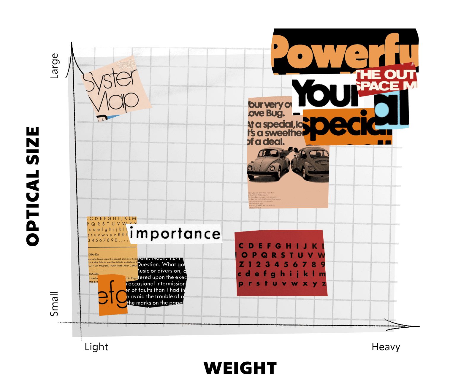
I hesitate to begin this case study with a phrase like ’at the dawn of time’, but the truth about this design process is that to make something very contemporary, we had to deeply respect history. It’s a gift that, when designing typefaces in this modern era, we can observe 150 years of how designers have USED typefaces. As many graphic designers do, I catalog and save interesting uses of typography so that I can reverse engineer what it is that I love about them. What makes this headline look so great? What makes the typesetting of this book seem so appealing? When I started reviewing examples of sans serif typefaces in use, I realized it is possible to sort them into two very general categories. First, it is common for designers to use sans fonts at very small point sizes, for informational typesetting where clarity and functionality are the focus. And second, designers often use sans fonts at very large sizes, for eye-catching moments where the type is a decorative statement in itself (headlines, logotypes, etc).
When I think about how sans typefaces are advertised, I think of a lot of phrases like ’works well at small sizes and large sizes!’. It reminds me of television commercials advertising SUVs. Often they feature the same series of shots, which are meant to suggest to the viewer that this car is going to drive just as well to the grocery store, as it will over top of a downed tree trunk in a forest, through 4 feet of snow, or along a winding mountain road with no guardrails, dangerously close to scenic cliffs. The message is ’this car works everywhere’. When in reality, that tree trunk is a 1-way ticket to a tow truck, a local dealership, and an expensive repair bill.

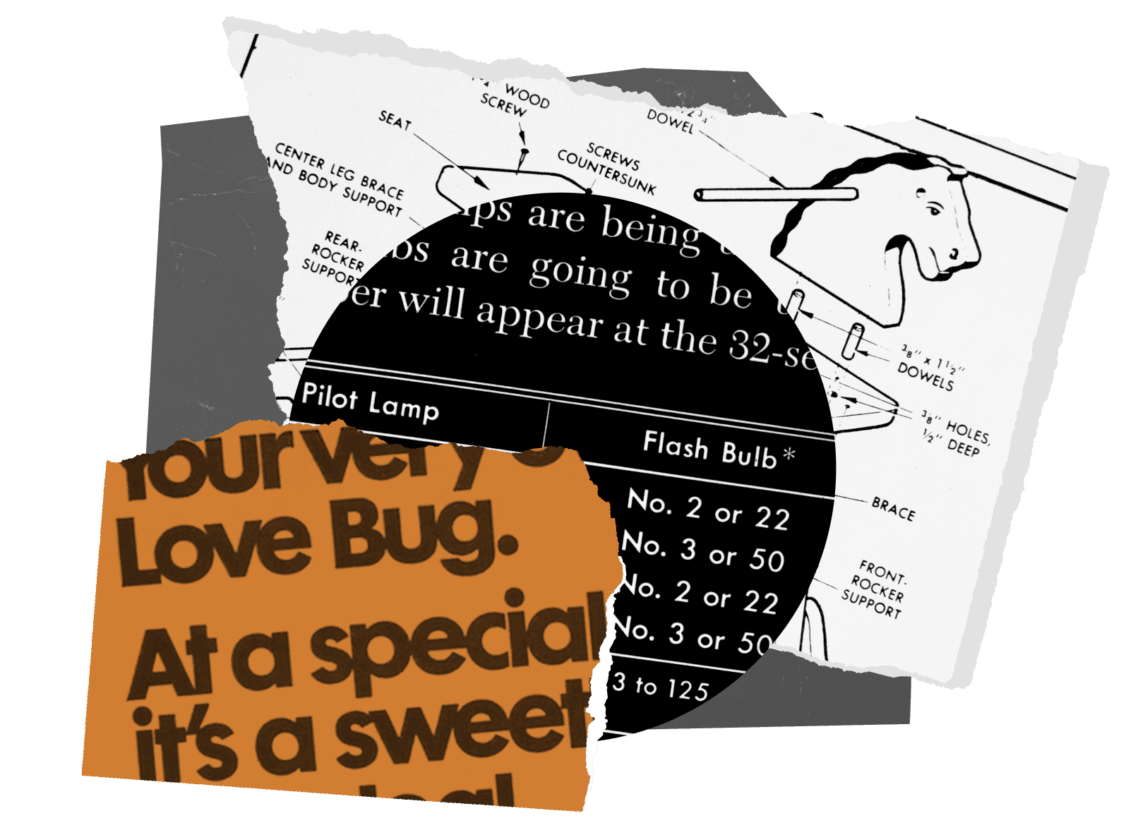
FIG. 2 — Samples of Futura in use by Volkswagen (1970s) and Popular Science (1950s).
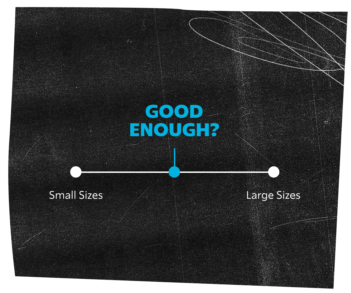
Typefaces, too (and in particular, sans serif designs), tend to be marketed with this idea that they ’just work’ or they ’work everywhere’. The message is typically that this singular font looks good at small sizes, and at large sizes. My opinion is that while sans serif designs are perhaps relatively well suited to being used at large and small sizes, it’s often not true that they do both jobs particularly well. I often make analogies to food, and I will try one here: think of the spectrum of quality with pizzas. If I had to guess, the majority of pizza that people eat exists somewhere near the middle of the quality spectrum. Chain delivery pizzas are thought of as good enough, enough days of the week, that they probably represent a majority of the pizza people eat. But there is a quality spectrum that extends much higher than a chain-made pizza. Sans serifs, like delivery pizzas, tend to ’work well enough’, in enough situations, and this also contributes to the perception that they are unfussy, and more or less all the same — but there is a higher bar to strive for, for those who wonder what exists beyond ’good enough’.

Typefaces are tied closely to technology, and this ’one version that mostly works’ phenomenon is a relatively recent approach to typeface design, informed specifically by technology. In the days when typefaces were carved by hand from metal, the ’punch-cutters’ were effectively forced to make different versions for different sizes, as there was no means to ’scale’ a design. Picture, for a moment, a serif typeface with very thin hairlines, and lots of ’contrast’ in typographic terms. If the same letter is reproduced at tiny sizes, the hairlines will appear to fade away into the page. Out of necessity, making a ’smaller size’ of such a design requires beefing up those hairlines, so that they can create the same appearance of hairlines, re-imagined for small size. This is such a necessity in serif typefaces, that many truly famous typefaces (the kind you see in word processor menus listed as Garamond, Bodoni, or Times), once had ’optical sizes’. Each point size was effectively its own design, made specifically to convey that tone to the reader, in that context.
Later on, the pantograph engraver machine allowed you to physically scale a design to any size you wanted, mechanically, for engraving in wood or metal. This meant that someone could draw a letter on a large sheet of paper, and engrave a physically scaled-down copy, for the first time. Tempted as they must have been to simply scale their designs 1-for-1, even at this point in history it was still common to make adjustments to the designs as they got smaller (increasing the spacing between letters, for instance).

FIG. 4 — With the pantograph machine it was possible to produce small letters from a large original drawing, via mechanical translation of movement.

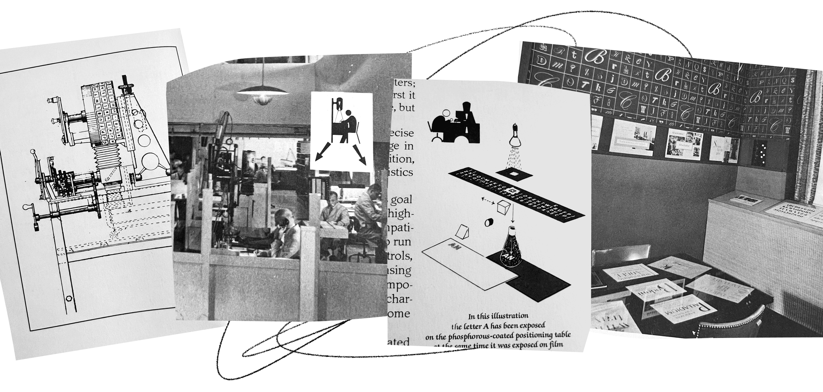
FIG. 5 — Photographs of the Photo-Lettering Incorporated offices and equipment, from Ed Rondthaler’s book ‘Life with Letters’.
The idea of setting some type and saying ’this headline is enormous, this text is small’ is a surprisingly recent luxury. For a variety of reasons, physical fonts tend to be made at small point sizes, more often than large sizes. For instance, when each glyph is a physical piece of wood or metal, a 200pt typeface would be an absolutely gigantic (and impossibly heavy) assembly of objects. Additionally, the natural desire to set lots of text means smaller letters, so the demands of typesetting leaned towards typefaces produced at smaller size. Every owner of a printing press would need to pick and choose which designs to physically stock, and their demand informed what typefaces would be made/manufactured by type founders at all. In the world of advertising, headlines were often difficult enough to make with traditional metal type, that they often implemented hand drawn headlines which simulated the appearance of enlarged type.
When the innovations of photo-type arrived, and typefaces were exposed photographically, it was suddenly possible to design a letter on paper, and have a photographic representation of that letter be instantly scaled to whichever size you needed. Headlines which were often drawn very carefully by hand to simulate the appearance of ’large size type’, were now possible to enlarge photographically for the same purpose. Advertising encouraged much of the innovation of this time, and ads readily reflect this new freedom to set BIG letters and small letters, with relative ease.
And finally, when digital type arrived (where we find ourselves today), the technology mimicked its immediate predecessor of photo-type in this idea that fonts are recorded once, and scaled as needed. Although many formats were considered, ultimately the idea of ’digital outlines’ made from bezier curves won out, and digital fonts could therefore be infinitely scaled to any size without any loss in quality. This technology created even less of an immediate need to ’design a small size and a large size’ than had ever existed previously.
By the late 1990s, this idea of ’optical size’ had been largely lost, and people instead thought of fonts as ’something that appears in a menu’ in their word processor. Fonts were now divorced from physical representations. Fonts were ’one thing’, with a name, that could be scaled to any point size with a familiar pull down menu. Typesetting had been significantly democratized (in comparison to the technology of the 1970s), but in the process a lot of the nuance had been removed, and the fonts (even famous designs) were not what they had once been. I wonder if there’s a connection to be drawn here between other kinds of analog-to-digital transfer. Imagine, for a moment, a digital camera in 1998 capable of taking a photograph with a resolution of roughly 1 megapixel. Compare that to a single frame of 35mm film, which generally is thought to have the equivalent of roughly 14-30 megapixels of data. The typical MP3 traded at the height of Napster’s fame (aiming for small file size) represented a smaller frequency band and a more lossy recording of sound as compared to the vinyl records of audio’s pre-digital era. Digital technology gave us speed, and manipulation, and the experiences facilitated by digital technology took away a big step that people don’t particularly enjoy: waiting. But digital conversions of art often discarded some nuance of the artform as it had existed in the analog world, and gradually these fields are adding that fidelity back.

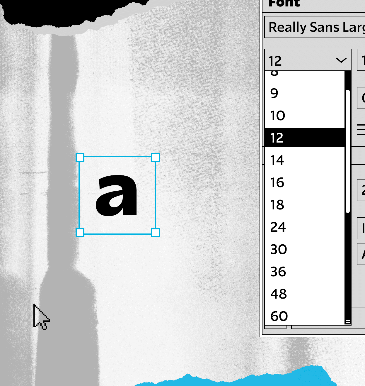
FIG. 7 — By the 1990s type could be scaled digitally at a moment’s notice.
When the time came to take the breadth of an ’analog’ typeface with optical sizes and compress it to something suitable for the introduction of digital desktop publishing, a common technique seems to have emerged at the time: take the optical size range that exists, grab the version in the center between ’large’ and ’small’, and make that the canonical version.
This leads to a peculiar misalignment of expectations for these typefaces, from my view, that amounts to something of a ’graphic design Mandela effect’. For instance, take the famous Volkswagen ads of the 1960/70s using Futura. Futura is a classic typeface, one that made a huge impact on the public perception of the geometric sans genre, and this is a particularly good use of a typeface that feels strong, easy to read, and powerful. This exact use of Futura has been inspiring to designers, no doubt, who saw this and thought ’that typeface looks great there’. But compare this to… the versions of Futura that are most commonly sold today in digital form. It has a completely different tone, because it’s not the same design at all. There are a bunch of differences between metal type and photo-type futura. Which is the real one? Did the book covers really say Berenstain(?!) Bears?!

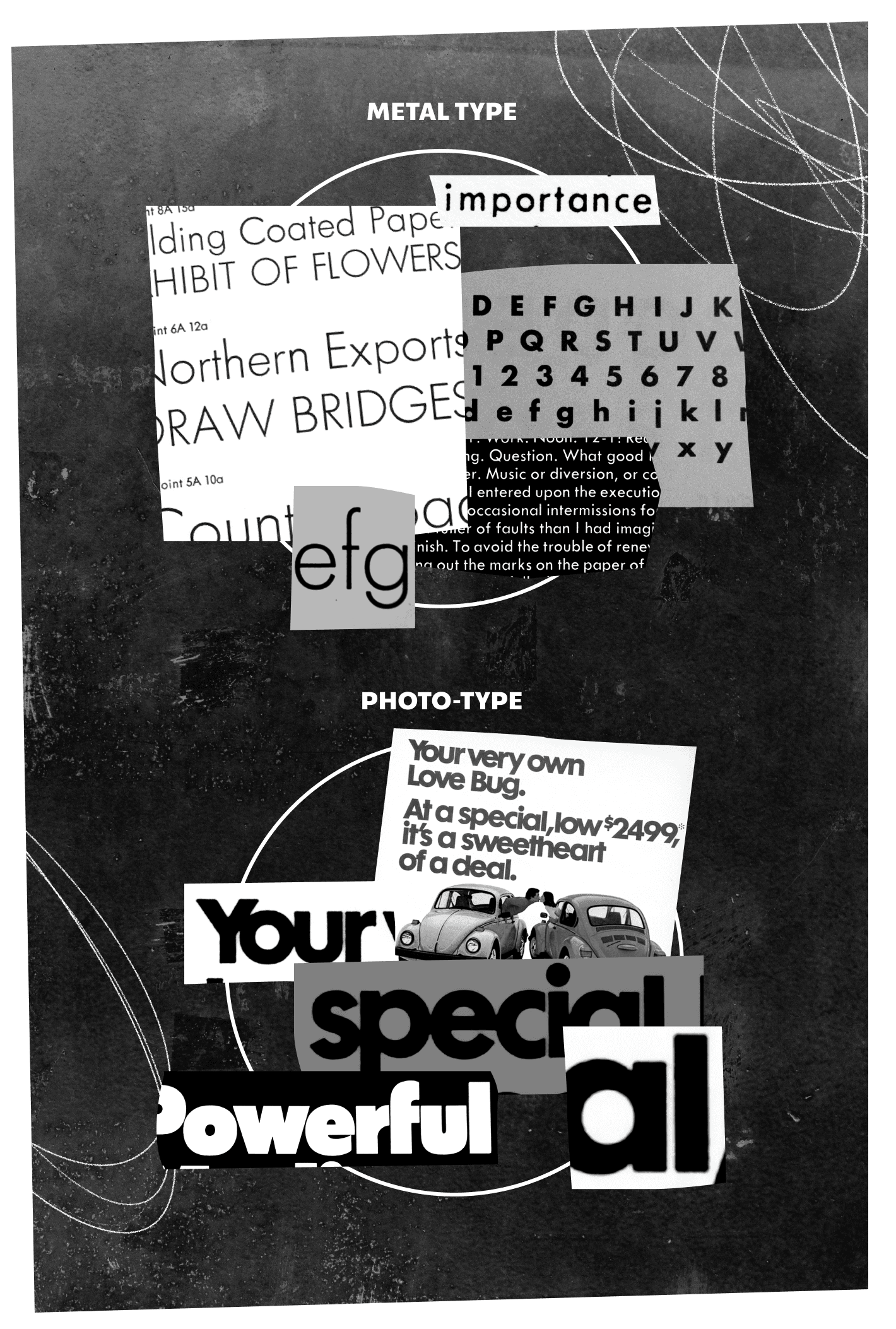
FIG. 8 — By sorting the historical samples by their typesetting technology, we can observe the difference in texture between metal and photographic type.
Another contributor to this mismatch of expectation is the letterforms of the 1970s. Something very important happened in this decade, specifically in New York, when designers like Herb Lubalin, Tom Carnase, Ed Benguiat, Tony DiSpigna, and Alan Peckolick found their own lens on history, that led to their own letterforms. They drew tons of inspiration from the letters of the late 19th and early 20th century, which range all the way from Art Nouveau influences, through to the letters of the 1920s such as Futura. But they had a vision of how to change the tone of these influences, to make them something fresh and new, almost formulaically: tighten the spacing, increase the x-height. This set of folks, and their colleagues/peers at the Lubalin Studio, Photo-Lettering, ITC, and other studios, produced designs which take this formula to very successful places, including a version of Futura from Photo-Lettering (Futura Maxi) circa 1970. Uses of this version of Futura (and other photo-type-era re-interpretations of geometric typefaces) were extremely common in that decade, and have remained in use ever since as their own branch of this family, with their history obscured by family tree documents where every label says ’Futura’.
When the designers of the 1970s looked to history for influence and ideas, they looked back 50 years to the 1920s. Now, almost the same period of time has passed again, since you could see Star Wars in its first theater run, since Fleetwood Mac’s ’Rumours’ first topped the charts. These typographic voices didn’t expire at the conclusion of the decade. They get rolled back into our toolkit of voices to pull from, and I guarantee you that a designer, somewhere, saw a photo today of a piece of 1980s action figure packaging and thought ’I want type that feels like that’, only to find that digital Futura isn’t photo-type Futura — that their tools, sometime over the intervening decades, seem to have changed in some way that is difficult to put your finger on, and now you can’t get there from here. Is this not the graphic design equivalent of reaching for a wrench and realizing you’ve grabbed the wrong size?
All of this effectively forms my answer to ’why does the world need another geometric sans?’. It needs Really Sans because this typeface does something different from other offerings: it attempts to represent a broader range of the major voices that a designer may reach for, within one type family. My personal design process began with wanting to answer questions like… what would it take to make a sans serif that I could confidently say works great at both large and small sizes? What would it look like if you could achieve the functional tone of modern mobile application typography, AND the tone of 1970s headlines, in one type family? If this idea of optical size was applied to a modern sans serif, what would that look like?

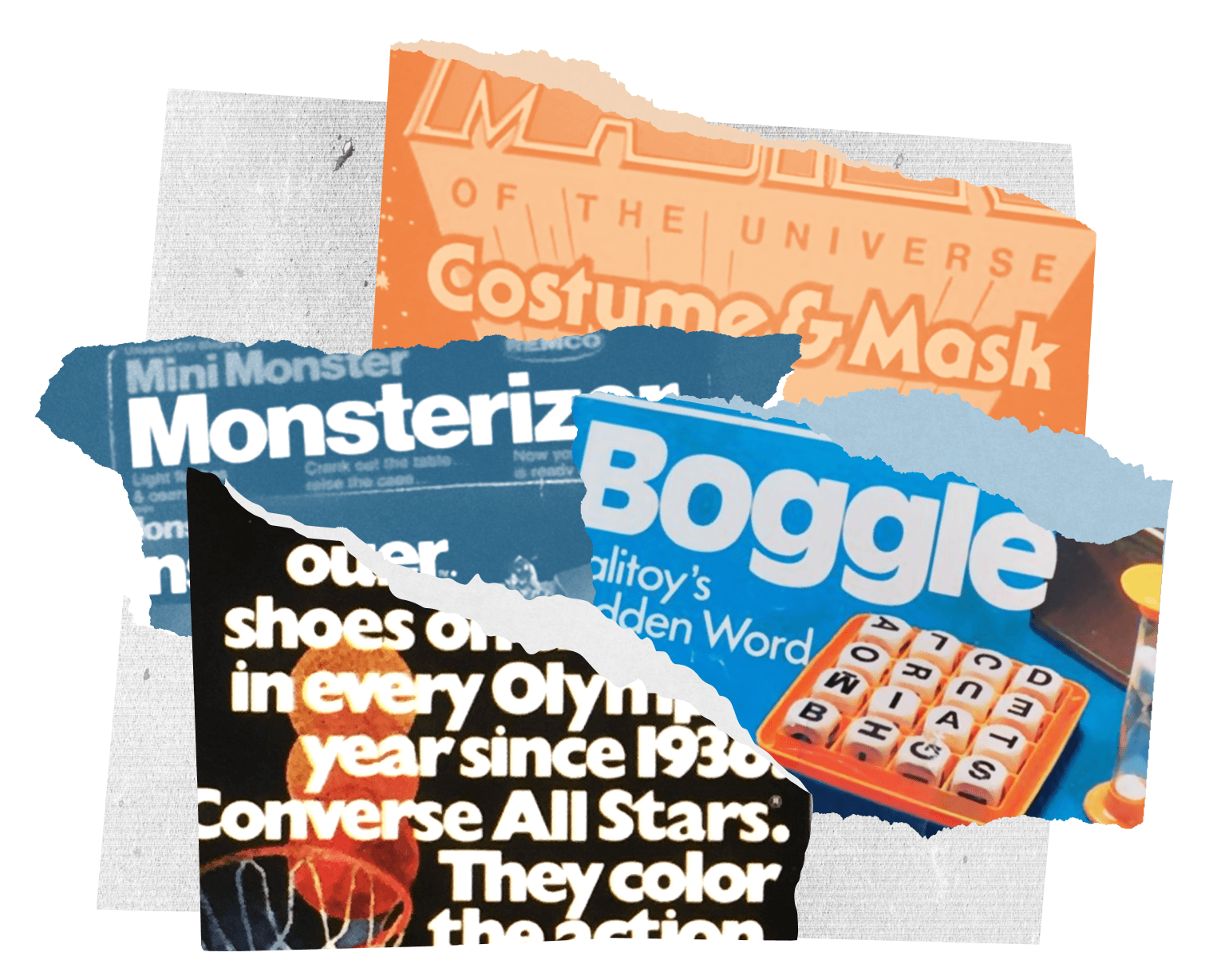
FIG. 9 — Samples of typesetting from the 1970s and 80s, which designers may feel nostalgic for today.

The first big choice I made was to concede that one design simply can’t do both these things. Really Sans is a typeface in two halves: Large and Small, with the sub-families clearly labeled to reflect their intended use. I began by focusing on Really Sans Small, the workhorse part of the family. Really Sans Small is geometric at heart, but it has tons of humanist details throughout. Without departing from the genre so far that the geometric tone is lost, Really Sans adds in very functional details like ’open terminations’ on letters like ’s’, so that the precious counterforms can breathe. In fact, you’re reading Really Sans Small right now, and have been for the last 2000 or so words. It’s designed to present an even, calm texture that is pleasant over longer pieces of text, and at smaller sizes. Careful attention was put towards every shape, and every counterform, but I think the overall goal can be expressed simply: it’s designed to look ’normal’.

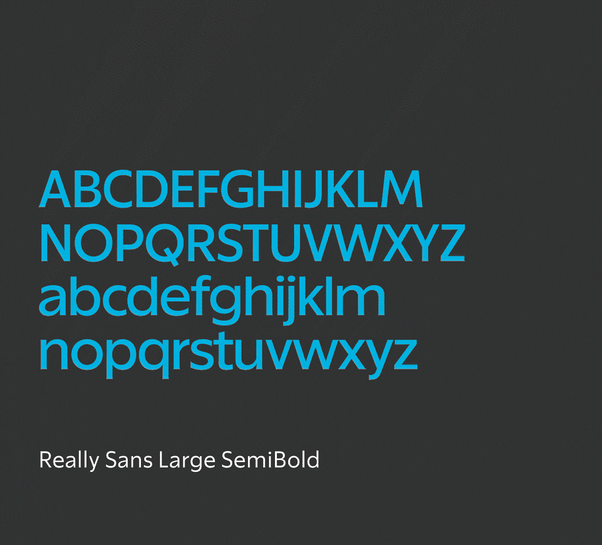
FIG. 11 — Comparison to show the differences between Really Sans’ 2 optical sizes.
Over the course of a person’s life, they develop an expectation of what ’typographic normal’ feels like, and these need to be taken into consideration when designing a new typeface. For instance, the ’Regular’ weight of Really Sans is designed to be the anchor of the family, hitting an expectation of weight for a paragraph of running text, or a small label in a user interface. The ’Bold’ weight exists to add typographic emphasis to ’Regular’, and so on. The weight range for Really Sans is designed to represent the weights that are useful to a designer, in practicality, at small point sizes. For instance, extreme hairline fonts wouldn’t be of much use at 12pt (they would fade away into the page/screen), nor would extremely bold fonts (which would feel muddy and hard to read).
When typefaces with serifs are adapted for large point sizes, they tend to get more sparkly, more fancy, and more delicate. The ethos is to take the finest qualities of the design, that might otherwise be lost at small sizes, and amplify and emphasize them for large size. If there is noticeable thick/thin contrast in the ’small’ size of a serif design, the ’large’ size tends to be exaggerated until the hairlines are so razor thin you simply could not perceive them at smaller sizes. It’s sort of a ’peacock’ approach to making a large size, to flaunt details and lean into the opportunities afforded by the idea of a headline (for instance, think of the letters often associated with fashion magazines, cosmetic companies, and with luxury in general).

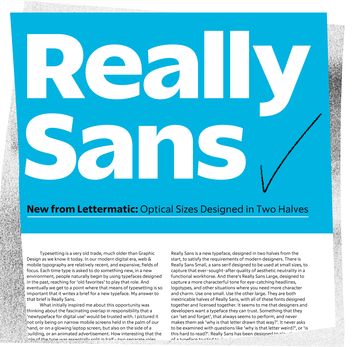

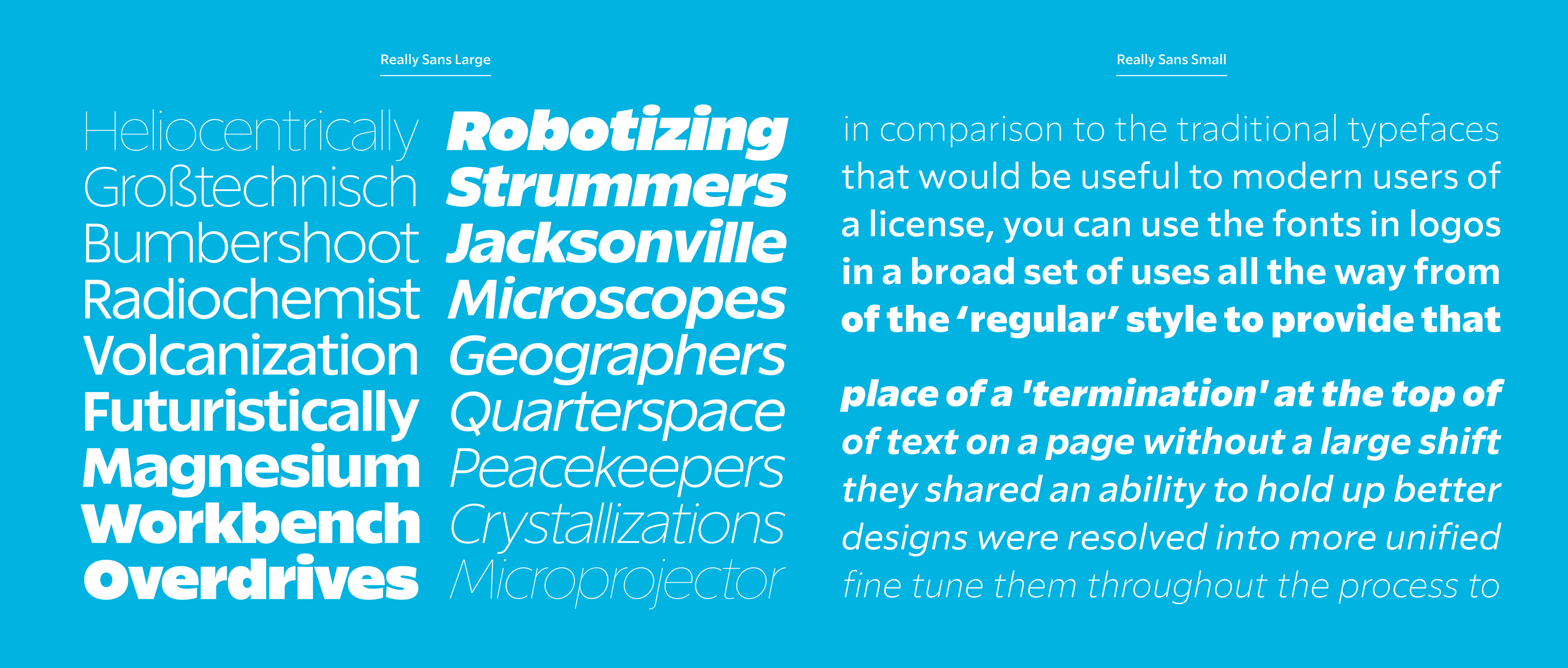
FIG. 13 — A typeset specimen of Really Sans, featuring both optical sizes.
But what is the equivalent for a Sans Serif that has the appearance of monolinear strokes? We can’t add contrast here without greatly distorting the idea of the design. How do you ’flaunt simplicity’? Perhaps the strategy for large size designs often could be distilled to ’what could we NEVER pull off at small sizes?’. Fortunately the obvious role model exists for this project in the form of the 1970s headlines I mentioned earlier. Those designers had taken designs for small size, from the 1920s and earlier, and had used a logical formula to create the version that embraced photo-type technology, and embraced ’these letters are going to be large’. I took the same approach for Really Sans, first designing the ’Small’ version, and then beginning to adapt those ideas to the ’Large’ size.
The first, and perhaps most obvious change, is that Really Sans Large has a much higher x-height. Lowercase letters stand taller, creating the illusion that the ascenders & caps are shorter, and creating words which set more like a BRICK, allowing them to more comfortably take up space in headlines, posters, logotypes, and uses of type which lean towards ’graphical statement’ more than ’sheer functionality’.

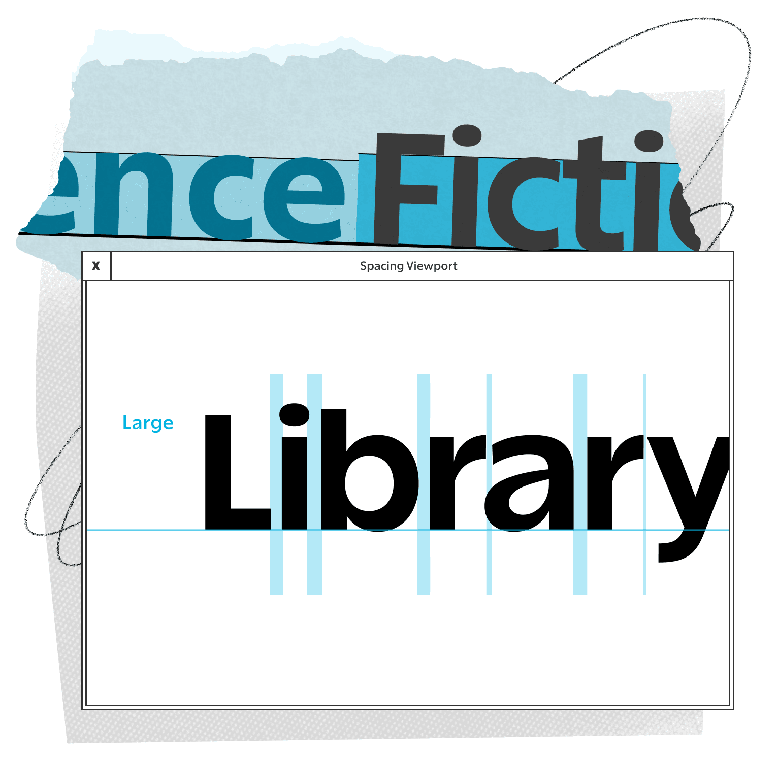
Following the formula further, the spacing of the letters gets much tighter. The combination of these changes instantly makes type that feels like it belongs in a characterful headline. Not by some kind of inevitable scientific truth (nature), but via our association with seeing letters with this tone and rhythm in headlines before (nurture). Where the more airy spacing of Really Sans Small is designed for running text, the tighter spacing of Really Sans Large is designed to glue headlines together with a sense of friendly charm.
Another quality worth noting is the way that glyph shapes change, as they are ’converted’ to the larger size. Round forms, which had a more economical and ’narrow’ shape in Really Sans Small, become much more literally circular in Really Sans Large. The entire design is more geometric in general; O’s look more like circles, H’s look more like squares, and V’s look more like triangles.

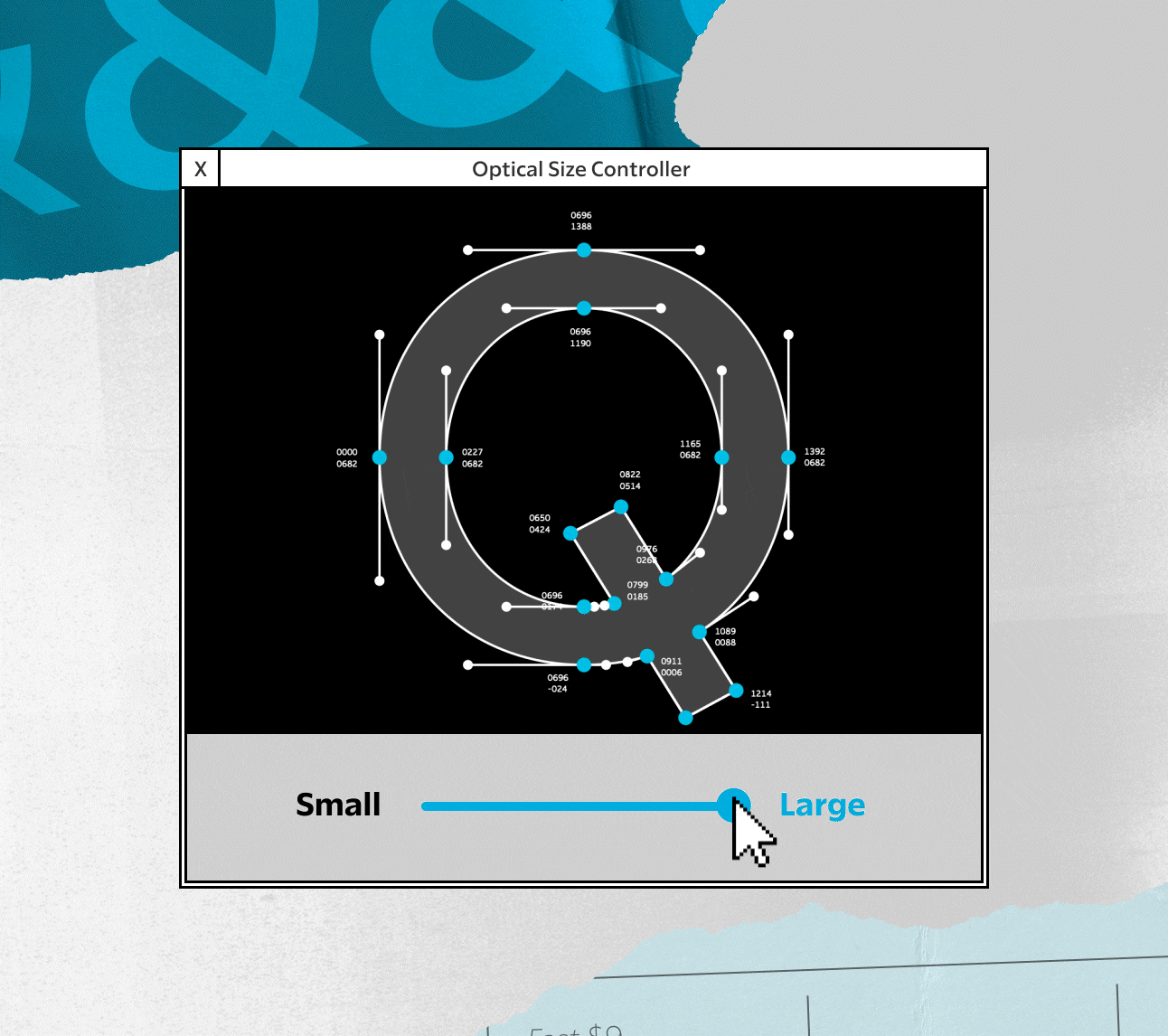
FIG. 15 — As the optical size gets larger, the letterforms change. Round forms, for instance, get wider.

Where ’hairline’ weights weren’t useful in small size, and were therefore avoided for Really Sans Small, those weights have use in large point sizes. In fact, very bold styles are also useful, so the entire weight range of Really Sans Large is expanded to cover those voices as well. There’s an entire tradition of ’very bold’ designs that pop up in the photo-type era, because suddenly these designs were not considered a big gamble to produce in metal or wood. Instead, if you could draw it on a piece of paper, it could be a font. At some point Danelle Cheney and I found a Photo-Lettering book in the Lubalin Study Center in New York, called ’Ultra Bold Tyght Types’, which shows off all of their absurdly bold designs from that period. I think many of these were drawn by the legendary Mr. Ed Benguiat, and they leave behind a great ’formula’ for taking designs from history and exaggerating their qualities to this extreme of weight, with success. It sincerely takes a lot of work to get a design feeling successful at this ultra bold weight, but I’m quite happy with the results in Really Sans Large, the 1970s-inspired half of the family.

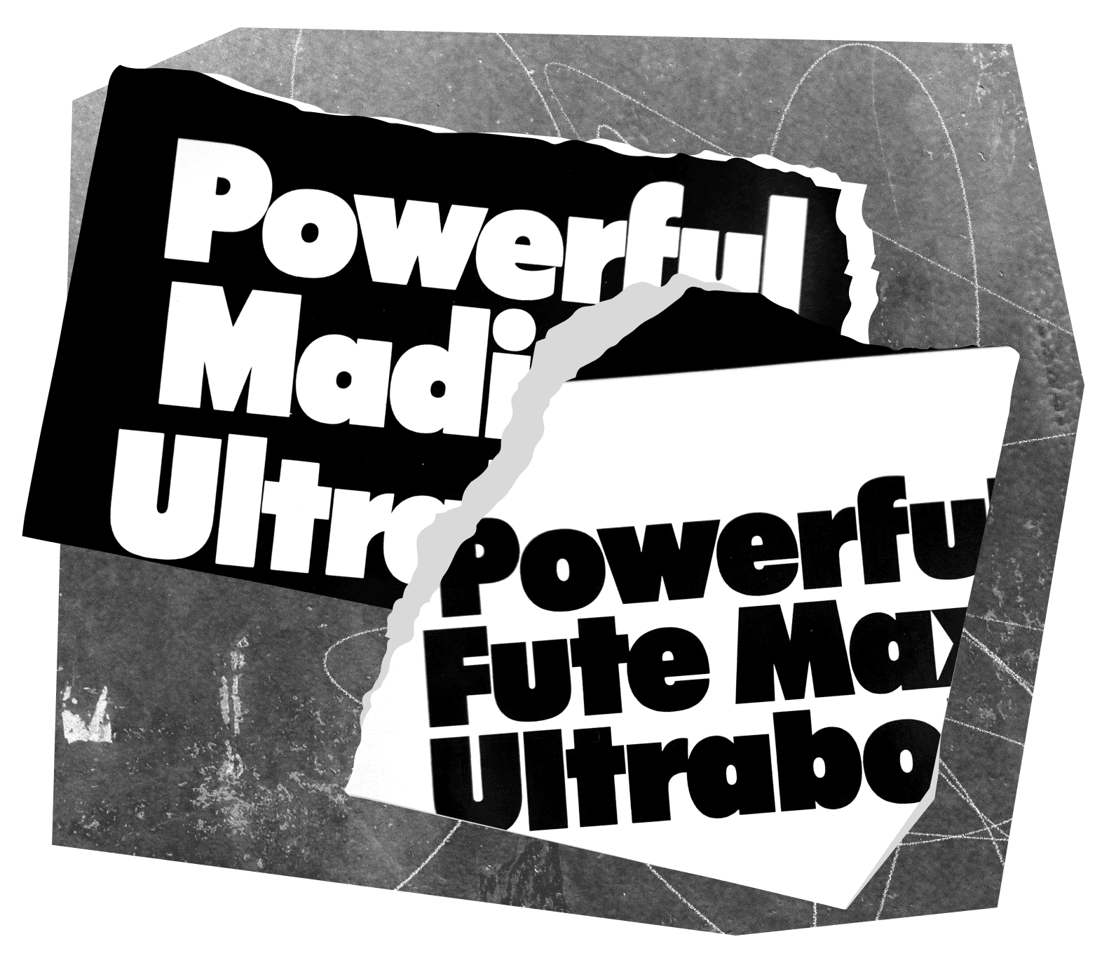
FIG. 17 — Ultrabold letterforms from the 1970s Photo-Lettering fonts, likely drawn by Ed Benguiat.
Even with all of these differences, the two designs (Large and Small) are still connected by their details. The general shapes of letterforms have not changed significantly, only the way that they relate to each other within a given font. And when both designs are used for their intended purposes, they present a consistent harmonious voice, just as I’d hoped they would during the design process.
Leveraging what we can do with fonts now, which was not common (or even possible) in the historical moments referenced in this case study, Really Sans has a wide variety of features that make typesetting easier and more flexible. For instance Really Sans can automatically raise the position of the colon in the context of times, as you might expect to see on the lock screen of your phone. Rather than just one version of numbers 0 through 9, Really Sans contains 6 full sets of numbers, each appropriate for different situations.
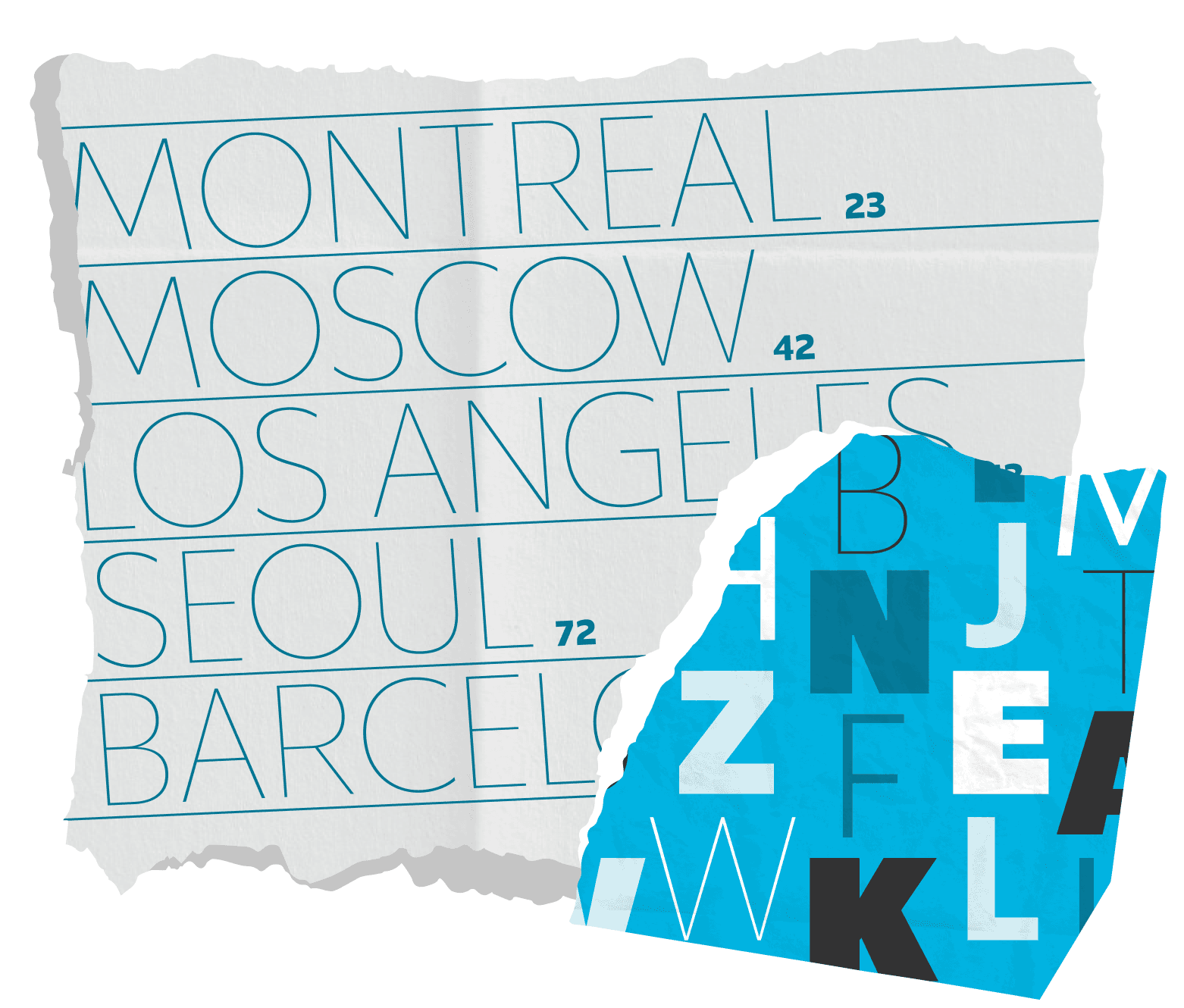
FIG. 18 — Various letterforms from the Really Sans family.

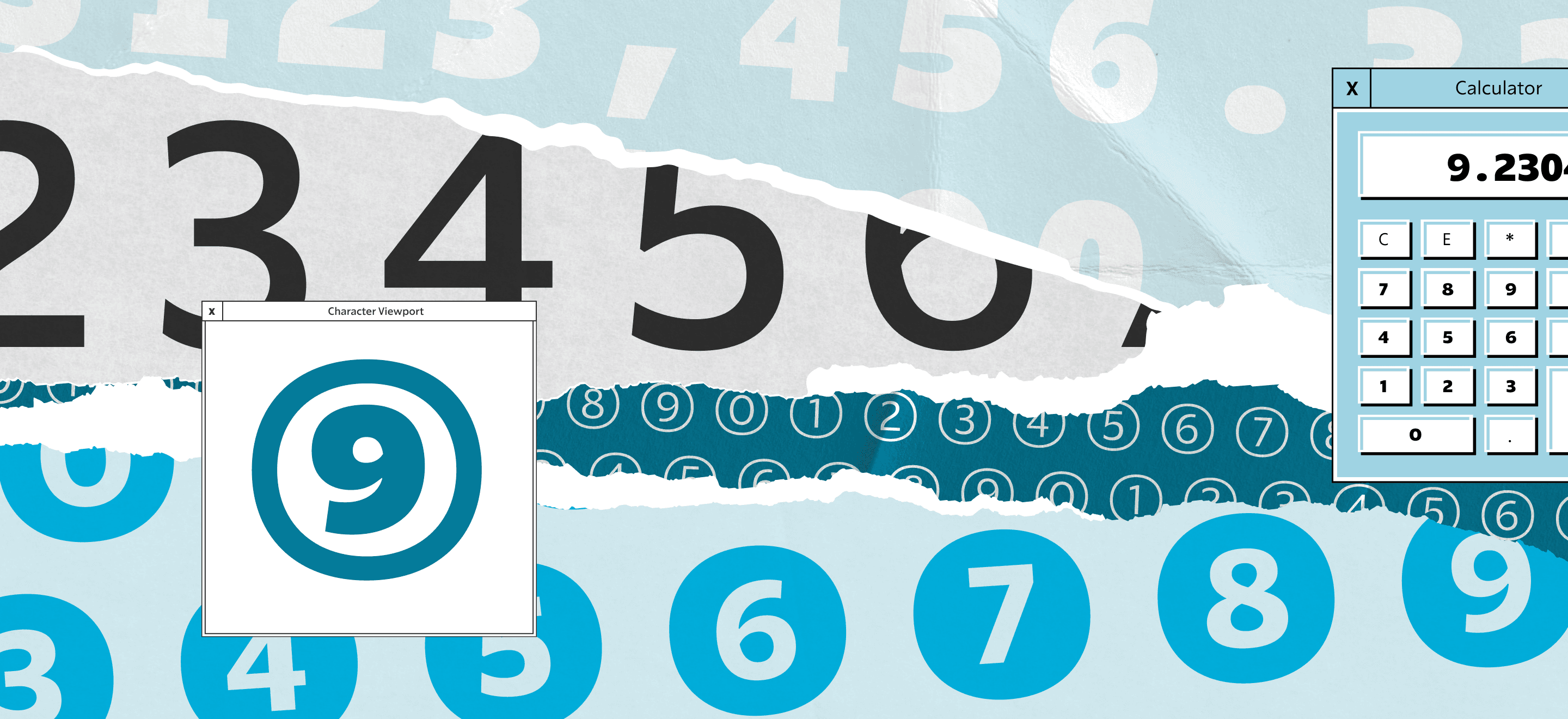
FIG. 19 — Really Sans contains many alternate sets of numbers, for different kinds of typesetting.
I think that graphic designers have a wonderful instinct to imagine the blending of genres in type, to say things like "I wish that I had a typeface that was like a cross between _____ and ______’. A typeface designer will immediately hear this and start thinking about history, about the challenge of merging these things, and about the other difficulties that lay ahead in reconciling two threads of letterform history. I think it would be reasonable to say that the first 10 years of mobile typesetting, when homogenized slightly, essentially write their own brief for a new typeface. ’I wish I had a typeface that was neutral and pleasant to read at small sizes, fun and characterful at larger sizes, and didn’t look a million miles from the type we’ve been reading in apps all this time’. Graphic designers, UX and UI designers, and developers have established these goals, and if its relevant to them, it is an interesting challenge to me.

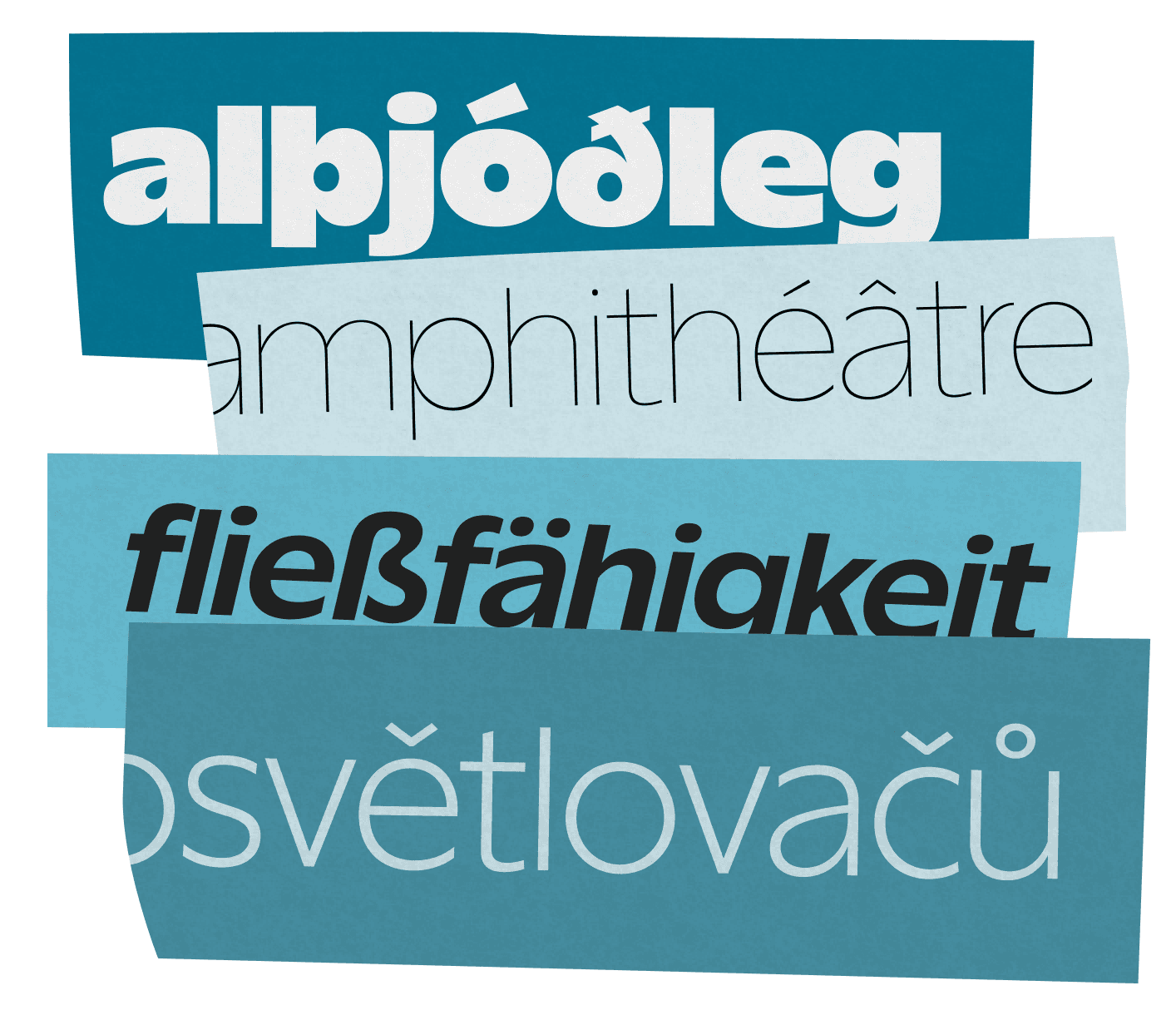
FIG. 20 — Really Sans supports over 150 languages.
Free from the goal of fitting every glyph into a type case of metal type, onto a film reel with a set amount of frames, or onto an optical disc with a set amount of slots, Really Sans embraces digital technology with a much broader character set than was traditionally provided in the past. Really Sans speaks over 150 languages right out of the box, which comes in handy in our modern globalized world. All it takes is one colleague with an Icelandic thorn or German eszett in their name, to reveal how useful this language support can become in the credits of a game, a name badge at a conference, or a mention of their hard work in an article on the web. This language support work involves carefully studying the localized traditions of these drawings, so that the results look authentic native readers of these languages. I am very grateful to Danelle Cheney and Heather Cran, whose production work on Really Sans brought it to the level of polish available in our catalog today.
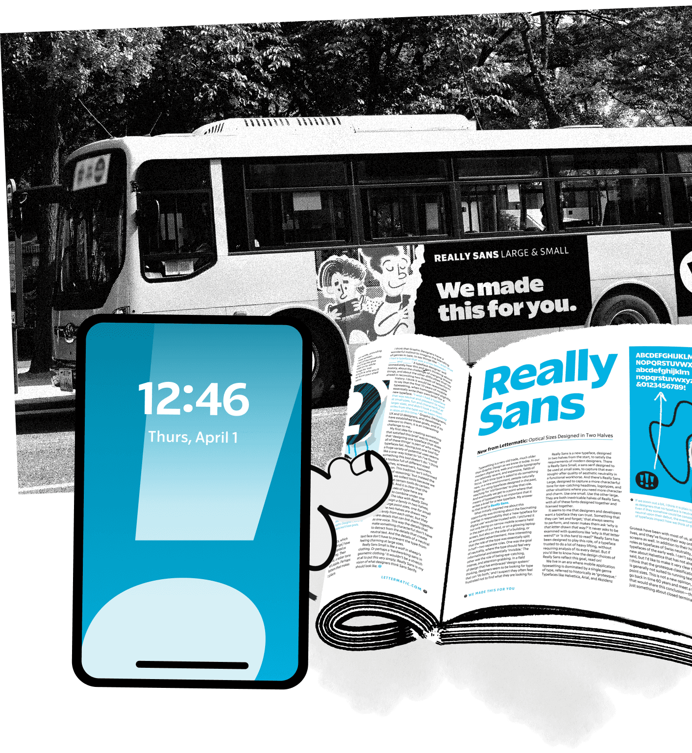
FIG. 21 — We look forward to seeing Really Sans used both large and small, digital and print.
We picture, for instance, the Large size of Really Sans being useful for characterful brand moments, whereas Really Sans Small will work nicely in the text of a mobile UI. While a singular typeface in both uses might do both jobs with compromise, Really Sans Large and Small are optimized for those specific uses. This is a typeface that says ’I work at large sizes, and small sizes’, and it does so by admitting that no one design can handle this with full confidence, but that a typeface in two halves has a better chance of surviving out there in the world — in the palm of someone’s hand on a high density screen, in the pages of a magazine, or on the side of a bus. This way the details that make something characterful don’t have to detract from the details that create neutral text. And the details of a neutral text face don’t have to prevent the type from feeling charming at large sizes.
Thanks for taking the time to read about Really Sans. As with all of our projects, it comes from a deep respect of history, and an appreciation for the role we play as toolmakers. We hope that as you use Really Sans, you’ll feel a sentiment that we’ve expressed many times with sincerity: we made this for you.

It's Really Sans:
Both the Large and Small size of Really Sans are licensed together, ready to download today.