custom fonts for


A LETTERMATIC CASE STUDY: DOUBLE FINE PRODUCTIONS
By Riley Cran


Every now and then, a project will compel you to make something unlike anything you’ve ever made before. Such was the case in early 2020 when Double Fine asked us to make custom fonts for Psychonauts 2, their now-released masterpiece sequel to the original Psychonauts (2005). Just as other visual assets in games tend to be custom made (character models, illustrations, props, locations, etc), the fonts in Psychonauts 2 were to be custom too, tailored to the unique world that the game inhabits. Malena Annable, a producer at Double Fine, explained that the first game had its own fonts — so the second game should, too.
Information
- Released:August 2021Art Direction:Lisette Titre-Montgomery, Seth Forester, and Tim SchaferLead Designer:Riley Cran№ of Styles:40№ of Families:4Contributing Designers:Dave Bailey, Heather Cran, and Danelle CheneyClassification:Display
We feel understood by people who work in games. Because the talented team at Double Fine spend their time making custom assets to immerse the player further into the experience of their games, they understood the value of custom fonts right off the bat. Double Fine’s message to us was loud and clear: we know that people make fonts, this game needs fonts, and this is why. That left most of the process to the ‘how’ question, and we got straight to work figuring that out.
Our early meetings were led by art director Lisette Titre-Montgomery, and designer Seth Forester, who shared the look and feel of the game with us, and walked us through some placeholder fonts they had been using during development. We loved hearing about their perspective on the visuals, and learning about what each font was meant to do in context. Whereas the reasoning for many custom typefaces is something like ‘it has to be legible in this context’ or ‘we want this to represent our brand,’ the brief for these fonts was largely based in narrative. The characters and plot points within the game gave reason for these fonts.
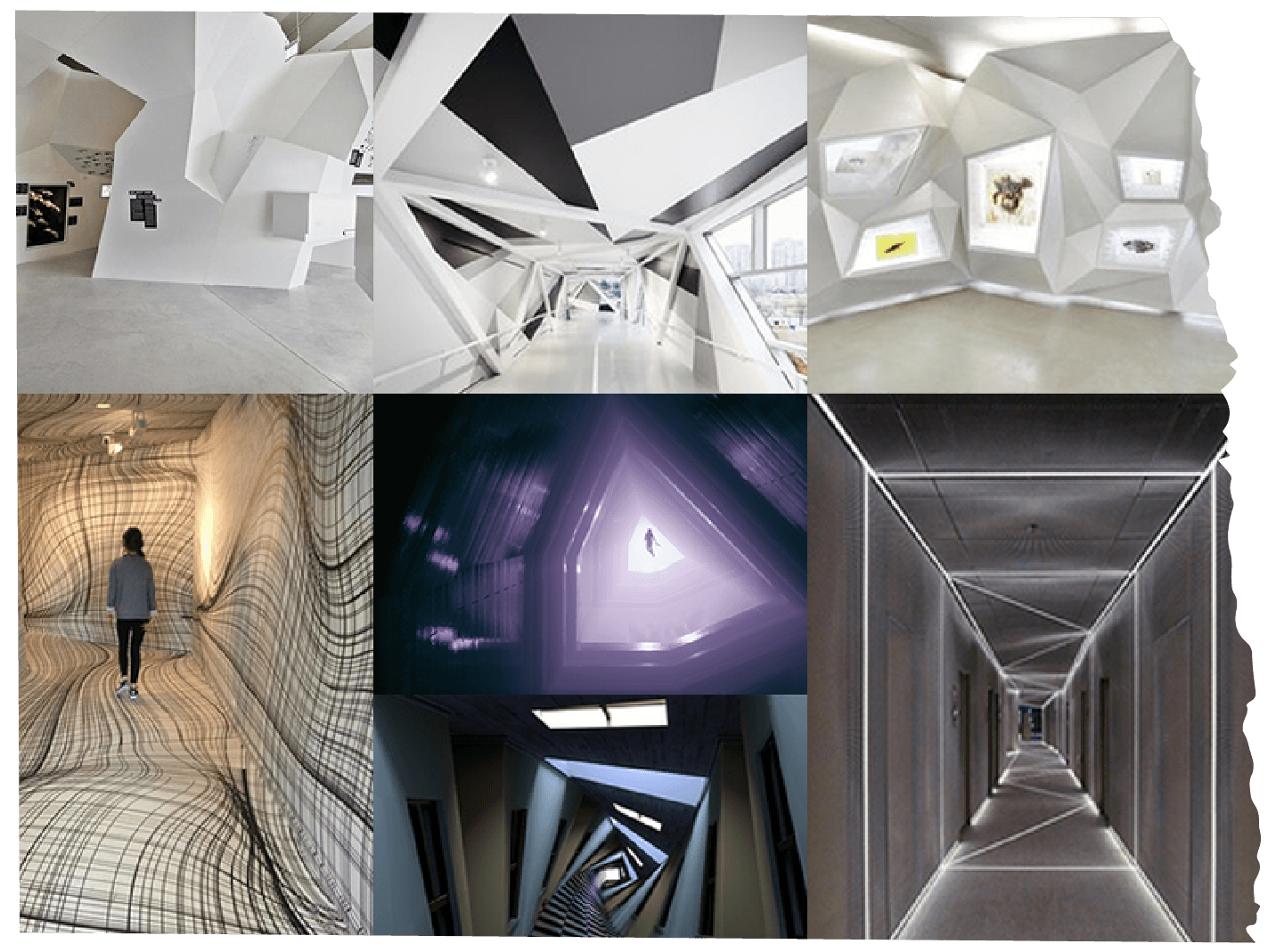
FIG. 1 — Early concept moodboards created by Lisette Titre-Montgomery (Art Director, Psychonauts 2), provided to Lettermatic as inspiration.
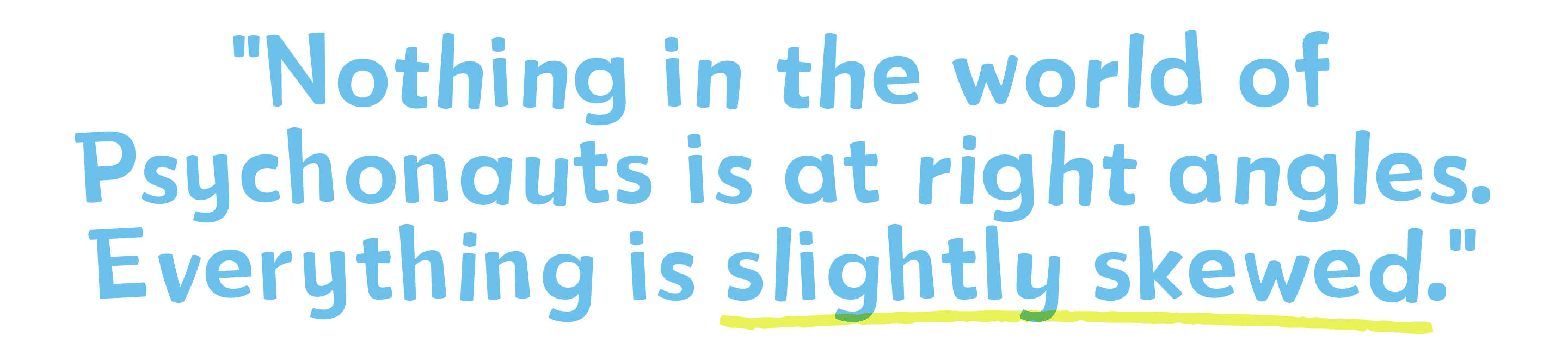
We were given access to the concept art that existed at that time, and we had a blast poring over that and imagining how this inspiration could translate to typography. Many of the mood boards were based on 1970’s patterns and geometry, with photos of architecture and furniture. The concept illustration amplified those ideas, creating a stylized tone that permeated through the architecture and prop designs. One day while we were waiting for a video meeting to begin, producer Malena Annable described the aesthetic to me in such a perfect way: “Nothing in the world of Psychonauts is at right angles. Everything is slightly skewed.”
FIG. 2 — Early concept art by Nathan 'Bagel' Stapley and Peter Chan from the Psychonauts 2 creative team, provided to Lettermatic as inspiration.
A typical day at work for the team at Lettermatic involves somehow striving for a higher level of refinement than we found the day before. Generally, part of our job involves describing shapes that might be as close to perfect as we can make them: rectangles having straight sides is actually someone’s job to check and re-check. But here was an entirely different project: we needed to make fonts that were purposefully not-quite-perfect, for aesthetic reasons. Shapes with angles that didn’t exactly match. My mind immediately began racing — how could we take all that we had learned, and transpose our systematic instincts into a process that resulted in fonts fit perfectly for Psychonauts 2?

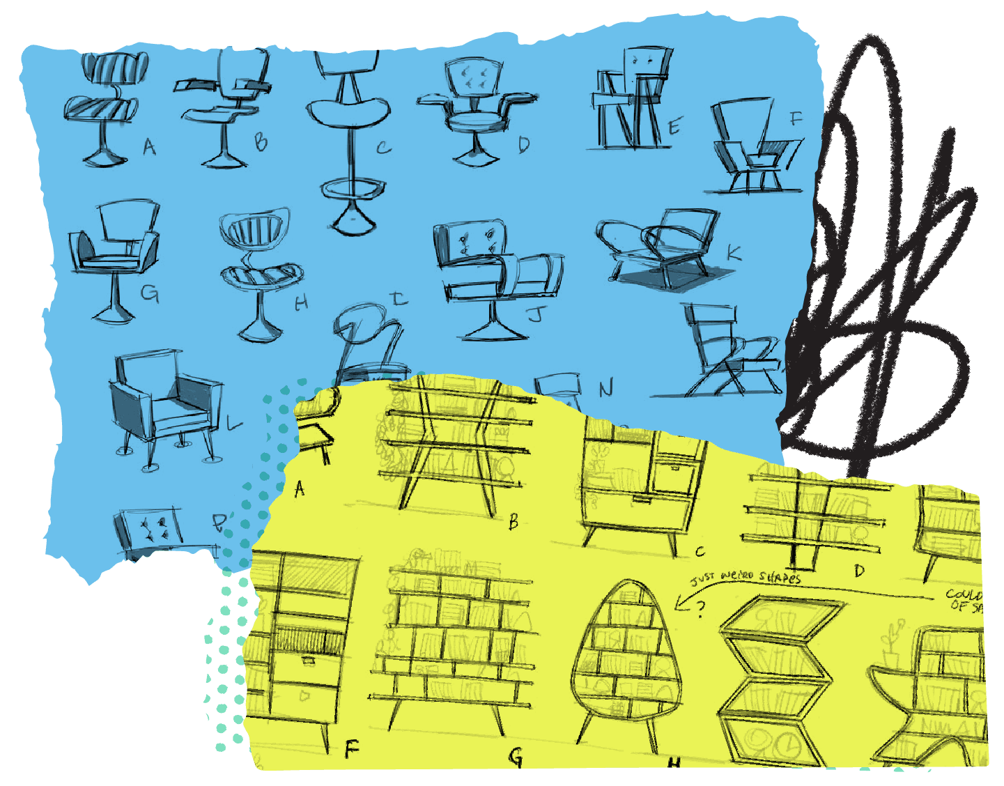
FIG. 3 — Early concept art by Nathan 'Bagel' Stapley from the Psychonauts 2 creative team, provided to Lettermatic as inspiration.

The scope was quite large: we were to design 3 separate families of type, each with a specific purpose in-game. Additionally, each of the typefaces had a clear goal in mind for aesthetic voice. In the pre-pandemic times at Double Fine, the teams would bar crawl through San Francisco’s China Town, and they repurposed the bar names into their project code names. Psychonauts 2 was code-named Grasslands, so we figured the fonts needed code names too. Naming typefaces is actually remarkably not-fun given how many names have been taken, so we decided to get it out of the way as early as possible, and the code names stuck: Chia, Savannah, and Arundo (all types of grass).
Chia was to be a font reminiscent of naive print handwriting, written by the game’s lead character Raz (used in props and dialogue trees, among other uses). Savannah was to be a more legible design for a wide variety of in-game uses including in the user interface.
And Arundo had yet another brief entirely: this was a typeface that existed in the in-game universe, to represent the branding of an in-world organization. From our perspective it had to feel as if typeface designers within the Psychonauts universe had drawn Arundo for use on way-finding signage and elsewhere.
One of my roles at Lettermatic, in addition to drawing letters, is to build custom software tools which we use in our design processes. Fonts are software, and there is an ‘engineering’ component to this work, so such tools become handy pretty quickly. This project immediately got that part of my brain working — Double Fine was asking us to go somewhere new aesthetically, and perhaps we could get there more skillfully with the help of some custom software tools.

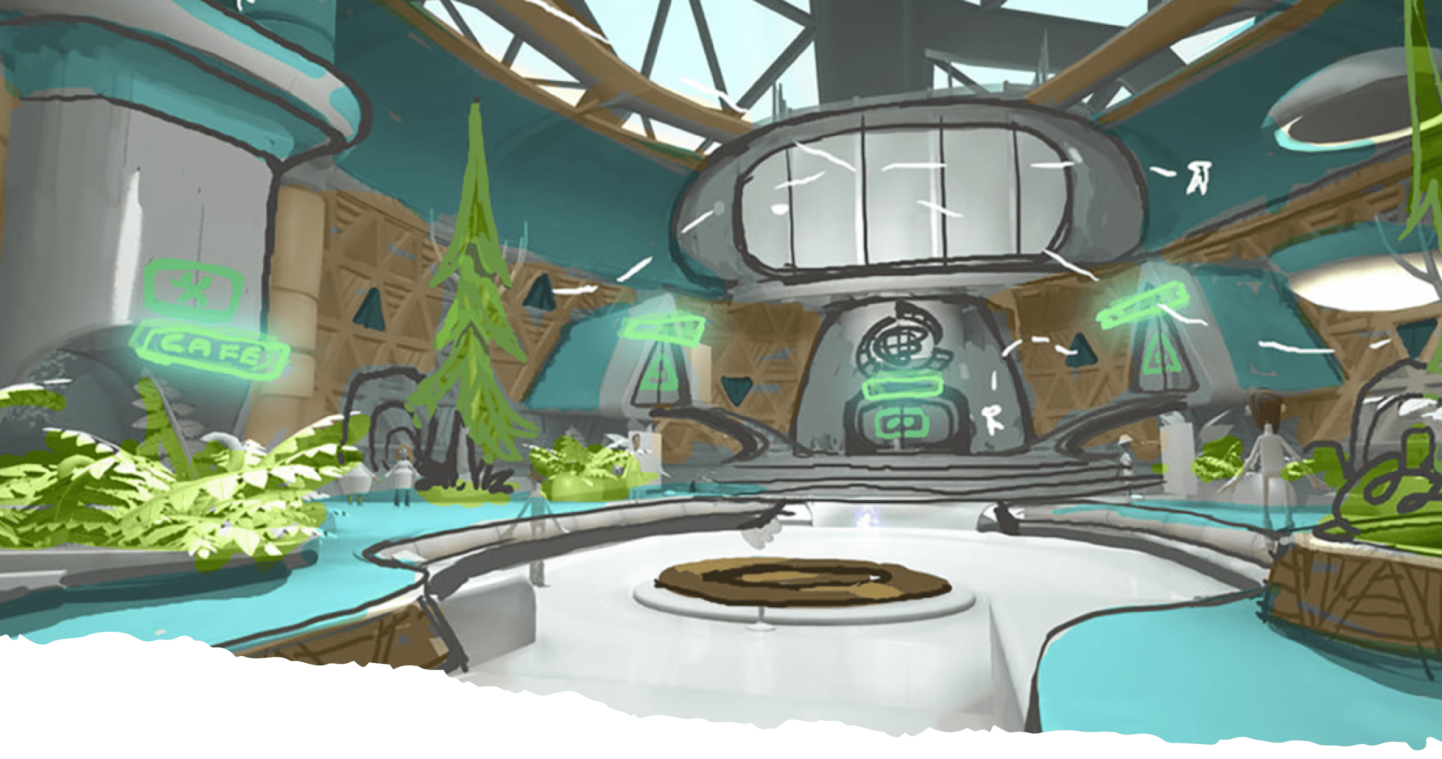
FIG. 4 — Early concept art by Levi Ryken, Geoff Soulis, Lisette Titre-Montgomery, and Nathan "Bagel" Stapley on the Psychonauts 2 creative team, provided to Lettermatic as inspiration.
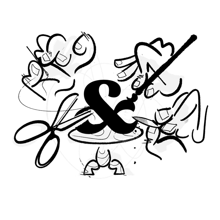
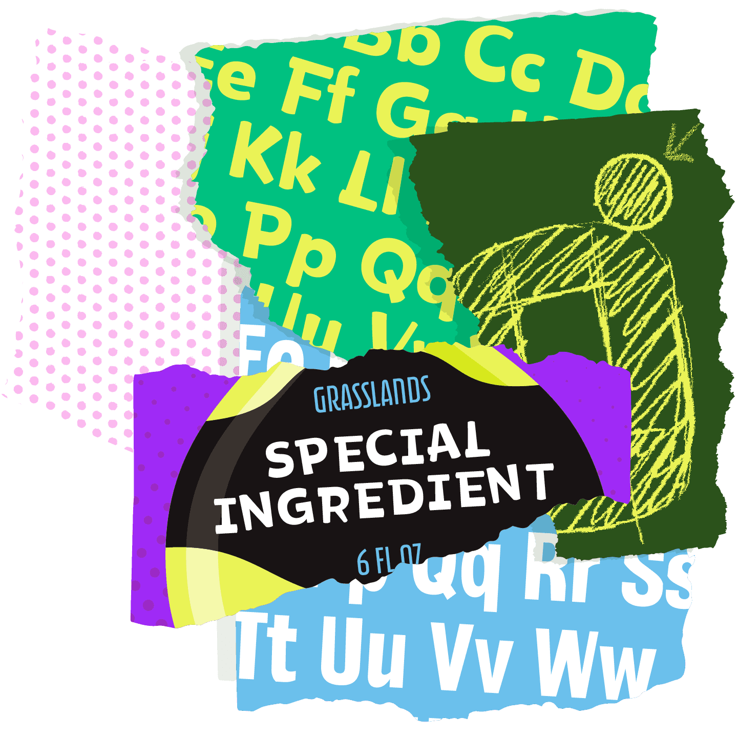
In our first presentation to Double Fine, we showed an illustration of a glass bottle labeled ‘Grasslands Special Ingredient.’ As a team at Lettermatic, we imagined this being the ‘wonky’ element to the designs — something that could be added to any design, making it feel at-home in the world of Psychonauts. Something that we could use as a conceptual anchor and ask ourselves if we’d hit the mark. Funnily enough we specifically avoided using the word ‘wonk,’ because we were worried it might sound negative in some way. But after seeing our first presentation, the team from Double Fine replied using the word ‘wonk’ as a positive descriptor towards what we had been drawing, so we all started using this phrase regularly.

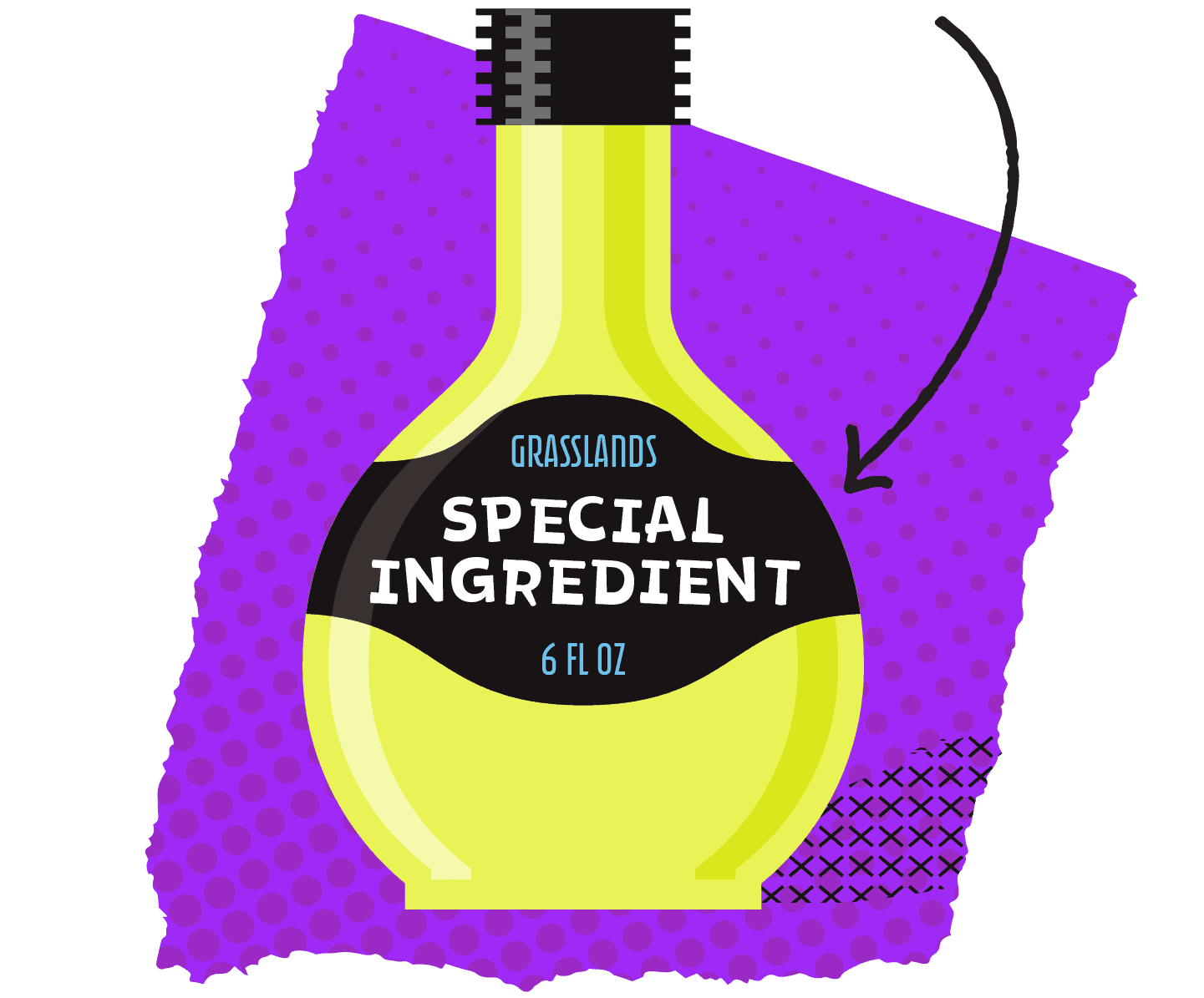
FIG. 5 — Our visualization of “wonk” that could be added to a design as needed — or to taste.
For Chia, the typeface intended (for instance) for the notebooks of the game’s lead character, Danelle Cheney researched print handwriting exemplars. We knew these fonts had to be grounded in something systematic, and stay legible, but they also had to feel like they were drawn by someone, that they had heart. Knowing the Chia fonts could be used in dialogue put a distinctive ‘functional’ spin on the brief, but we also knew how important the ‘wonky’ aesthetics would be to the result. Print handwriting was a great place to begin because it is traditional, familiar, and structured, but it is also something that feels naive and human, rather than mechanical and perfect.
It seemed fitting that the Chia fonts have a sort of a ‘pen’ quality to them, which implied rounded ball-point-like endings to strokes. We have previously observed something called the ‘dogbone effect,’ where literally rounded strokes seem to swell in weight as they terminate. To avoid this, Danelle came up with a very clever solution: ‘domed’ endings that were neither fully round or fully straight. A balance between function and character.
I had drafted a fairly straightforward geometric sans as a basis for the design, but we immediately began implementing construction choices that were warmer and more hand-made. Danelle’s drawings of the ‘v’ and ‘w’ are great examples, with their strokes that bow slightly, rather than being comprised of straight lines. Glyphs like ‘x’ and ‘k’ had terminations that aligned to the direction of the stroke, rather than to the baseline or x-height, which made them feel more animated and alive.
I drew a sketch of systematic ‘overhangs’ for the cap drawings, that were reminiscent of the kind of handwriting detail that feels very human: humans are not super good at making two strokes line up exactly. Danelle implemented this idea into the cap drawings, and they started feeling more human, unique, and charming. All of these decisions were giving us a basic structure for Chia that was simultaneously systematic and energetic.

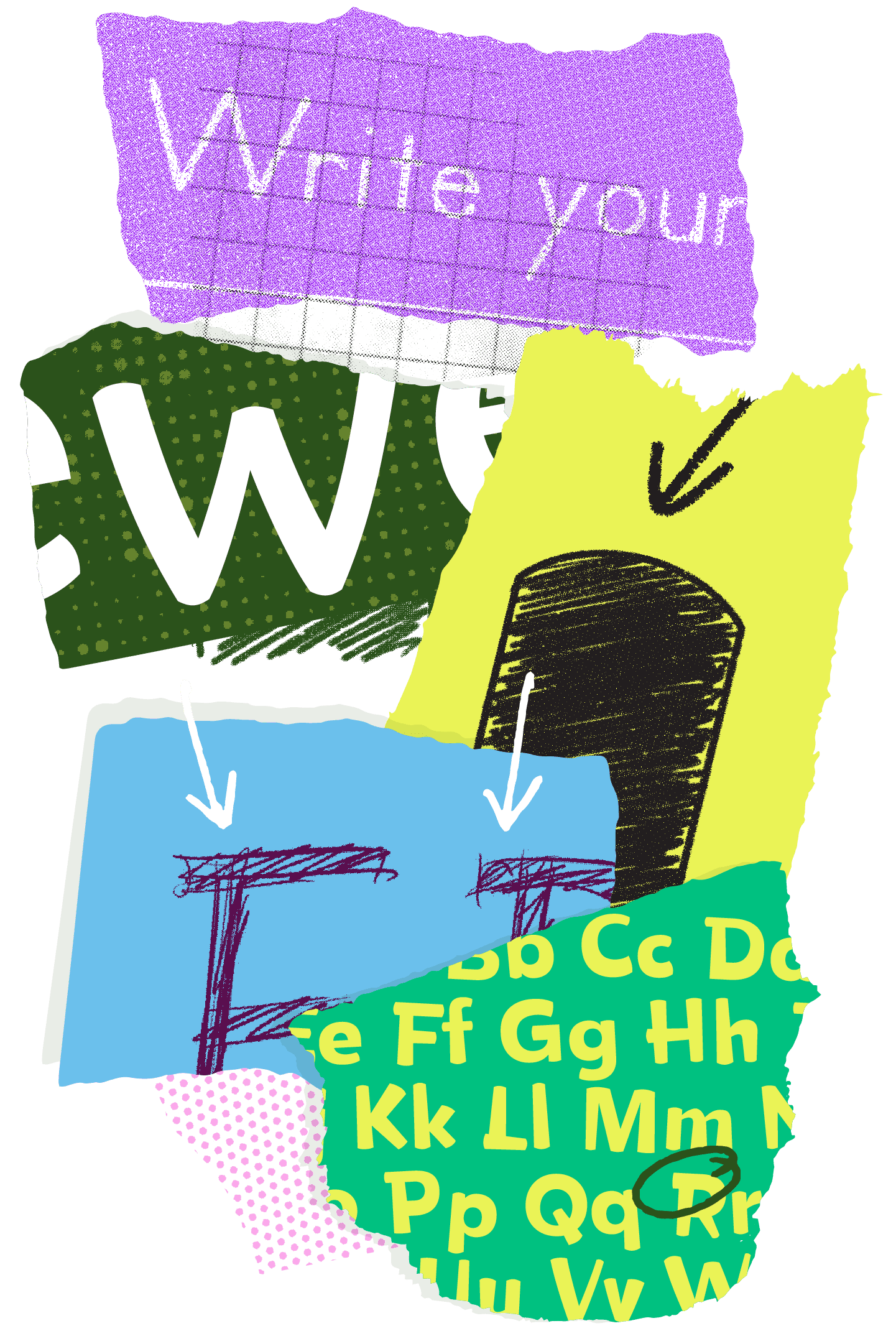
FIG. 6 — Top (purple): A writing exemplar, one of our early pieces of inspiration for Chia. Dark green: The slight bow in “w” adds a hand-drawn quality. Lime green: Danelle’s experimental sketch showing a domed termination. Blue: Riley’s sketch showing capital overhangs. Bottom (teal): Completed Chia alphabet.

FIG. 7 — Chia comparison showing alternates off (top) and alternates on (bottom) to more successfully simulate handwriting.
In order to get the ‘wonky’ quality into Chia, I designed and built a new software tool that allowed us to have flexible and exacting control over many manipulations of the design. Whereas you might think the best way to get ‘wonk’ is just to ‘draw everything all weird,’ it seemed to me that the moment you commit to any singular understanding of imperfection, you’ve greatly reduced your options for considering other approaches. Human beings are really great at recognizing patterns, we want things to align and be systematic. But the beauty here was going to be in the sense of spontaneity, and the decisions that felt less logical in their own subtle ways. The tool I created essentially took our drawings and then ‘made mistakes’ with them, drew things subtly askew, and tried things out. The process was freeing, and the results were compelling.
Via this custom software tool, we had control over the tapering of strokes (as if the pen had varying pressure as it moved across the page), and the lean of the letters (as if to emulate the typical inaccuracy of the human hand).
The custom software could also alter the bounce (allowing the letters to drift vertically up and down slightly, just like real handwriting). After a few drops of this ‘wonk’ special ingredient had been added to the recipe of Chia, the words and sentences suddenly had life to them. Everything was slightly askew, just like the rest of the Psychonauts imagery.
The software tool I built was also tasked with generating alternates, specifically for use in repeating pairs. When two identical letters occur next to each other, Double Fine has the option to swap one to the alternate version, and it carries the same jovial tone of taper, lean, and bounce, while maintaining the illusion that someone wrote this. The alternates were made via the custom software tool, so that their ‘wonky’ details always contrast against the default version of the relevant glyph.
We found the direction for Savannah largely by looking at the fonts for the original Psychonauts game released in 2005 (the first game had fonts desinged by Scott Campbell and Nathan 'Bagel' Stapley). Most letterforms have a basis in what I will call ‘pen logic,’ a way that the letterforms are constructed from individual pen strokes. So influential is the pen, in this way, that when ‘pen logic’ is broken, we see it very clearly as ‘wonky.’ The original fonts had this quality to them, take this capital ‘E’ for example. The main ‘spine’ of the ‘E’ is not one solid stroke, as we might expect it to be. Instead the negative shapes ‘cut into’ it, more like a potato print or a linocut. It seemed like the letters had been drafted in a way where positive and negative shapes were made independently, rather than at once via the strokes of a pen. With this in mind, I started working on a software tool that would allow us to draw Savannah this way.

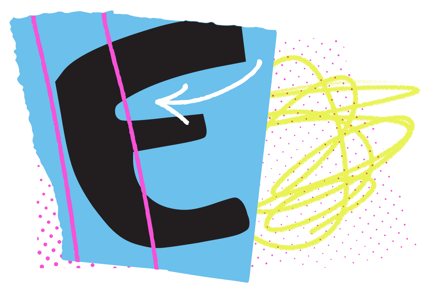
FIG. 8 — Letter “E” from the original Psychonauts release, showing how the negative spaces feel cut out of the main shape.

I imagined that our Savannah letters were going to be made from construction paper, with the positive and negative shapes each cut individually with scissors. And shortly after we had carefully arranged the pieces on a table top, a slight breeze would have come in the window and disturbed all of these little pieces of paper ever so slightly. So I built a software tool that we nicknamed The Wonkerator™. The Wonkerator is our ‘digital breeze’ (if you will), taking our carefully assembled positive and negative shapes and scattering them in very careful ways. Each piece was permitted to move up and down, left and right, rotate, change in size slightly, etc.
Danelle Cheney drew a solid base design for Savannah, and with the help of this new software, we watched an energetic linocut-like, construction-paper-esque typeface full of heart and spontaneity emerge. From a systematic process came an a-systematic result, and Savannah suddenly felt like it belonged in this game. The talented designers and art directors at Double Fine felt the same way, and this exploration was refined into the Savannah fonts you can now see in-game.
Danelle’s narrower proportion drawings for Savannah allow the typeface to take up less space on screen, and therefore appear at a larger point size more often. This comes in handy for things like subtitles and UI elements. Danelle’s drawings for Savannah follow largely traditional constructions (knowing that the software would push all of the drawings to a more aesthetically wonky place), but she added a few departures that I really love; the unusual construction of the uppercase ‘Y’ is a great example.

FIG. 9 — Top: We imagined Savannah as if it were cut out from construction paper, which informed our technical production process. Bottom, Blue: A process screenshot. Purple: Completed Savannah alphabet.
The third family, Arundo, had an interesting purpose in this game, a little different from the other typefaces. Arundo is a typographic voice that comes from an in-game entity, essentially a branded element. Double Fine had requested angular, almost Sci-Fi qualities for these letters and as a result, we started gathering inspiration from 1970’s dry-transfer lettering. In the 1960’s and 1970’s, dry transfer lettering from companies like Letraset introduced a new democratization of display typography. No need to go to a typesetter and request a specific font, you could just buy a sheet and literally rub the letters onto your design yourself (just as long as you didn’t run out of e’s you were fine). Although it wasn’t exactly cheap (roughly $15-20 per sheet, adjusted for inflation), it was much more accessible, and as a result these letters found a home in prop design. Dry transfer fonts were used in the props of many sci-fi films including Star Wars and Alien, and so they’ve now been solidified in that visual context.
Dave Bailey, a typeface designer we worked with at that time, did the drawings for Arundo, and he focused on designing a condensed display face that looked like it plausibly could be a corporate typeface, albeit with some ‘wonky’ and eye-catching qualities. Concept illustrations had shown this typeface was to be used in the context of wayfinding signage, with a green neon glow, and being able to use the concept art to visualize this was very helpful in our process. Dave’s early drafts of Arundo were more angular and sharp, but based on feedback from Lisette and Seth, the follow up versions were softer and warmer. The design plays off the tension between round and sharp shapes, dispensing them in almost equal measure. Dave designed a range of weights from very thin to very bold, to give the designers at Double Fine a variety of voices to use.

FIG. 10 — Top (lime green): Neil Bold, designed by Wayne Stettler in 1966, as dry-transfer lettering — one of our early pieces of inspiration for Arundo. Dark green: Riley’s early sketch showing tension between inner and outer shapes, and a perfectly round ear for the “g.” Blue: Dave’s drawings for “O” and “Q” with that inner/outer tension. Green: Arundo in-game as a glowy neon sign. Bottom (magenta): Completed Arundo alphabet.

FIG. 11 — Completed Arundo (left), Savannah (middle),
and Chia (right) font families.
Similarly we began adding a range of weight to both Savannah and Chia. It was a wonderful challenge to both change the weight of these designs, AND keep the right amount of ‘wonk’ in each. In both Chia and Savannah, the wonkiness is distributed uniquely to each weight in the family. So if a letter ‘e’ leans left in Chia Regular, it may lean the other way in another weight. Rather than treating these details consistently, we let the custom software make them more ‘realistic’ and more perfectly imperfect. What otherwise would be an insurmountable amount of manual ‘wonky’ drawing, became rather swift.
Tim Schafer, founder of Double Fine, sent some aesthetic feedback at one point, that Lisette, Seth, and Malena relayed to us: please add more wonk. And whereas if we had just drawn the wonkiness manually, we’d have to then redo all of our work, our custom software tools on this project allowed us to achieve a new result by changing some parameters and re-wonkerating everything. In this way, our working method had aligned with the practical reality of making complicated projects, and we were able to make aesthetic adjustments late in the process that did not require a delay in delivery, which is something I am quite proud of.
This same flexibility allowed us to make versions of the fonts specifically for accessibility settings in the game. Accessibility is something that Lettermatic and Double Fine both take seriously, and so Psychonauts 2 includes an accessibility setting that switches to a ‘low wonk’ version of these custom fonts, improving legibility for captioning and elsewhere by making the letters less lean-y, less bounce-y, and less taper-y. For this version, we added a new lowercase ‘a’ and ‘g’ (with double-story drawings by Danelle) because these constructions are often seen as more legible in context.
Rather than switching to a different typeface entirely, and suggesting that accessibility should come at the cost of aesthetics, this solution allows the game to provide more accessible visuals, while keeping the typography aesthetically styled. This, too, is something I am very proud of.

FIG. 12 — Top (green): Chia Wonk compared to (blue) Chia Legibility, with its double-story “g” and “a” drawings. Bottom: Overlays comparing Chia Wonk and Chia Legibility.


Soon we began adapting the fonts for localization of the game, allowing them to speak languages beyond English. Dave Bailey drew these language support additions, while Heather Cran drew remaining glyphs in the character sets, until the fonts were ready for implementation into the game.
With each presentation we delivered, updating Double Fine on our progress, we received succinct, helpful, and on-point aesthetic direction from Lisette and Seth — and Malena kept the entire project on track. It was wonderful working with their team, and their professionalism was truly top-notch. As a team, we felt understood and respected by Double Fine. When we had ideas, they listened. And when they gave feedback, it was clear and easy to understand.
There are a few phases in this typeface design process, that happen each time, and still thrill me. One is when you feel the brief has opened a world of opportunities, and you’re a little... scared by how many options there are ahead. Eventually your explorations have progressed to the point where it feels like the design is telling YOU what it should be, and it has a tone and temperament of its own. Finally you can look at the result, and feel it looks like it has existed all along; when your familiarity with the design (as a designer) progresses to the point where you know the letters more as ‘the Psychonauts 2 fonts,’ than you do as ‘that set of letters we have been drawing.’ Another thrill beyond these, that working on fonts for games has provided, is the experience of seeing these familiar glyphs on screen. Our team is currently playing Psychonauts 2, and having a wonderful time, just as we did in the design process.
Congratulations to everyone at Double Fine on releasing your new, beautiful, thoughtful game. Every bit of praise is deserved, and more. And thank you for giving us the opportunity to contribute to it — it was an experience we will not soon forget.

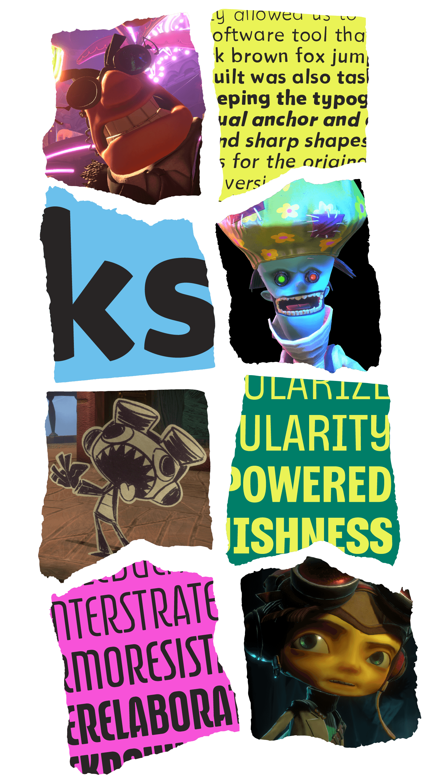
FIG. 13 — Final Psychonauts 2 art, with the final Psychonauts fonts:
Chia, Savannah, and Arundo!