


Custom Fonts For


A LETTERMATIC CASE STUDY:
Giving characters a typographic voice in Obsidian’s new RPG
By Riley Cran


The year was 2019. I was sitting on my living room couch playing The Outer Worlds, the latest release from Obsidian Entertainment, traveling through the solar system of Halcyon with my ragtag crew I’d assembled on my journey. I found myself on the planet of Terra 2, speaking with a random NPC standing on the streets of Byzantium, when I burst out into laughter over their dialogue. The character explained that her Grandfather had designed a font used in Byzantium, or rather he had “described the idea of it to their font development team.” I thought to myself “I need to work with the company that would put this line of dialogue in this game.” Little did I know that a couple years later, we’d be doing just that with Josh Sawyer, Studio Design Director at Obsidian, for the new game he was directing, Pentiment.
Information
- Released:November 15th, 2022Research:Jane SolomonGame Director:Josh Sawyer№ of Styles:5Classification:Display№ of Families:5Typeface Designers:Riley Cran, Heather Cran, Dave Bailey, Danelle CheneyArt Director & Concept Artist:Hannah KennedyCase Study Design:Danelle Cheney, Anna Thomas
The case study below is a story of making an extremely thorough toolkit of digital fonts to let the team at Obsidian accurately, warmly, and legibly recreate the writing of people living 500 years ago. In total we drew over 2,700 glyphs (including inking these by hand with authentic writing tools), to build this extremely flexible toolkit of fonts to help Obsidian realize their vision for the typography of Pentiment.
Pentiment is a game with no voiced dialogue, where the written word is core to the player experience, and Josh and the team working on Pentiment had already put a great deal of thought into this by the time Lettermatic was brought in to work on the typefaces for the game. They had a vision of fonts that would simulate the writing and typography of the game’s setting: 16th century Bavaria. Dialogue would then appear on screen, written one letter at a time before the players’ eyes.
In a game with no spoken dialogue, the fonts play a different role than they might in other games. They play some of the role that might otherwise go to a voiceover artist, to say something about who is speaking. And in a well-researched game that is influenced heavily by real world history, there were further character roles we could transpose onto the typefaces. For instance, could we create fonts that allow the character’s writing to be reflective of their level of education, and their standing in this 16th century European society?

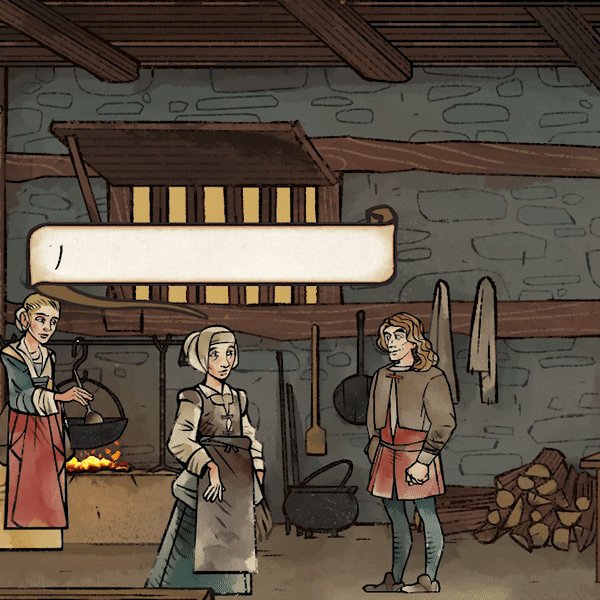
FIG. 1 — Dialogue selections from Obsidian’s Pentiment.
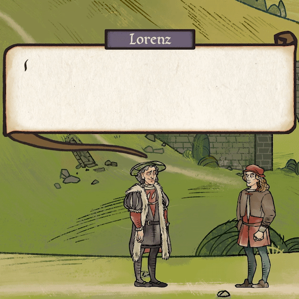
FIG. 1 — Dialogue selections from Obsidian’s Pentiment.
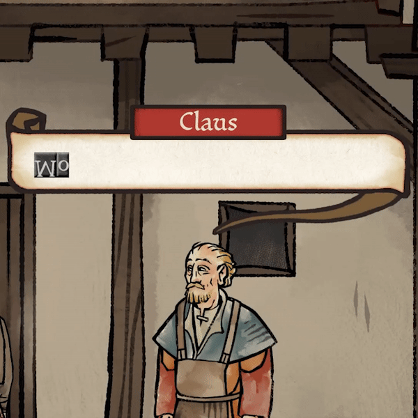
FIG. 1 — Dialogue selections from Obsidian’s Pentiment.

Josh Sawyer and Hannah Kennedy (Art Director & Concept Artist) had already done quite a bit of typographic research when we first spoke with them, and the Lettermatic team was compelled to do the same when we kicked off the project. We now have an entire shelf of books in our library dedicated just to Pentiment research: books of European manuscript writing from the period, Italian ‘italic hand’ masters, books of educational exemplars collected in the centuries since these styles were popular, and books on the history and evolution of these ‘hands’ as they progressed through time and geography.
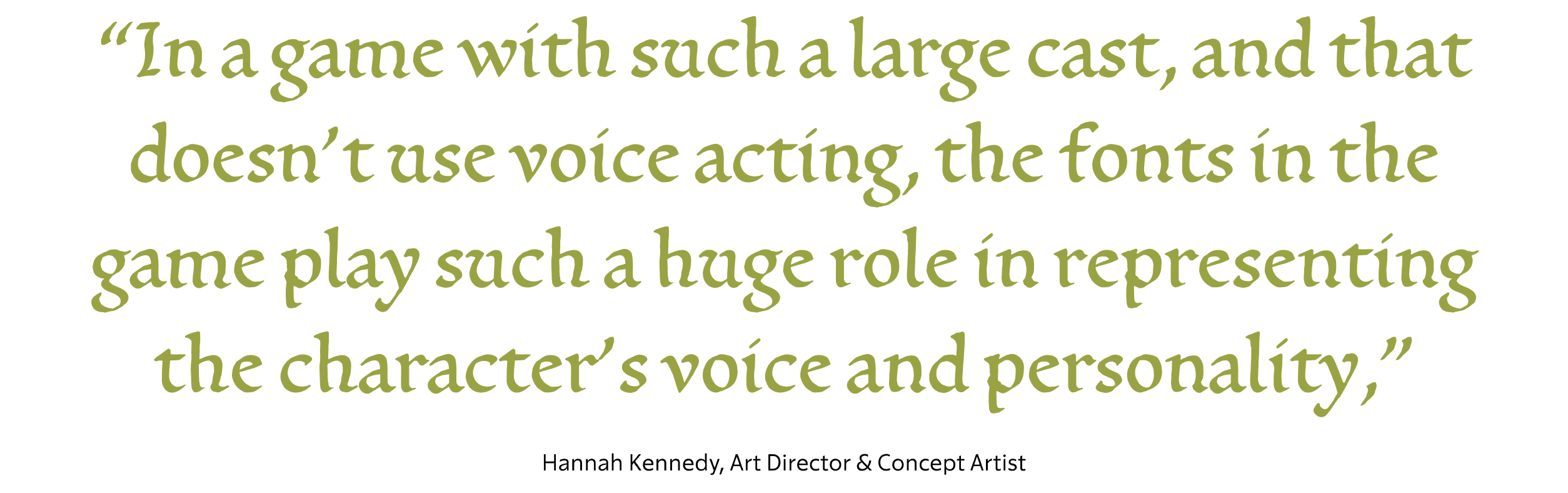
“In a game with such a large cast, and that doesn't use voice acting, the fonts in the game play such a huge role in representing the character's voice and personality,” notes Hannah Kennedy, Art Director for Pentiment. “The level of effort put into making each font feel representative of different types of people makes our conversations feel so much more dynamic.”
 Top right: A Kurrent cursive script sample, from Obsidian’s mood boards. Center: Nicolas Jenson’s ‘Quintilianus’, Venice (1471), from Obsidian’s mood boards. Bottom left: Carolingian samples from *Letter by Letter* by Laurent Pflughapt (2007). Bottom right: A humanist calligraphy sample from Obsidian’s mood boards.](/_next/image?url=https%3A%2F%2Fcdn.sanity.io%2Fimages%2Fblwjvcya%2Fproduction%2Fd83b21f46373b8ceee4639d33271385d8d3e6394-705x674.png&w=3840&q=75)
FIG. 2 — Top left: A “long s” on the U.S. Bill of Rights. Top right: A Kurrent cursive script sample, from Obsidian’s mood boards. Center: Nicolas Jenson’s ‘Quintilianus’, Venice (1471), from Obsidian’s mood boards. Bottom left: Carolingian samples from Letter by Letter by Laurent Pflughapt (2007). Bottom right: A humanist calligraphy sample from Obsidian’s mood boards.

 Center: The family tree of writing styles created by Heather. Bottom center: Comparison from *The Alphabet and Elements of Lettering* by Frederic Goudy (1942). Top right: type by Bartolomeo de Libri Florence (1487) in the Epistola a Pino de' Rossi (1487), [Munich DigitiZation Center.](https://daten.digitale-sammlungen.de/0006/bsb00066096/images/index.html?fip=193.174.98.30&id=00066096&seite=7) Bottom right: Ludovico Arrighi, Letter From Cardinal Pietro Bembo (1516) from *Two-Thousand Years of Calligraphy* by Dorothy E. Miner.](/_next/image?url=https%3A%2F%2Fcdn.sanity.io%2Fimages%2Fblwjvcya%2Fproduction%2F2f5d75b04665c17d8c39cb0f41b6e85a95ecedb4-2722x1132.png&w=3840&q=75)
FIG. 3 — Top left: Nicholas Jenson’s Eusebius Pamphilus, De evangelica praeparatione (1470) from The Visual History of Type by Paul McNeil. Bottom left: The Malmesbury Bible (1407). Center: The family tree of writing styles created by Heather. Bottom center: Comparison from The Alphabet and Elements of Lettering by Frederic Goudy (1942). Top right: type by Bartolomeo de Libri Florence (1487) in the Epistola a Pino de' Rossi (1487), Munich DigitiZation Center. Bottom right: Ludovico Arrighi, Letter From Cardinal Pietro Bembo (1516) from Two-Thousand Years of Calligraphy by Dorothy E. Miner.
Additionally, we hired our friend Jane Solomon to help us research samples available digitally from institutions around the world, which led to us pouring over samples of handwriting from historical figures alive at this time. Things like the last will and testament of William Shakespeare (26 April 1564 – 23 April 1616). From this historical information, Heather Cran on the Lettermatic team made a ‘family tree’ of writing styles from this period of time, tracing them back to a common ancestor (the Carolingan Miniscule, the prototype of our modern lowercase). We had to place the world of this game in time, in relation to this history, to find references which were, realistically, the kind of writing you’d encounter in the 16th century world of Pentiment.
In total we reviewed over 50 pages of mood boards with the team working on Pentiment, to find our directions for each of the fonts in the series. We also had a goal of tastefully modernizing these letterforms where we could, to make them easily legible for a modern audience that was unfamiliar with the letterforms of the period. For instance, knowing there was to be a Textura (blackletter) design of some kind, we thought a lot about which forms of capital letters we could gently modulate to bring them more in line with the Imperial Roman inspired forms that modern readers now are presented with daily. In short, we had to rewind time, find fossilized letters, and update them subtly wherever possible to survive in our modern world.

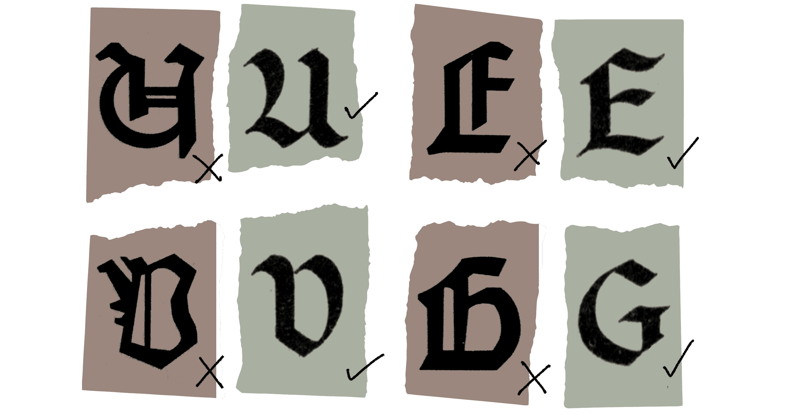
FIG. 3 — Comparison of Johannes Gutenberg (1455), digitized by Manfred Klein (1992, brown samples) from Fraktur mon Amour by Judith Schalansky (2006), and Ross F. George's Textura in the 13th Edition Speedball Textbook (1938, green samples).
We aspired to create several different typefaces for this project, each with a very different voice. However, each of these individual designs, rather than being a one-note emulation of a writing style, would instead be a sort of Swiss Army knife of ever-changing utility and flexibility. We were motivated to this result by an age-old question: what is the difference between lettering/writing and type?
A human writing with a pen produces results that are organic, full of slight imperfections, and perhaps most importantly: beautiful inconsistency. Two letter ‘e’s written by hand directly in sequence won’t match. The letters will gently modulate in weight as the pressure of the pen is applied with a slight warble of the hand. The letters will vary slightly in height, in width, and in how they relate to the letters before and after them. Humans effectively cannot write the same letter twice, and there’s something genuinely beautiful about this.
In contrast, typefaces (as they’ve been known through history) tend to have just one version of every glyph. This is (on the one hand) WHY typefaces have had such a big impact on the way humans communicate (you can mechanically re-arrange the letters to spell anything you’d like). On the other hand, hundreds of years later, it poses an interesting problem when you want to create a typeface that replicates writing. When you record just one version of an ‘e’, and you spell a word like ‘feel’, you risk the audience catching on, even in a subconscious way, to the idea that these are not real human-made letters. The illusion can be broken, because we are inherently good at spotting something made by humans, the same way we are inherently good at recognizing a CGI face that isn’t quiiiiite realistic enough.
Working with Josh, Hannah, and the rest of the team at Obsidian, we all collaborated to identify hallmarks of connected script ‘cursive’ writing styles that would be nice to revive. For the Scribe Script design, influence was taken from Cancelleresca, Batarde, and Kurrent (writing styles of the period). One of my favorite notes of feedback we received while working on this design was when Josh cited some Kurrent writing that he’d previously had tattooed on his own arm, as a point of reference.

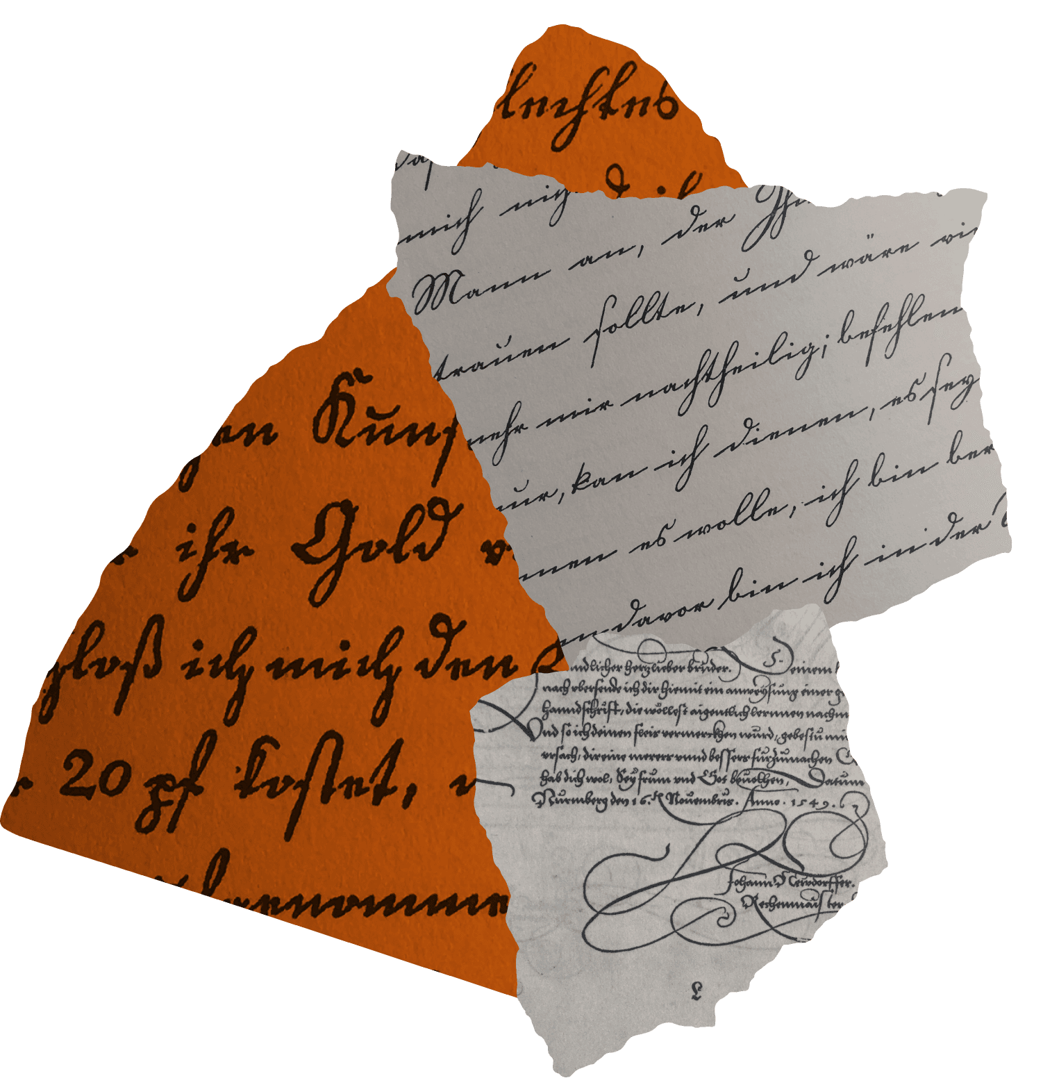
FIG. 5 — Left (orange): German Schreibschrifts (1793); top right: a Schreibschrift of unknown origin, both from An Introduction to the History of Printing Types by Geoffrey Dowding (1961). Bottom right: Anton Neudörffer, Schreibkunst, Nuremburg (1601) from Two-Thousand Years of Calligraphy by Dorothy E. Miner.

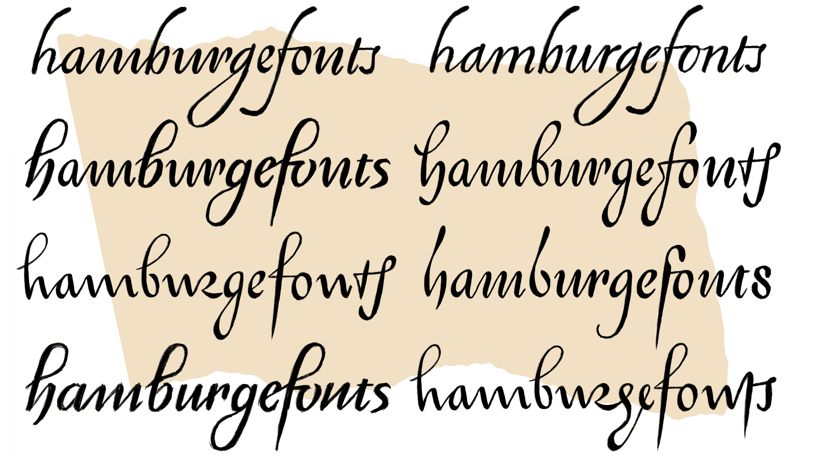
FIG. 6 — Heather’s early cursive explorations for Scribe Script.
From this direction, Heather disappeared into iPad-land, drawing sample words by hand, stringing together variations on the details of our favorite samples from history, and testing out options. Amongst the explorations were both right and left leaning cursive designs, and various tests of looping, flourishing details which were eventually incorporated into the final design as a modular system of alternates that can be swapped at will.
Heather’s Scribe Script typeface is something very rare in the world of cursive fonts, in general, let alone ones that emulate writing from the past. Its sprawling system of alternates provides such control over the way that words are rendered, that the team at Obsidian was free to use a digital tool to simulate analog writing in an authentic way. For instance, say that there are two lines of dialogue on screen, that happen to create a sort of ‘pocket’ of white space between them. Just as a manuscript artist might have written an elaborate ascender to an ‘h’ to fill that negative space, the same can be done with this cursive typeface by selecting one of the various ‘h’ alternates with elaborate ascenders. The resulting Scribe Script typeface contains so many variations for each alphabetic letter that there are literally thousands of ways to render a 10 letter word using this typeface by mixing the alternates into new combinations.

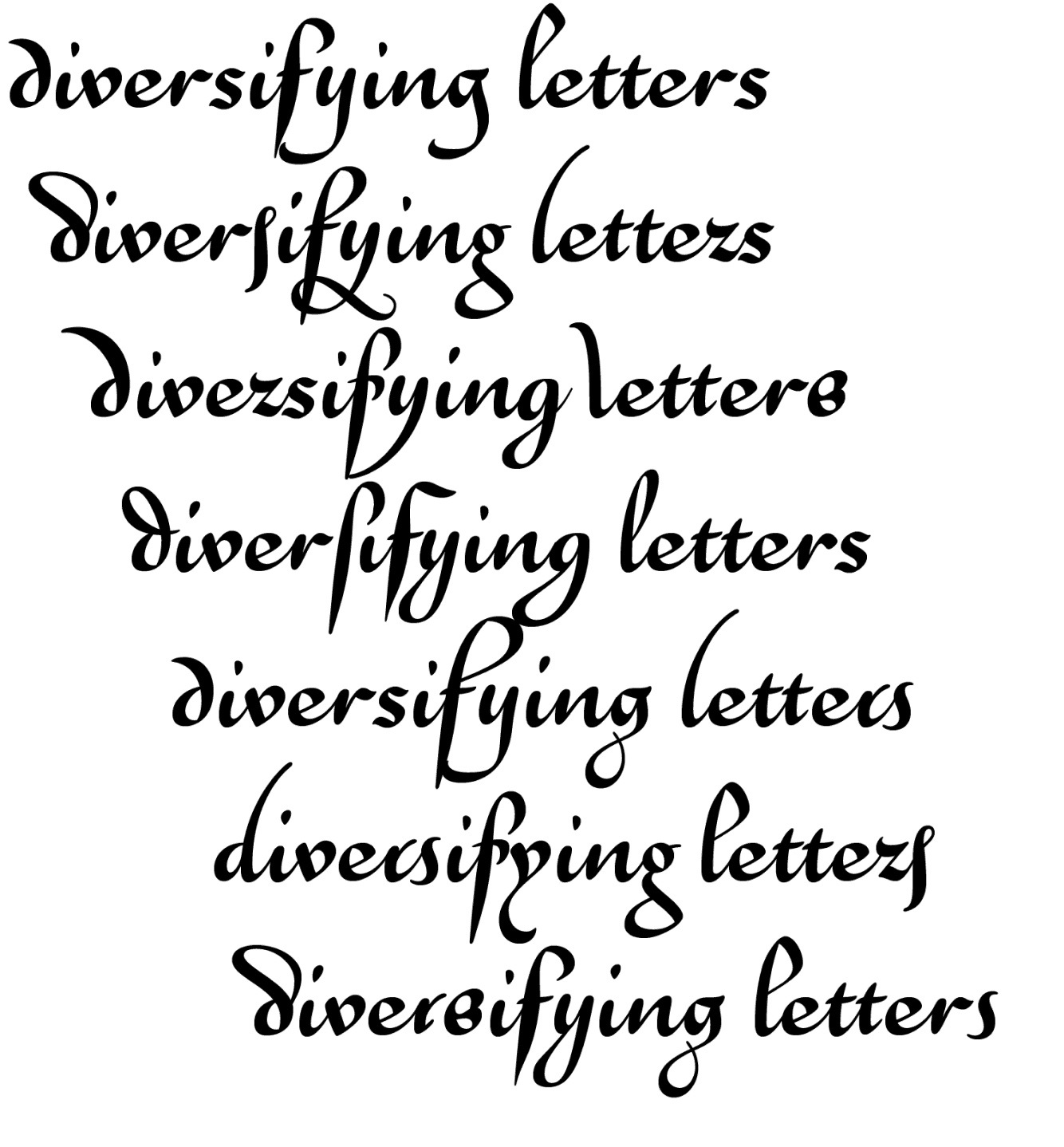
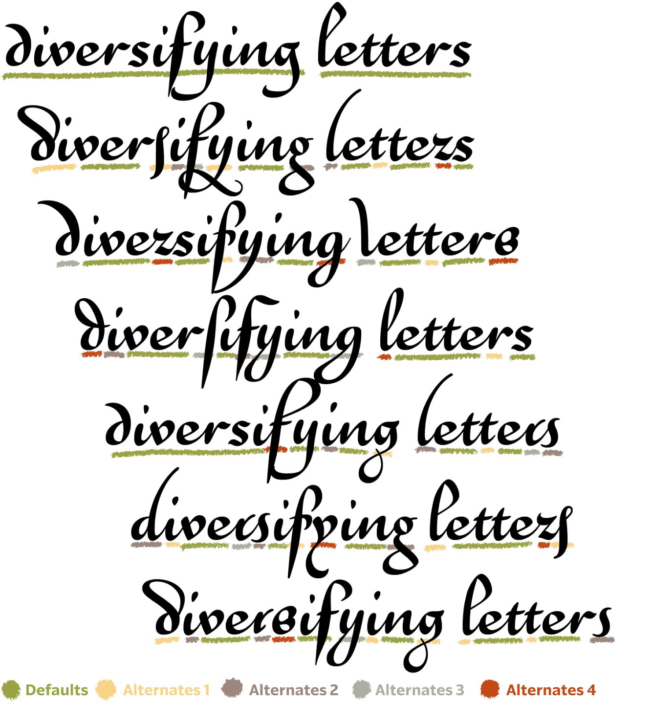

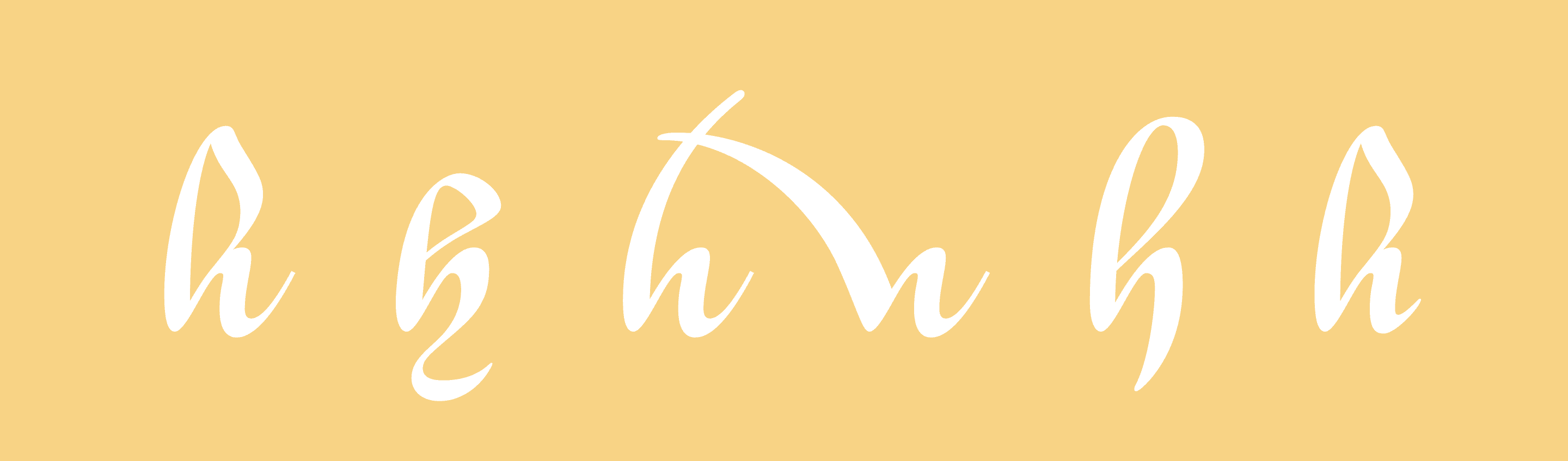
FIG. 7 — Every available alternate for the lowercase “h” in Pentiment’s Scribe Script.
The game also needed a font which could produce a convincing humanist manuscript letter, for longer form texts, and moments where legibility was the focus. We looked at many samples of humanist writing, and I took the lead on this design, compiling my favorite examples from history and searching for a perfect mixture of reading rhythm and aesthetic accuracy. These letterforms are effectively the ancestor of all serif typefaces, and so the goal was to create something which had the period-correct eccentricities of written samples, and the familiar rhythm of modern serif text, all held in balance. My process originally began with much too strong of a digital emphasis. I was mocking up textures for the rhythm using bézier curves, and trying to capture some kind of ‘ideal’ in these forms, for a while during this process. But my results felt much too cold, when they attempted to distill the forms to some kind of underlaying heartbeat and perfect recording. What I was missing was the imperfection. This was an important lesson I learned on this project, with the feedback of Obsidian and from my own colleagues, and once I re-oriented my thinking around adding in imperfection, the design started coming to life day by day. Freeing myself from a goal of perfection, I got a chance to see the true beauty in imperfection and eccentricity, and I started adding details like the ‘bowing shoulder’ of glyphs like h/n/m/u, which had previously been too rational in my drafts.

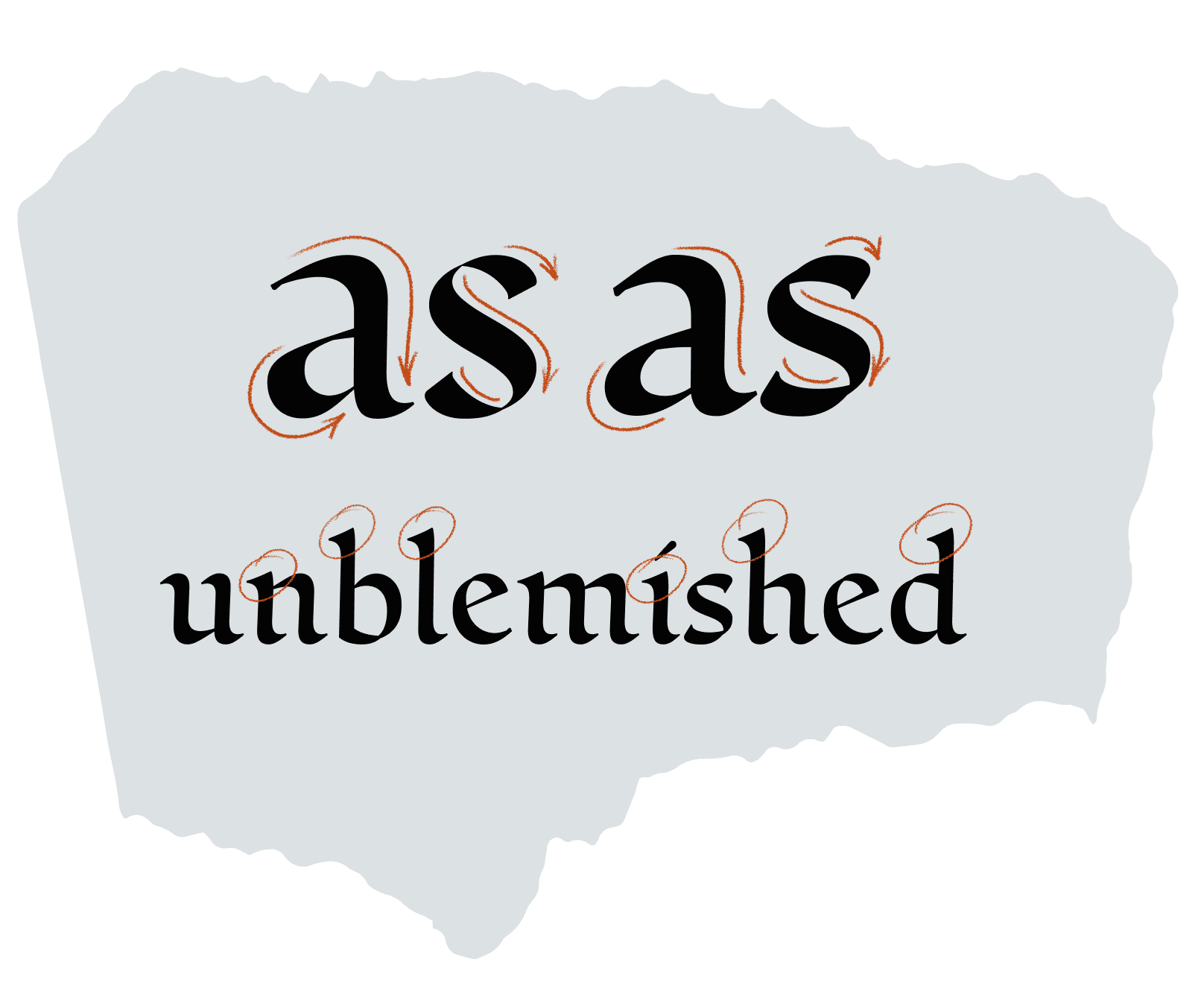
FIG. 8 — Riley’s early Humanist Script designs, in vector form, with pen-like details such as wedge-shaped intro serifs and small blunt terminations on outro strokes.
Once I had crafted the underlaying skeleton for the design, my colleague Danelle Cheney worked on inking the design, by hand, over and over again using my drawings as a template. During this process Danelle cleverly incorporated the concept of a ‘skill axis’ in which the letters would be purposefully drawn to adhere to, or depart from, the template to various degrees, to simulate the in-game author’s level of skill with a pen. She drew progressively less and less accurate versions, finally writing a version with her left hand (her non-dominant hand) to truly capture the shaky and inconsistent letters of someone less familiar with writing. The core Humanist Script is a legible, easy to parse, and familiar texture that feels at home in the game, and familiar to readers. Via the game’s accessibility settings, you can even choose to see this Humanist Script design used consistently for all voices in the game, if you have any difficulty reading the other fonts in context.

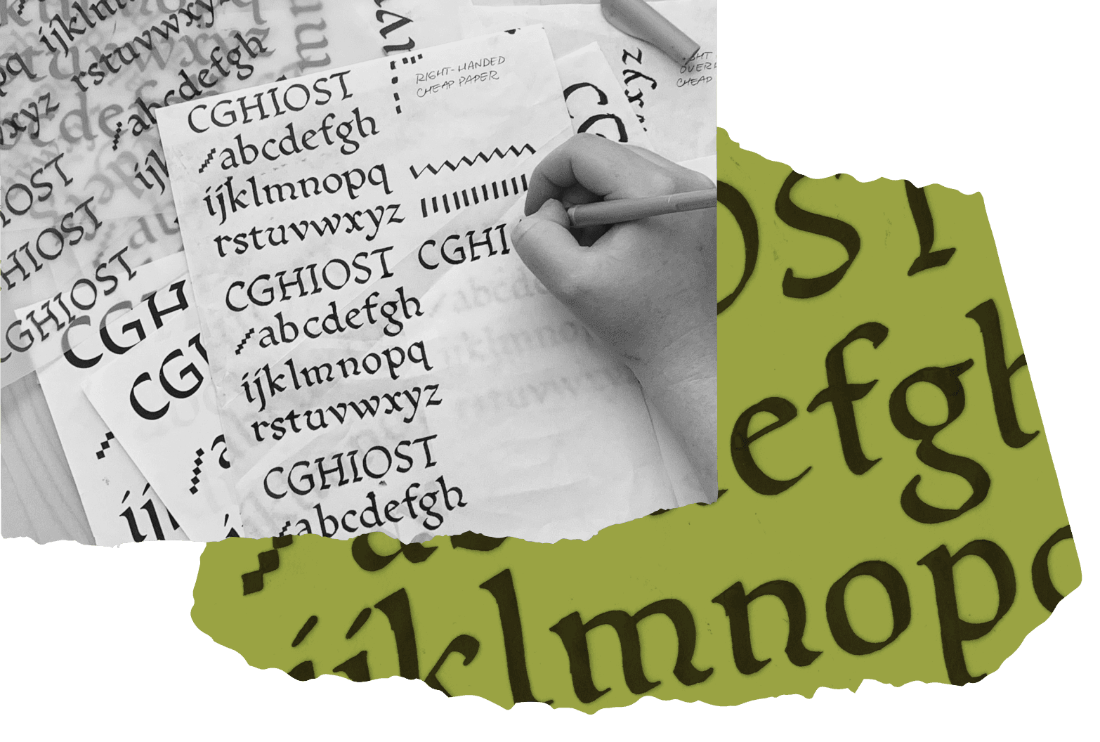
FIG. 9 — Left: Danelle inking Riley’s Humanist Script on various materials to achieve different textural effects. Right (green): A scan of the Humanist Script inkings.

FIG. 10 — The progression in drafts of Humanist Script, from early prototypes to the final hand-inked form.
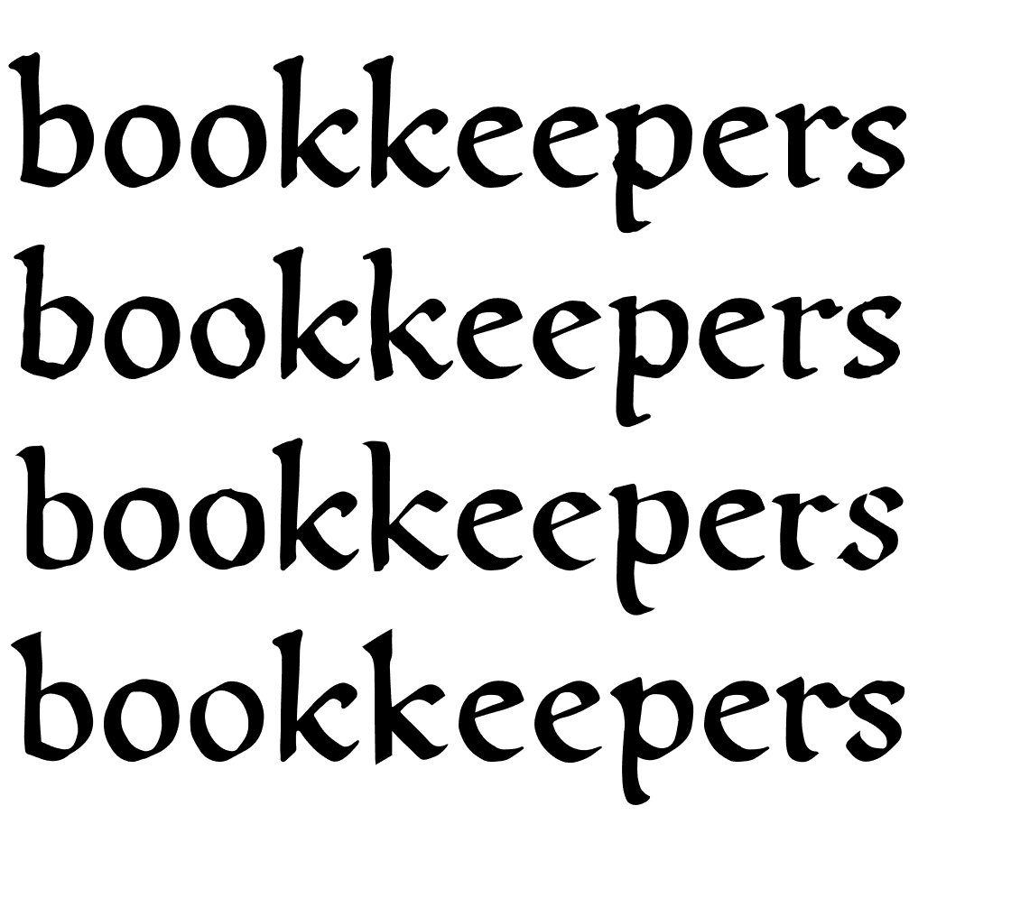
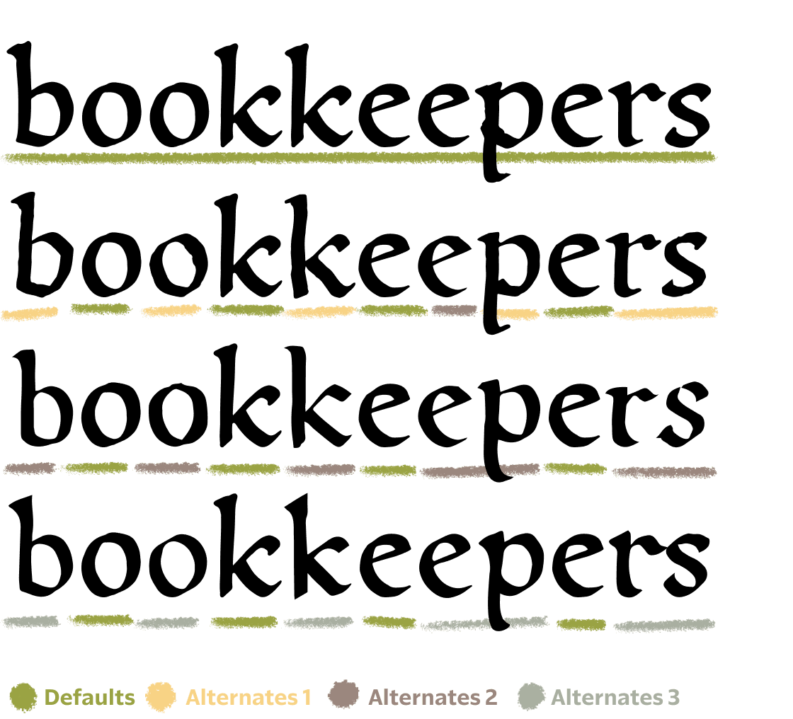
Rather than reviewing the wide variety of drawings that Danelle had inked by hand, based on my template for the Humanist Script design, and making those the official ‘canonical’ drawings, we instead incorporated 4 different versions of every letter, within the digital typeface. This means that the same ever-changing list of combinations is available for the Obsidian team to choose from. They can be used to represent the skill level of the author, or they can be used to help more accurately simulate the natural spontaneity of hand drawn words. The word ‘bookkeeper’ contains the most repeating pairs of letters in an English word, and shown here you can see the word being rendered multiple ways, each unique, just like a person’s written words.


 [Oxford, Bodleian Library MS. Laud Misc. 720, pt. II (13th century);](https://digital.bodleian.ox.ac.uk/objects/948cdd87-88ae-4714-b79d-979d8e254727/) [Oxford, Bodleian Library MS. Ashmole (1523);](https://digital.bodleian.ox.ac.uk/objects/7f9e58ea-2b0e-4bb5-a9c9-f8529ba3d5b6/) [Book of Hours, Toronto, The Robertson Davies Library at Massey College (1290).](https://fragmentarium.ms/overview/F-taus)](/_next/image?url=https%3A%2F%2Fcdn.sanity.io%2Fimages%2Fblwjvcya%2Fproduction%2Fedf670f914d5fc95b119e26d0a8f4c986bd243fb-2880x863.png&w=3840&q=75)
FIG. 11 — The four primary classifications of Blackletter sub-genres: Quadrata, Semi-Quadrata, Precissa, and Rotunda. Sources left to right: The Malmesbury Bible (1407); Oxford, Bodleian Library MS. Laud Misc. 720, pt. II (13th century); Oxford, Bodleian Library MS. Ashmole (1523); Book of Hours, Toronto, The Robertson Davies Library at Massey College (1290).
Dave Bailey, a lettering artist and typeface designer who worked with Lettermatic at the time, focused on the Monastic Script, a typeface that captured Josh and Hannah’s favorite qualities of the vast landscape that is often referred to as ‘Blackletter.’ Even I was surprised at the sheer amount of names that exist academically for the various sub-genres of Blackletter, but our research led us to 4 primary classifications: Quadrata, Semi-Quadrata, Precissa, and Rotunda. While reviewing samples of each, we found a mixture we were all fond of, and Dave set out capturing those details in a new design. The Monastic Script also had the same kind of trajectory from ‘perfectly captured’ to ‘purposeful imperfection,’ eventually gaining rounded ink bleed details, and imperfect edges on strokes, to better capture the result on a printed page, rather than the core intent of the raw calligraphy. Whereas the initial drafts had been recorded with crisp, perfect-looking strokes, the true beauty was in capturing the appearance of gently bleeding ink. Amplified, of course, by the clever rendering system created by Brett Klooster (Programming Director) at Obsidian.
This design is formed from a very ‘picket fence’ texture, and so the art is in capturing the careful departures from that repetitive series of vertical lines, to differentiate one glyph from another. Narratively it made sense that this kind of letter would be drawn slowly, and purposefully, by someone skilled with a pen, so Dave incorporated details like gently bowing vertical stems that suggest the skill of the lettering artist. The design even has tiny purposeful overlaps that reveal the underlaying structure of individual strokes and how they happen to overlap, rather than hiding those behind a lens of perfection in which the letter disguises its own creation. With the humanity shining through, these letters feel authentic.
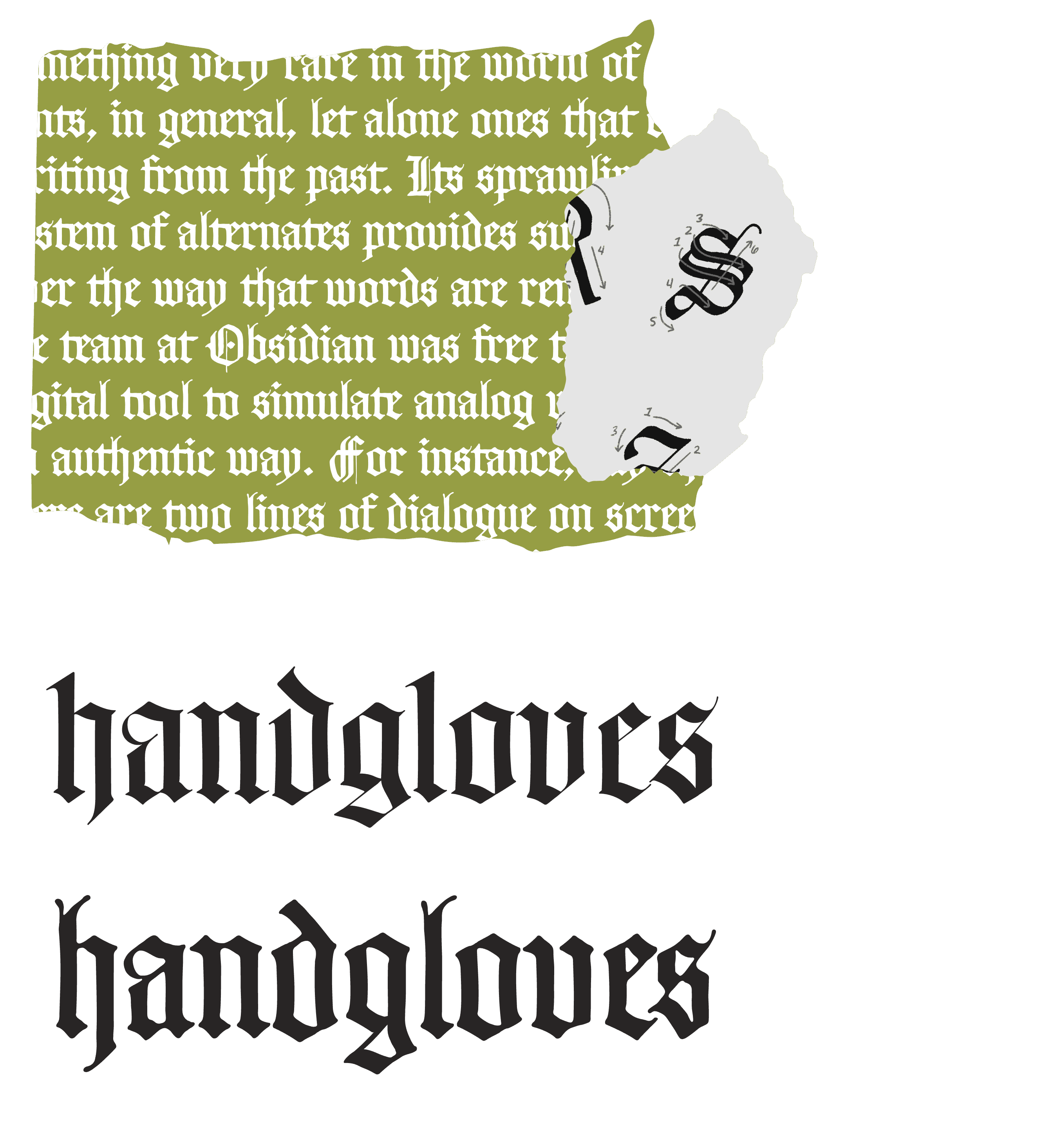
FIG. 12 — Top left: Monastic Script in-use. Top right: The ductus diagrams for Monastic Script created by Lettermatic. Bottom: Comparison of the precise and crisp first draft of Monastic Script (top) and the final design with ink-bleed and overlap effects (bottom).
The lore of the game also pointed towards a need for a design different from all the others; rather than a digital typeface replicating writing, this would be a digital typeface replicating the appearance of early metal typefaces, with ‘sorts’ (individual glyphs) that could be re-arranged infinitely on a printing press. The in-game character of Claus Drucker makes reference to his wife, Marie Druckeryn, creating all of their woodcuts and type for their print shop. Drucker means ‘printer’ in German — and in this century, it was common for women to have feminine endings such as “-yn” on their surnames. As an homage to Marie, we wanted a woman type designer on our team to design the Printer Type font, so Danelle took the lead on this design.

 and type by Bartolomeo de Libri Florence (1487) in the [*Epistola a Pino de' Rossi* (1487),](https://daten.digitale-sammlungen.de/0006/bsb00066096/images/index.html?fip=193.174.98.30&id=00066096&seite=7) both courtesy of Munich DigitiZation Center. Bottom left: Nicholas Jenson’s Eusebius Pamphilus, *De evangelica praeparatione* (1470) from *The Visual History of Type* by Paul McNeil. Bottom right: [Roman capitals on the base of Trajan’s Column,](https://en.wikipedia.org/wiki/File:Trajan_inscription_duotone.jpg) c. 113.](/_next/image?url=https%3A%2F%2Fcdn.sanity.io%2Fimages%2Fblwjvcya%2Fproduction%2Fae9e6d1f9bf6b7db818b2652be6038557f5f6924-1364x934.png&w=3840&q=75)
FIG. 13 — Top left and right: type by Bartholomaeus & Laurentius de Bruschis in the Genealogiae deorum gentilium (1481) and type by Bartolomeo de Libri Florence (1487) in the Epistola a Pino de' Rossi (1487), both courtesy of Munich DigitiZation Center. Bottom left: Nicholas Jenson’s Eusebius Pamphilus, De evangelica praeparatione (1470) from The Visual History of Type by Paul McNeil. Bottom right: Roman capitals on the base of Trajan’s Column, c. 113.
For this research, we naturally went back to the surviving samples of very early metal typefaces, specifically the work of Nicolas Jenson, who cut a typeface over 500 years ago that would look familiar to modern readers today. The eponymous typeface Jenson, as we know it today, was Nicolas’s attempt to move humanist manuscript writing away from pens and ink, and over to the printing press. We also looked at the work of Claude Garamont (circa 1530), and Francesco Griffo (circa 1498) for reference. These designs, when viewed as a series, paint a picture of a texture and style that was pioneering at the time, and Danelle’s Printer Type design aspires to capture this tone, while adding in a bit of unique spirit. Danelle found little details from historical samples, and worked them in as if to suggest the preferences of Marie Druckeryn, like the star-shaped dots on the ‘i’ and ‘j’. Much later, when the world finally learned of Pentiment’s name and saw the logo, we were delighted to see these star shapes had found their way into the promotional materials as well. A couple other callouts from this design would be the ‘M’ with apex serifs, and the ‘g’ with a unique crossover tail design.

FIG. 14 — Historical inspiration for the lowercase “g”, capital “M” and star-shaped dots in the Printer Type design.

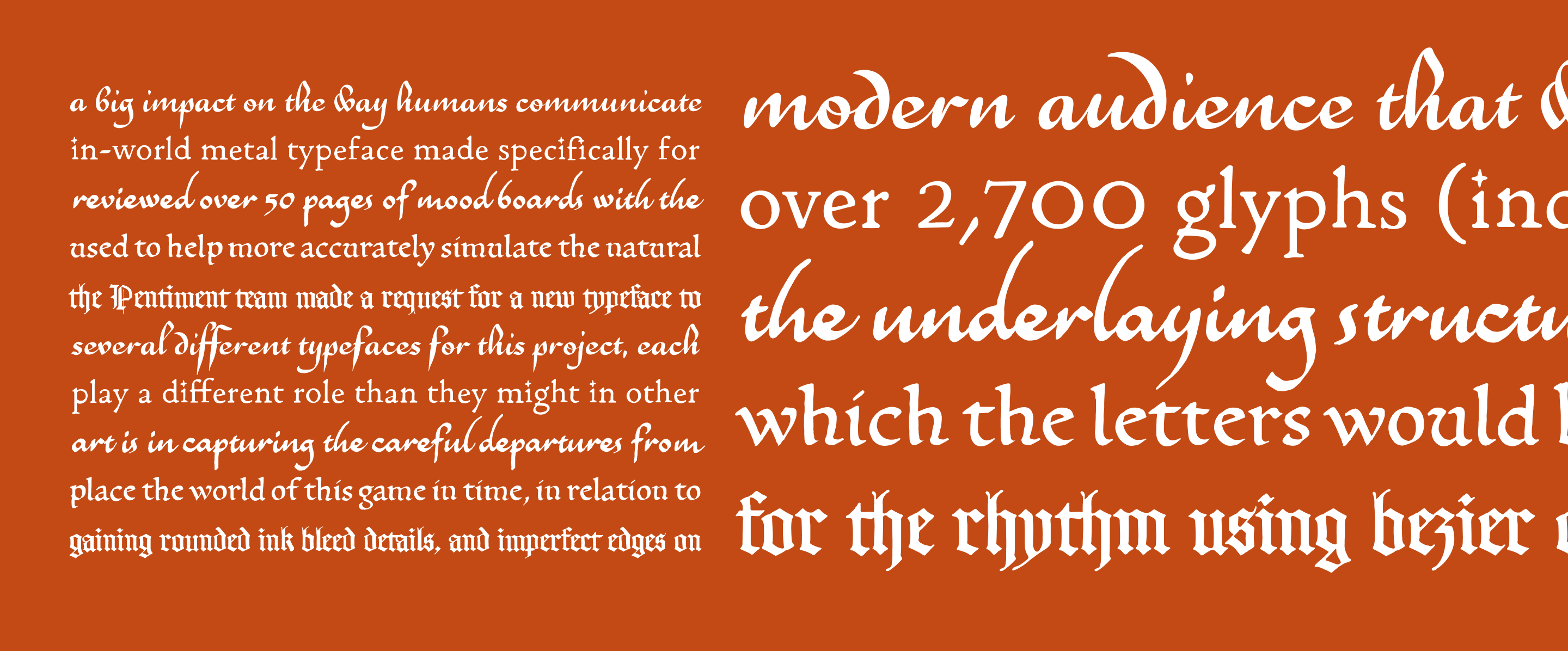
FIG. 15 — All of Pentiment’s custom fonts in-use.
While working on the game, the Pentiment team made a request for a new typeface to add to the game’s landscape of typography: this time a connected script design that took inspiration from Heather’s Scribe Script work, but had the appearance of being drawn at smaller scale, with less sophisticated tools, more quickly, and with less skill. Thus began the work on Peasant Script, which Danelle took the lead on, re-contextualizing Heather’s ideas into a new design with a completely unique set of drawings. Where Heather’s work on Scribe Script was crisp, skillful, and exacting, Danelle had another spirit to capture for Peasant Script that spoke of more casual and gestural writing, and so she turned to analog tools. Danelle is a very skilled lettering artist, and so the trouble she faced right away is that it’s actually somewhat difficult to convince yourself to draw ‘less skilled’ letters in this context. She once again utilized the non-dominant hand trick she had come up with, to get the shakiness and imperfection she was looking for. Seeing the same phrase written in both shows the wonderful differentiation between the two, and this new design then contributed to depicting more in-game about a given character’s education and societal standing. To maintain the ‘handwriting simulation and variety’ features we’ve added to the other designs, Peasant Script also includes 3 versions of every letter that allow the Pentiment team to simulate variations in skill, and create the appearance of more realistic looking natural handwriting. It also includes some ligatures like ‘ff’ and ‘ffl’, to create realistic looking interactions between letter pairs that appear often, and are prone to colliding.

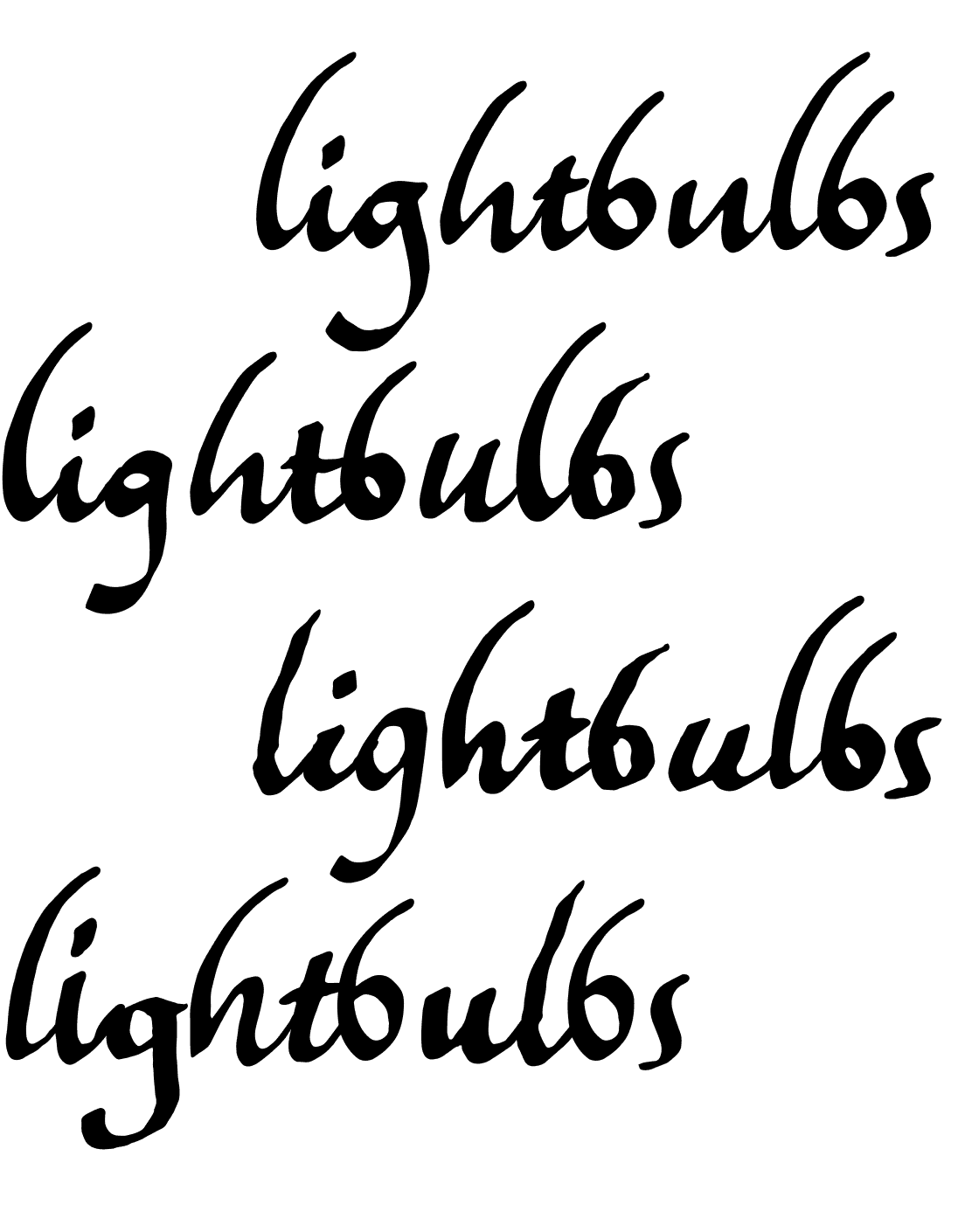
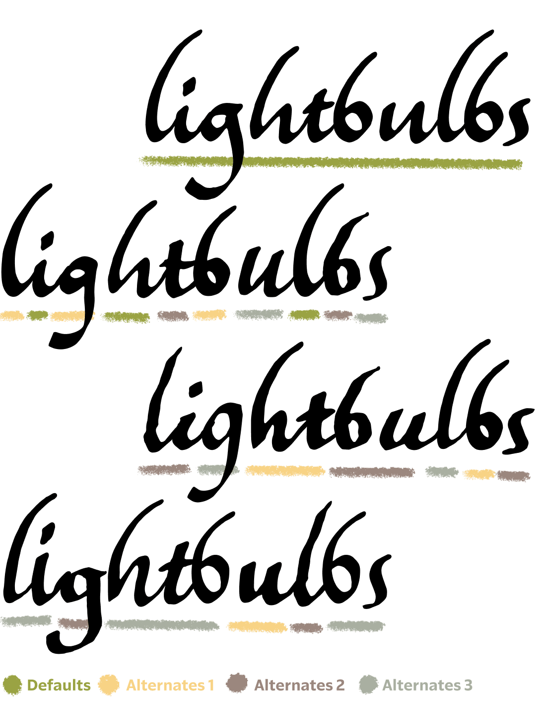


FIG. 16 — A comparison between Peasant Script and Scribe Script shows how the two designs have a shared skeleton.
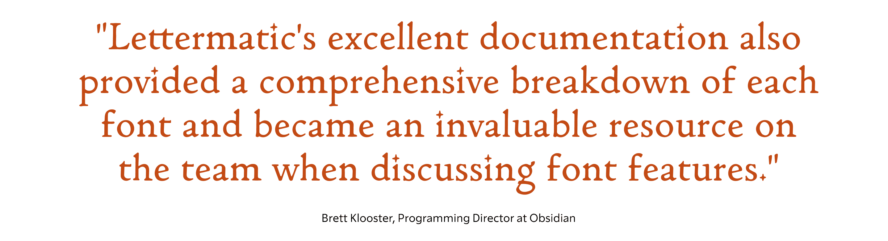
Brett Klooster at Obsidian worked on creating the custom toolset that allows these fonts to be ‘written’ on screen one stroke at a time. To assist with this, Lettermatic created ‘ductus’ diagrams which illustrate the strokes used to form a letter, the order they are drawn in, and the direction the pen travels for each. We had begun the process by reviewing such diagrams in historical examples, and it was a fun full-circle moment to then create equivalent diagrams for our own creations. “Lettermatic was an active partner in developing the font systems for Pentiment. They worked closely with all departments including the engineering team to make sure the deliverables met the unique technical needs of our project,” Brett said of the process. “Lettermatic's excellent documentation also provided a comprehensive breakdown of each font and became an invaluable resource on the team when discussing font features.”
Alec Frey (Producer on the Pentiment team) was responsible for then cutting our drawings back into these individual strokes, so it could be said that while Lettermatic was busy putting letters together, Alec was working to take them apart again. Alec said of the process, “It was important to us that the text and writing in Pentiment felt authentic. Finding Riley and the team and talking to them about our goals they were immediately on board. Their excitement to contribute to the game and make something really special was fun and motivating. Understanding the amount of research and care they put into developing the historical fonts for Pentiment made us confident that we were making something really special.”
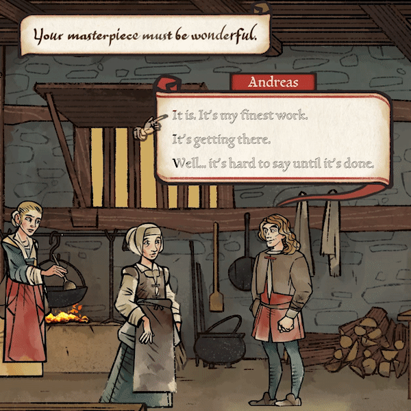
FIG. 17 — Dialogue selections from Obsidian’s Pentiment.
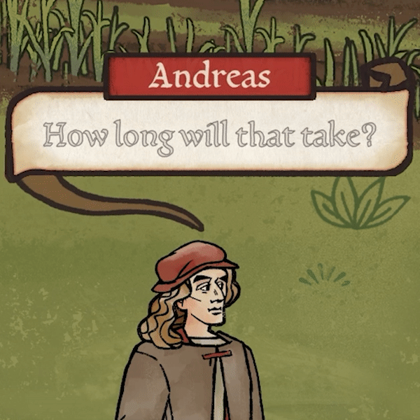
FIG. 17 — Dialogue selections from Obsidian’s Pentiment.
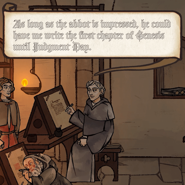
FIG. 17 — Dialogue selections from Obsidian’s Pentiment.

Pentiment is available via Xbox Game Pass and PC Game Pass in a variety of languages, and so the fonts had to be able to cover those languages as well. We worked as a team to add language support to each font in the series. In total the full series of fonts includes over 2,700 individual glyphs, many of which were drawn uniquely by hand for this series with paper and ink. We even included period-correct glyphs like the ‘long s,’ which can optionally be turned on via the game’s settings for extra authenticity.
At the time of publishing this case study, the game has just come out, and the Lettermatic team are enjoying our first playthrough of this game we’ve anticipated for the last couple of years. We are thrilled for our friends at Obsidian, who were such a joy to work with on this project, to see them release a game they all clearly care so deeply about. I felt, through this whole project, that this was a game Josh had dreamed of making for a long time, set at a point in history that had been the focus of his research for a big chunk of his life, and I am grateful that Lettermatic was given the opportunity to help the talented team at Obsidian in realizing that dream.
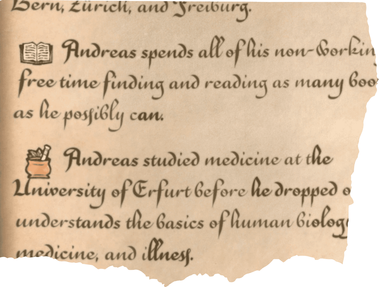
FIG. 18 — Dialogue selections from Obsidian’s Pentiment.

To close, here’s Josh Sawyer, director of the game, with a quote on his experience. “Fonts play an incredibly important role in Pentiment. We have a large cast of characters from a wide range of educational backgrounds in a transitory period between the medieval and the early modern worlds. Capturing all of the nuances and complexities of historical scripts and typefaces while keeping the game's large amount of dialogue legible for a contemporary audience was both vital and daunting. Riley and the team at Lettermatic did a fantastic job working with us over many months to achieve the results you see in the finished game.“
We hope in your own playthrough that you’ll enjoy the fonts, and the extra sense of immersion they’re designed to bring. If you feel like taking a screenshot of your favorite uses, and tagging us on Twitter, Instagram, or elsewhere, we’d love that. Thanks for reading!
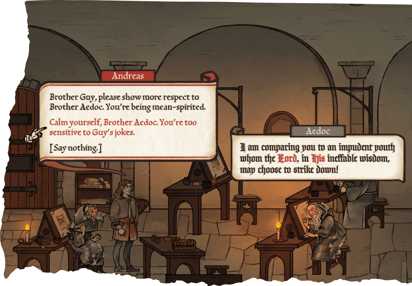
FIG. 19 — Dialogue selections from Obsidian’s Pentiment.
