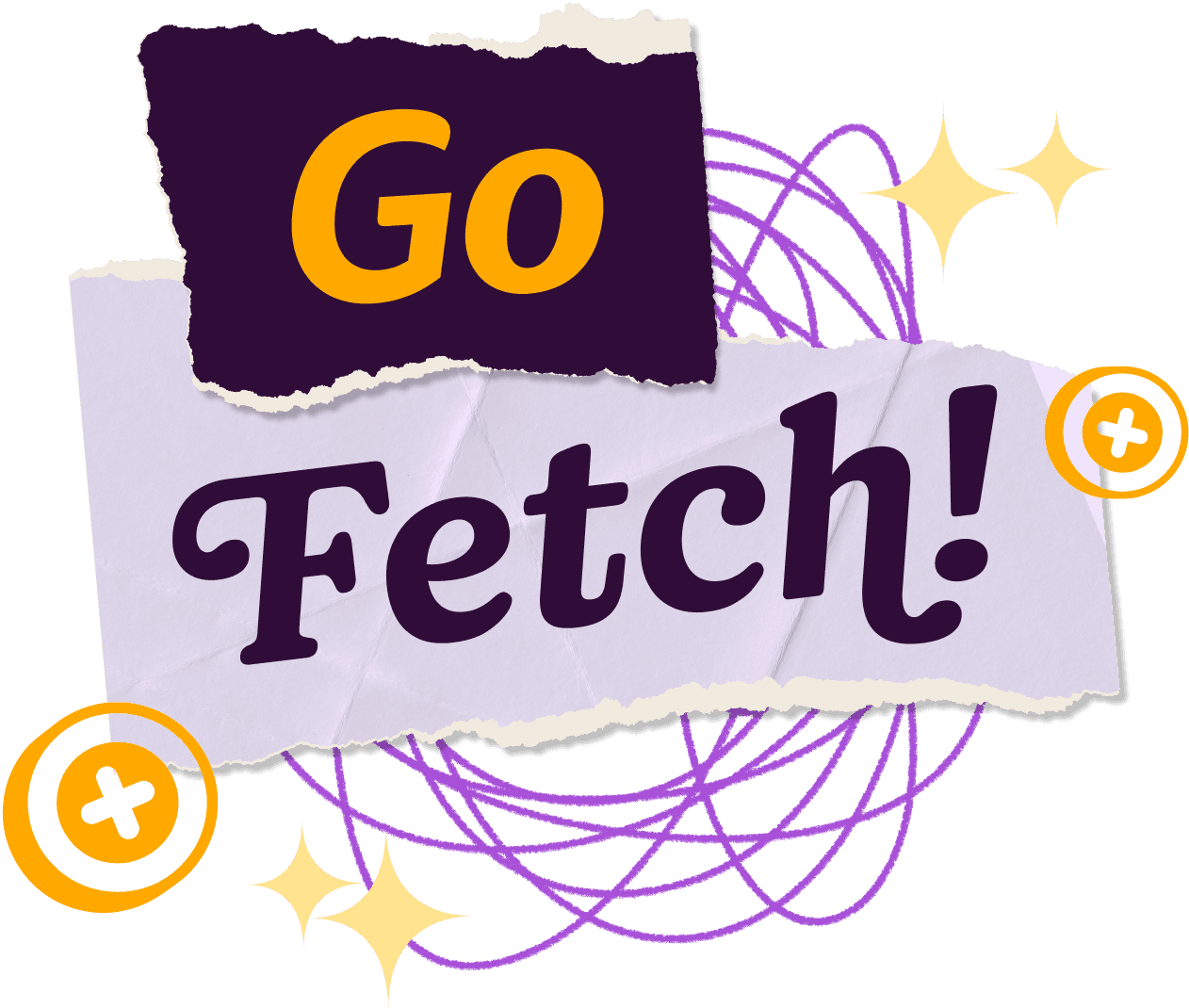
Custom Fonts For

A LETTERMATIC CASE STUDY
By Riley Cran


The best typefaces come from a strong need. Often when we are approached to make a custom typeface, the need stems from a desire to capture a certain aesthetic tone. Another common reason is that a team of people, already on their journey of making beautiful and functional design, need an assist in the form of a typeface that reduces the workload and creates consistency across departments. When Fetch (one of the most popular shopping apps in the USA) wrote to us with their brief, it involved all these things.
Information
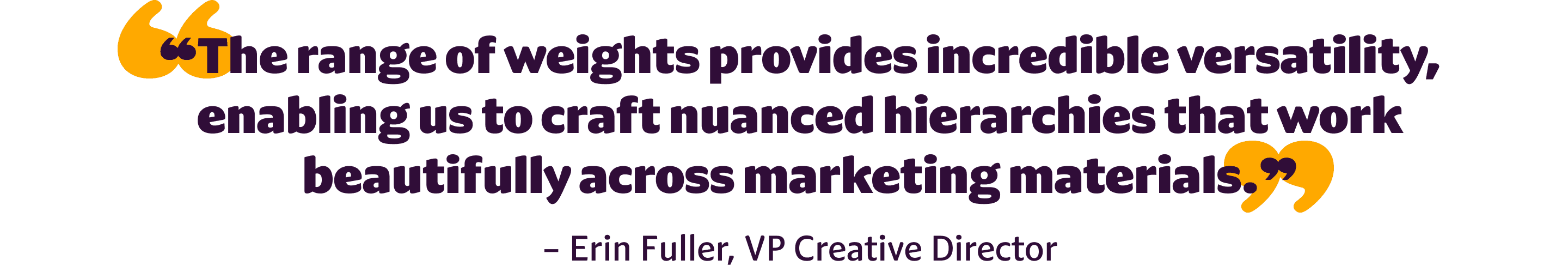
- Released:February 2025Classification:Humanist Sans + Rounded Serif№ of Styles:80№ of Widths:4№ of Families:2VP Creative Director:Erin FullerLead Designer:Riley CranContributing Designers:Danelle Cheney, Jane Solomon, Heather CranCase Study Design:Tina Dirmyer
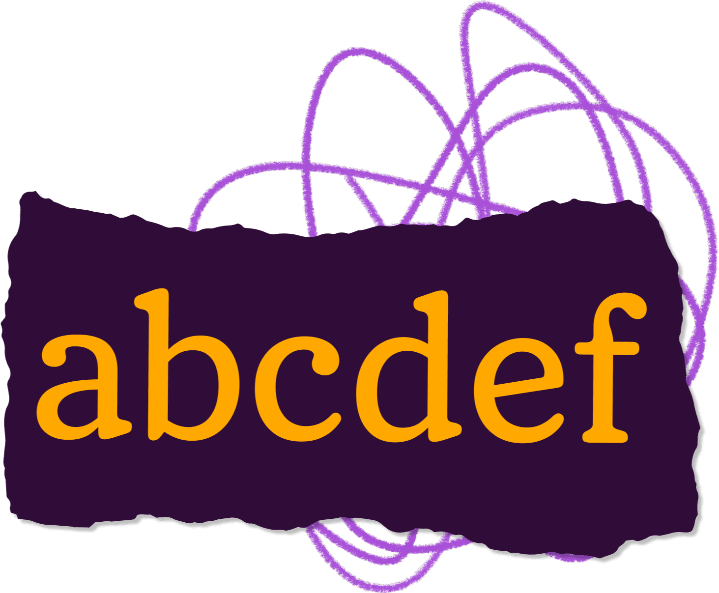
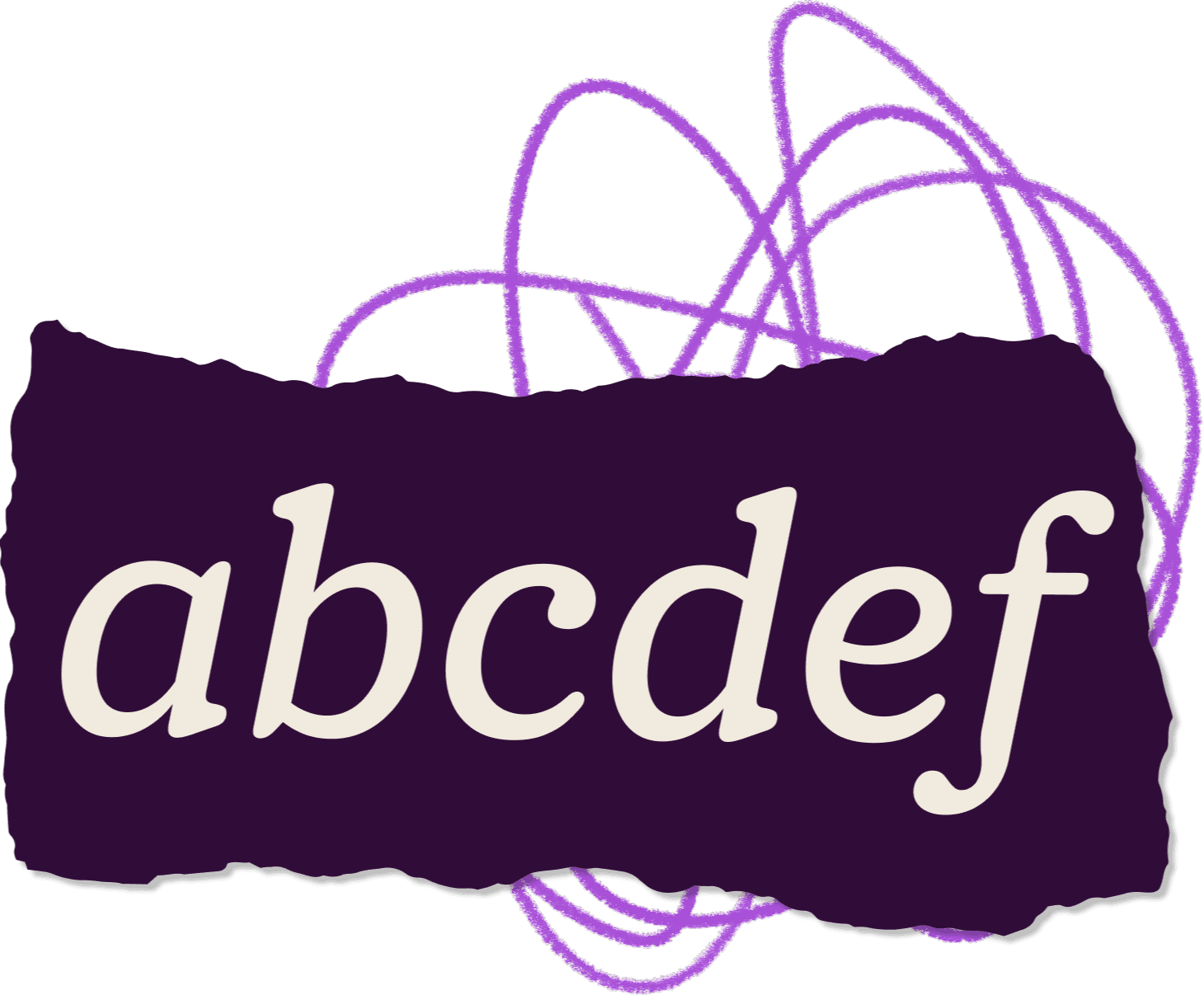
The process led us to making two type families, WeGo Sans and WeGo Serif. This pair of typefaces, which share a common skeleton, were made to cover a brief which itself pointed to a sort of duality — to be quiet and neutral in some situations, and loud and powerful in others. How do you make typefaces that achieve both of these goals at the same time? How do we create an asset that can both make work easier for the humans involved and produce a more consistent visual voice for Fetch?

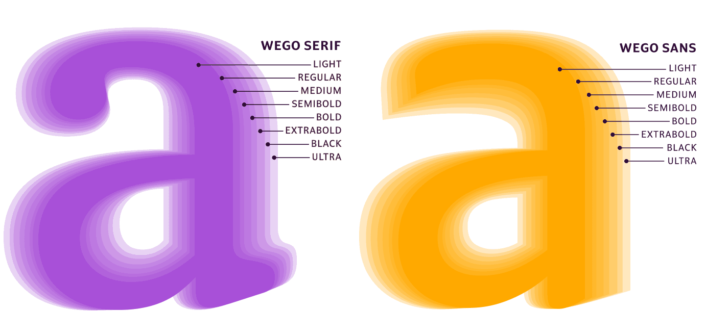
FIG. 1 — These overlay diagrams showcase the full range of weights available in WeGo Sans & Serif, and their related constructions.
In-house design teams are machines with moving parts — talented designers in various disciplines that work together to craft a harmonious face for a product and company like Fetch. The facets of that outgoing design for this project spanned all the way from small-size text in the user interface of the app itself, to the marketing materials that appear on social media, emails, and even billboards. When Fetch first approached us, they had identified a fracture of typography across these aspects of their design — different teams using different typefaces for different reasons. Lettermatic’s task then became a process of untangling these disparate typography contexts and collaborating with the Fetch designers to build a brief for a new set of letters that cover all these needs.


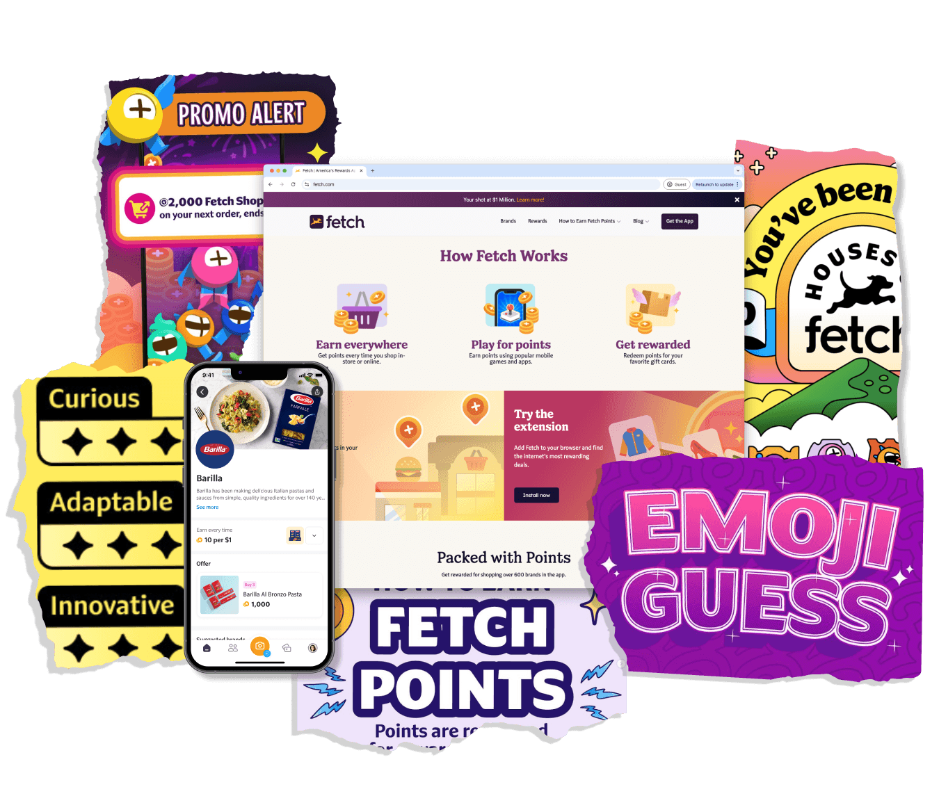
FIG. 2 — Samples of previous marketing campaigns by the talented Fetch team, using many different fonts and styles.
Open up most apps on your phone, and the typography feels the same. Over the last 20 years, typography for mobile applications has converged to a place where much of the product-design industry is using a small handful of typefaces, all roughly in the same genre. However, this homogeny of typographic voices is at odds with the goals of branding, where distancing company voices and making it clear ‘this is us talking’ becomes the primary focus.
Letters in apps are asked to fade away, and do their job neutrally. But letters in marketing and advertising are asked to do quite the opposite — stand apart, make a unique voice heard, and in modern social media, capture someone’s attention during a very narrow moment in time. The marketing team at Fetch often makes colorful, vibrant, and typography-heavy pieces of marketing that remind the users of a good reason to return to the app and participate in the experience they are nurturing. In a past decade these would have been the billboards pointing to the brick-and-mortar store. Now the demands on both aspects of the outward-facing design are much more complicated and elaborate than they’ve been any time in the past. Across these disciplines of design in-house at Fetch there is a tiny bit of friction added to every task, created by the fonts themselves. Any extra moment that those teams spend hammering the fonts to tailor them to shape is slowing down one of many thousands of small operations that lead to new campaigns and new features.

FIG. 3 — We knew from the beginning that the custom type families for Fetch needed to be very legible on small screens, so testing in that context early and often was a key part of Lettermatic’s workflow.
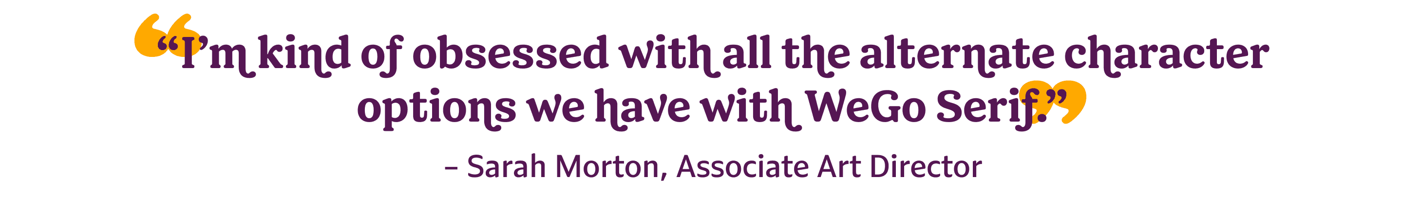
Learning during mood boarding that the team at Fetch was open to a serif typeface, the Lettermatic team began sketching and prototyping. We drew small character sets as a team and formed them into words to test the tone and rhythm we wanted for this new serif typeface. Early on we decided to aim for a very rounded serif typeface reminiscent of the friendly voice of typefaces from the past like Cooper Black and Windsor. This voice, which has been a persistent part of the landscape of typography for over 100 years, has always had a certain charm to it that we felt would work wonderfully for Fetch. We started with hand-drawn digital sketches and passed the work between members of the team with Danelle, Jane, and myself all sketching on ideas and iterating on each other’s progress. While researching for this project, we realized there was also great potential to use swashes and alternates in this serif typeface to allow the individual teams to finely control the character of the serif typeface, and ideas began to percolate.
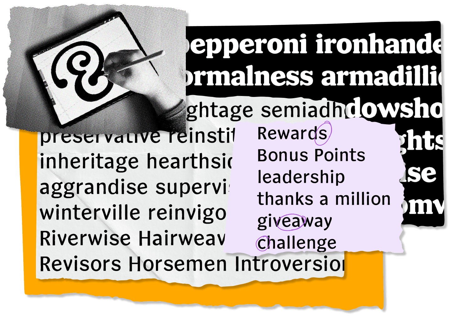
FIG. 4 — Early sketches by the Lettermatic team of both the sans and the serif, and a process photo of Danelle sketching on the iPad.
During the sketching phase, I took a draft of the serif design and quickly erased the serifs. As is often the case, there was a sans serif design hiding under there, and when the doughy rounded edges of the serif design were abruptly cut away, it pointed towards a more calligraphic influence, something more like the way a brush leaves behind artifacts on a hand-drawn letter. This created a clear path of harmony for how the friendly charm could find its way into both typefaces; a shared skeleton, unique paths towards doughy/calligraphic details in either family respectively, and alternates to shift the tone where useful. After my sketching on the serif design and the sans prototype was in good shape, my talented colleagues Danelle and Jane took the sketching and prototyping work from there, to build out a strong plan for the sans and serif pair.

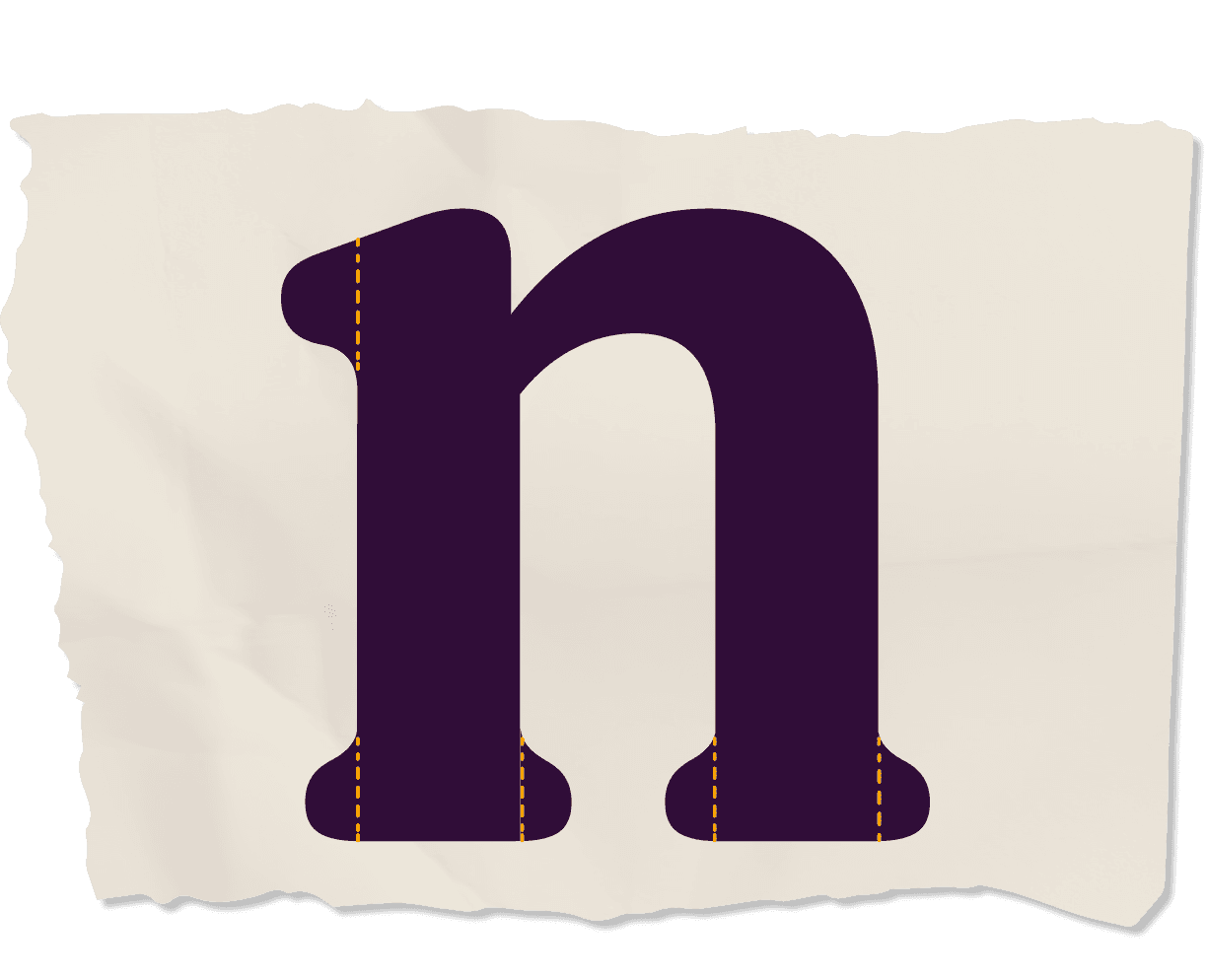
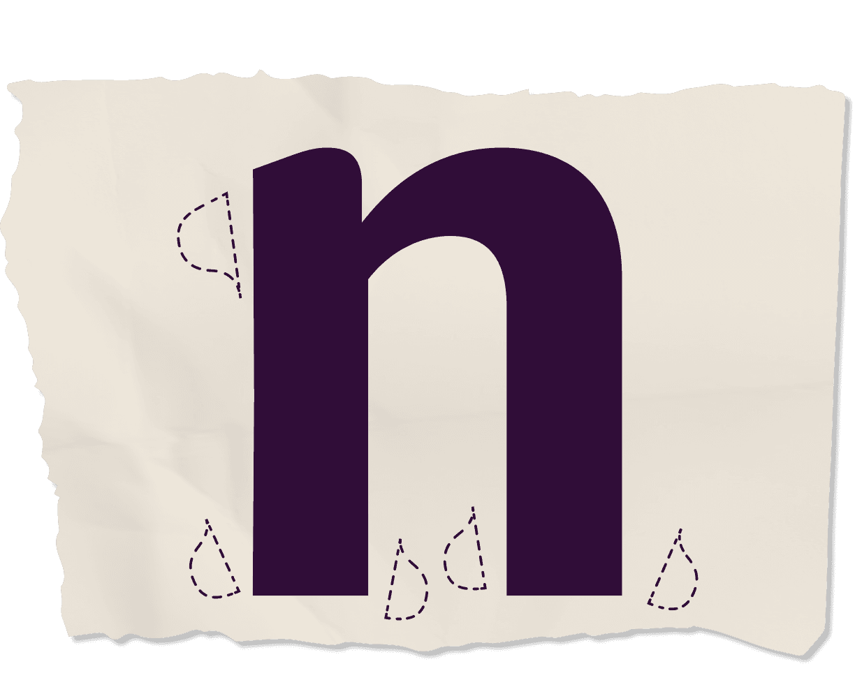
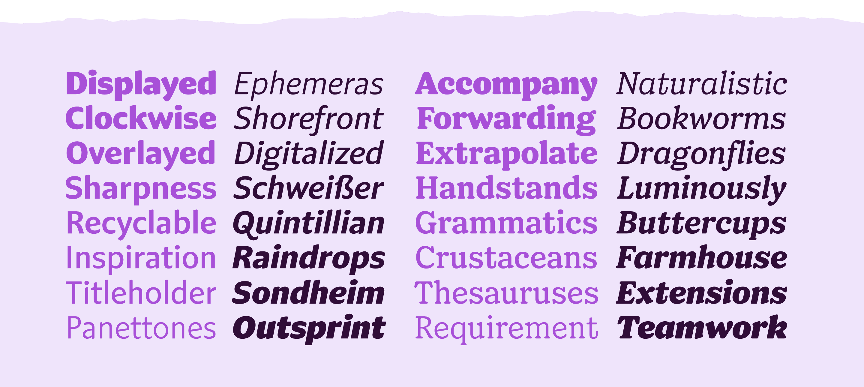
Jane worked on drafting the first complete alphabets because in a process like this we quickly want to get to words — something we can read and evaluate for texture and tone. Jane did a wonderful job drawing out light and bold versions of the alphabet so that we could see this brand new design come to life. Throughout the design we focussed on intense ‘bracketing’, the junction between serifs and stems, giving that doughy feeling that makes the letters feel slightly more like stuffed animals. We assembled inspiration from many historical sources, including typefaces from the turn of the century like Clearface (1905) and Cheltenham (1896). For letters like ‘f’ and ‘j’, we took a note from history and made strategic cuts into the letters which allow them to occupy less horizontal space. This was often done in metal typefaces to make them fit the structure of metal typesetting, and the remnant design artifact has its own charming character we wanted to retain. Clearface had a theme of gestural terminations that seem to reach out for the negative space rather than suffocating it, and we felt this positively impacts the texture of words. This group of typefaces from the past (many of which are over 100 years old) represent a charming team of voices that have shown up countless times over the intervening decades.

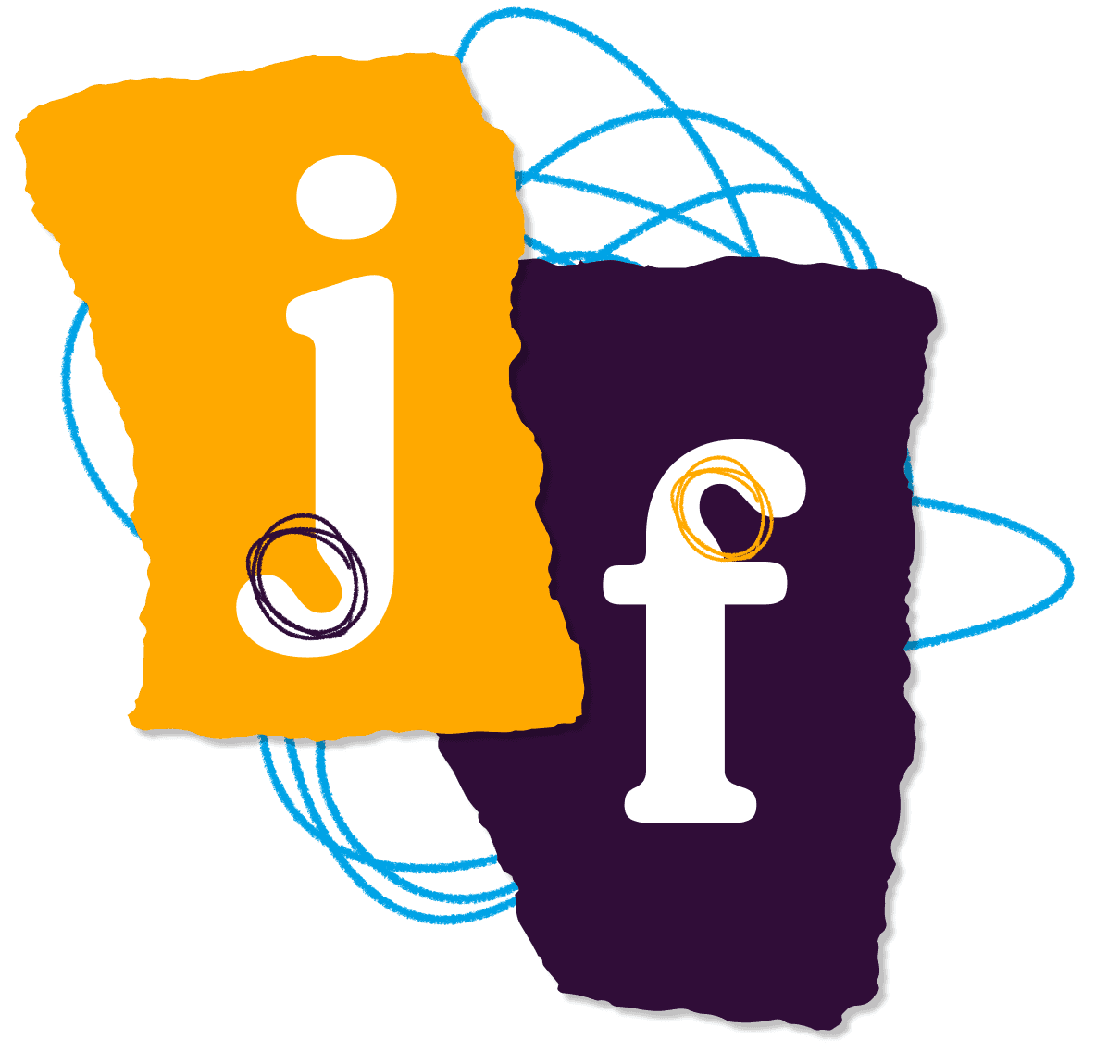
FIG. 5 — The strategic cutouts in the serif forms like ‘f’ and ‘j’ were inspired by Clearface (1905) and Cheltenham (1896), and add a great deal of character and legibility.

We did swashes in a unique way for this project. Most typefaces that include swash caps treat them as a binary option, on or off, where a default set of caps is replaced wholesale with a set of swash caps. While doing historical research we noticed that the overall intensity of swash caps varied greatly, ranging from extremely elaborate swashes that reached out expressively away from baseline and cap-height, all the way to swash caps which only subtly depart from the typical constructions of capital letters. After Danelle completed a draft of the swash caps, Vasiliki Volkova, Director of Visual Excellence on the Fetch team, asked us if we could increase the intensity of the swash caps further. Danelle then decided to push this to an extreme and drafted a swash system for this typeface where the Fetch team could control the ‘loudness’ of the swashes, ranging from moderate all the way to extravagant.

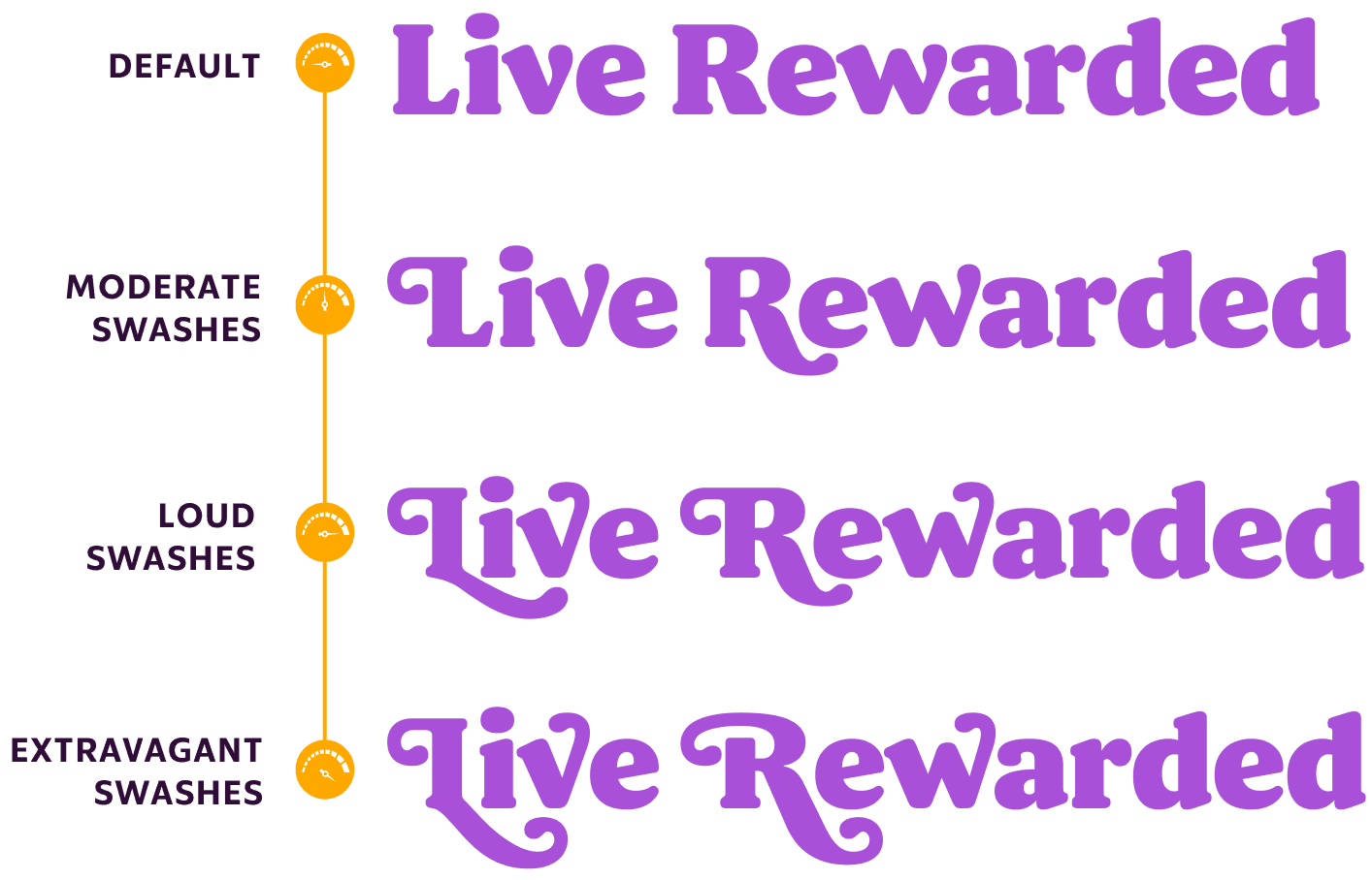
FIG. 6 — A diagram showcasing the various ‘volume levels’ of WeGo Serif, ranging from ‘moderate’ to ‘loud’ to ‘extravagant’.

For each intensity level, a selection of capital letters were redrawn uniquely to that intensity, along with lowercase counterparts. Swashes in the lowercase descend and ascend, and the combination of these various alternates mean that a single word can be styled dozens of ways. When the swashes are turned off, a word can feel friendly, but calm and traditional in tone. With all of these alternates there were potentials for collisions between glyphs, and so Heather stepped in to write a super clever series of OpenType features which automagically cause the typeface to pick alternates in a smart way that avoids collisions. This means that while implementing swashes in their design work, the folks working at Fetch do not need to manually choose alternates — they can just turn on a couple settings and the font itself selects the correct alternates to suit the given text. What could have been a complicated dashboard of options instead functions like a simple dial with ‘default’, ‘moderate’, ‘loud’, and ‘extravagant’.


FIG. 7 — The magic OpenType Heather wrote for WeGo Serif’s swash system in action. Notice the smart swaps that automagically create the best pairs!
Simultaneous to the exploration of the Serif design, the team continued to take the prototype Sans I had sketched, and refine and improve it. Using working files in Figma of the Fetch app’s user interface we substituted our typographic sketches directly into the UI during the process, both for our own evaluation and to share with the Fetch team for their feedback. The dream of having a typeface that is nice to look at in both large and small point sizes is difficult to achieve, but both teams quickly realized that this Sans design was achieving this goal. At large sizes the sans had charming, recognizable, and unusual details that made it clear this was a unique voice. In the app interface at small point sizes those details faded away into neutrality, and what was left over was the core tone and rhythm of a hardworking sans for running text. The more open construction of the letterforms allows counterforms to breathe, and we achieved a nice reading experience for product descriptions and small labels in the UI itself. The Figma files with sample app layouts provided by Fetch’s team were invaluable at this stage, as was the detailed testing and feedback from Jacob Berchem & Emily Smallwood on the Product Design team.

FIG. 8 — The shared humanist terminations on WeGo Sans have calligraphic influence that stands out in large sizes, but fades away to create nice rhythm and legibility at small running text sizes.
The team at Fetch emphasized from the beginning of the process that numbers were a particular focus for them as this had been a pain point for them in the past. The Fetch app often has to represent numerical data to the users, in the form of prices and point tallies, and this information is often arranged in tabular columns where a user can run their eye down a list of numbers for review or comparison. Jane and Danelle designed both proportional figures (meaning the numbers are allowed to have unique widths similar to capital letters), and tabular figures (which you can think of as effectively ‘monospaced’ numbers that share the same width). These tabular figures are great for column notation layouts because no matter which combination of numbers you’re representing, the typeset width will not change. Otherwise a string like ‘111’ would take up dramatically less space as compared to ‘555’. We also included Old Style figure designs for use in the middle of running text.

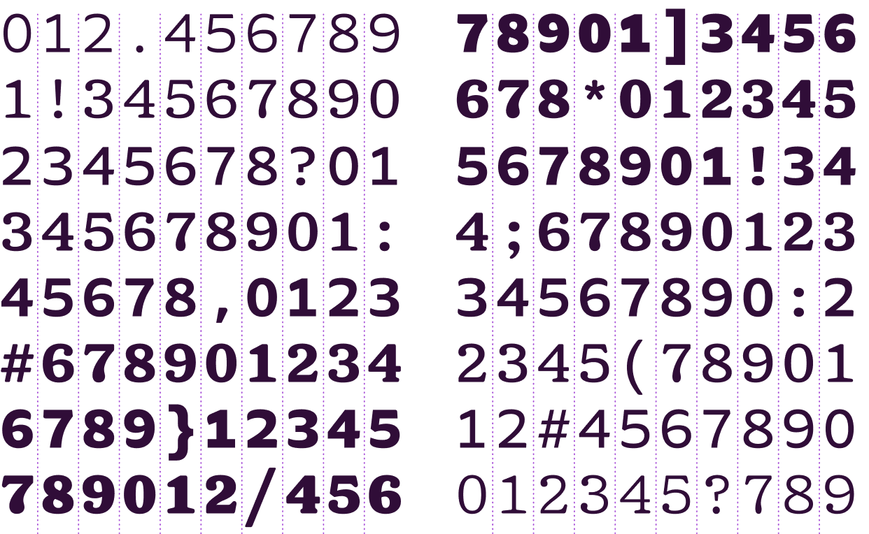
FIG. 9 — The numbers of WeGo Sans and Serif include tabular versions that are cross-family compatible, meaning they all share the same width. This makes any layout with an animation or incrementing number easier to read, since the numbers will never appear to ‘jump’ as they change.
As both the sans and serif continued to develop, we often re-typeset existing pieces of Fetch design in the new fonts, so that everyone involved could see how the new fonts can play the same roles, and often improve the harmony and texture, of the great design work that was already being done. App screens, social posts, banner ads, and many other pieces of design were tested this way during the design process, allowing the existing brand work to hold the typeface design in orbit. Much like tasting a sauce while you’re cooking it, small adjustments were made as we went to better suit these uses of the new fonts.

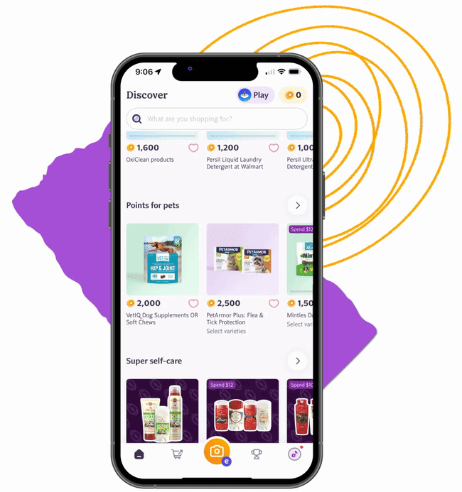
FIG. 10 — WeGo Sans and Serif in the Fetch app.
In the 1970s typeface designers revisited the same inspiration we had been considering, and made re-interpretations of those typefaces that were yet more friendly and charming than the originals. These, too, served as an inspiration for this project. An ‘e’ with a crossbar that leans slightly, something I think many folks would associate with 1970s typography, is a great example of a moment where the shared ‘skeleton’ of the two families ties together their aesthetic voice.

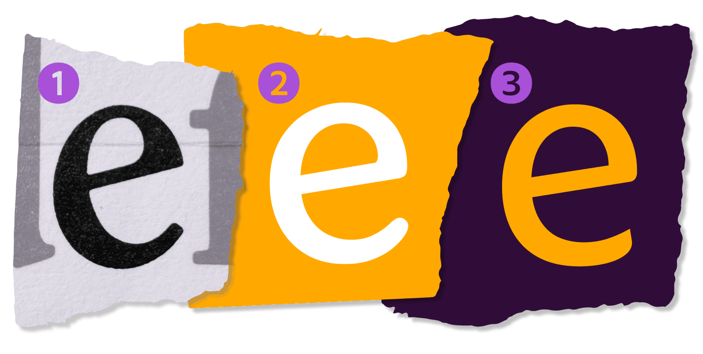
FIG. 11 — ① ITC Clearface; ② WeGo Serif; ③ WeGo Sans.
In order to allow more flexible use in marketing, Jane also began working on a widths of the Sans. This way, through the use of variable fonts, the designers at Fetch can dynamically change the width of their typesetting without stretching or distorting, but instead just by dragging a slider which always produces a typographically correct result. In the context of app typesetting, these narrower fonts can be extremely useful in mobile layouts where horizontal space is hard to come by. We delivered variable fonts of both type families to Fetch so that they can also finely increment and adjust the weight of the fonts to suit a given use case as well. The team at Fetch uses Figma, so we made sure that the fonts are nicely suited to use in their software of choice. When the designers at Fetch go to use the alternate letterforms in these new custom typefaces, they see nice human-readable labels for the features instead of cryptic labels, peculiar acronyms, and abbreviations.

FIG. 12 — The full weight and width ‘design space’ of WeGo Sans.

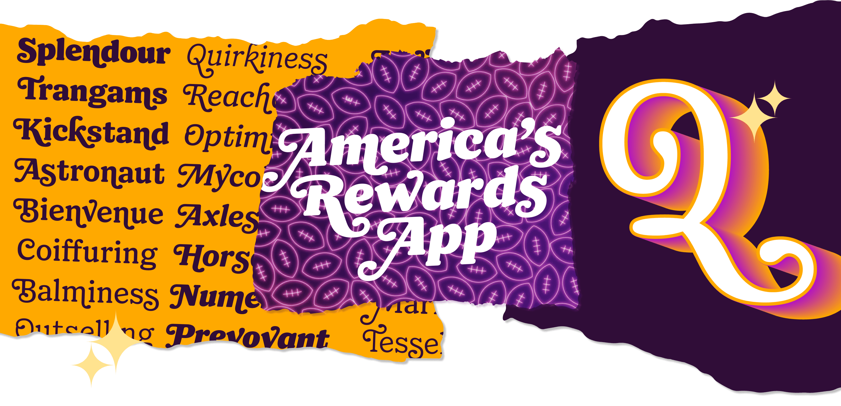
We increased the size of the character set to feature small caps, circled figures, exaggerated quotes, and many other additions that come in handy in various kinds of typesetting. Jane and Danelle worked hard to build out all these additions so that they fit the aesthetic tone of this new typographic world we were creating. If you type an all caps phrase in these fonts, caps-specific punctuation can be turned on to better suit that particular text. If the design team needs to use an acronym in the middle of a sentence, they can turn on small caps for a more harmonious texture with neighboring lowercase words. Circled figures are handy for enumerating lists and making labels. Fetch has a custom ‘points’ icon which is used throughout the app and marketing, and it is now recorded canonically as a glyph in their own custom fonts, easy to access both ergonomically and technologically in their design and engineering.


FIG. 13 — A few of the extra features of WeGo Sans and Serif, including two styles of circled figures and small caps.
Both type families have complementing italics. Traditionally a serif typeface in this genre would have a true italic, and so I began sketching the unique lowercase of the Serif’s italic. I designed the true italic to have a more flowing and gestural quality, while maintaining the charming and doughy qualities of the roman. Some construction changes are more subtle, like the cursive-style lowercase ‘e’. Others are more expressive like looping ‘k’ and the the classic italic ‘x’. Many glyphs gained intro and outro strokes, as is typical of serif italics, giving them a textural lilt. The Sans also has a companion italic, which departs less intensely from the roman, but still has hallmark italic additions. Both the serif and sans italics have a descending ‘f’ which matches between the two designs. In the variable fonts we provided a slider for Slant (in degrees), which automatically implements these unique italic glyphs when you cross the halfway mark of the range.


And with the expressive italic, came an obvious need to include swashes in the italic serif fonts as well, so Danelle adapted all her previous work to the italic for symmetry. This creates consistency not only in the aesthetic output of these fonts, but in the literal feature set for the designers using them. We work hard to make sure that a designer using these fonts will not reach for a feature that they find is missing. In our research Danelle and Jane had spotted many forms of swashy ampersand drawing from history, so they decided to include…all of them. The serif family now has 4 separate ampersands to choose from.

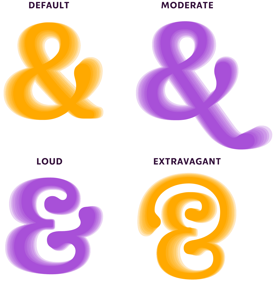
FIG. 14 — The ampersand in WeGo Serif alone has several unique swash styles for the Fetch team to choose from in their designs.
Heather and Jane worked together to build the language support for the Fetch fonts, covering a wide span over 150 latin-based languages, and preparing the Fetch fonts for proper localization in their app experience. The diacritic marks for a doughy serif typeface ought to be doughy too, and as is the case with each of our projects, the diacritic marks are custom designed to suit that particular recipe of aesthetic qualities. The most commonly-used language in the Fetch app beyond English is Spanish, and our team was particularly grateful for the expertise of Maider Izeta, Alejandra Gutierrez, and Amanda Romanski on the Fetch localization team who made sure we had Fetch-specific Spanish samples and detailed feedback from them as Spanish speakers. The Fetch fonts are now prepared for a wide variety of uses not only relevant to the current design work at Fetch, but facing the future of Fetch where fonts are called upon to do new and interesting things that require flexibility. Even the swash variations for the serif have language support, so that readers of other languages can enjoy the characterful swash typesetting results.

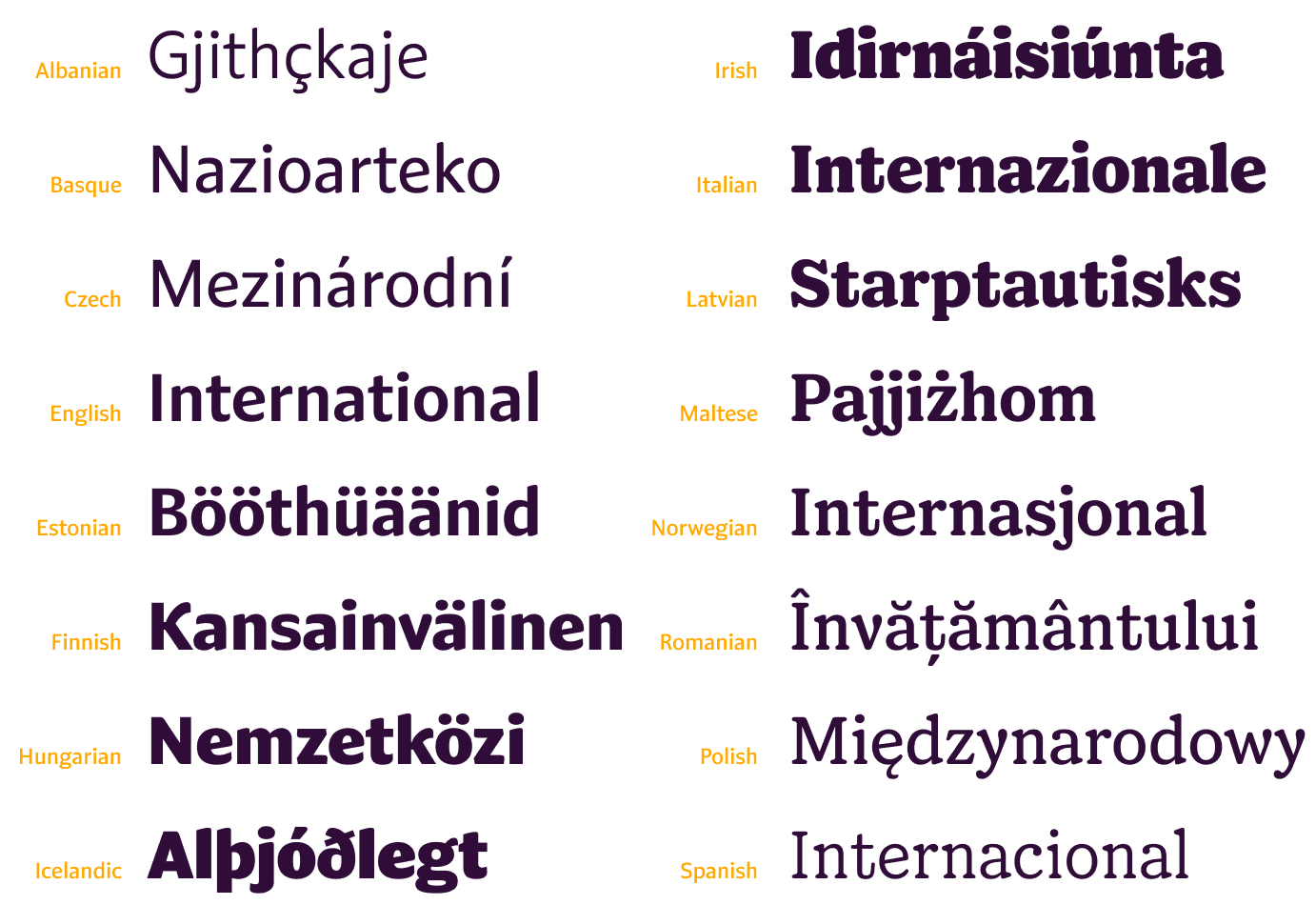
FIG. 15 — WeGo Sans & Serif speak 220 languages!

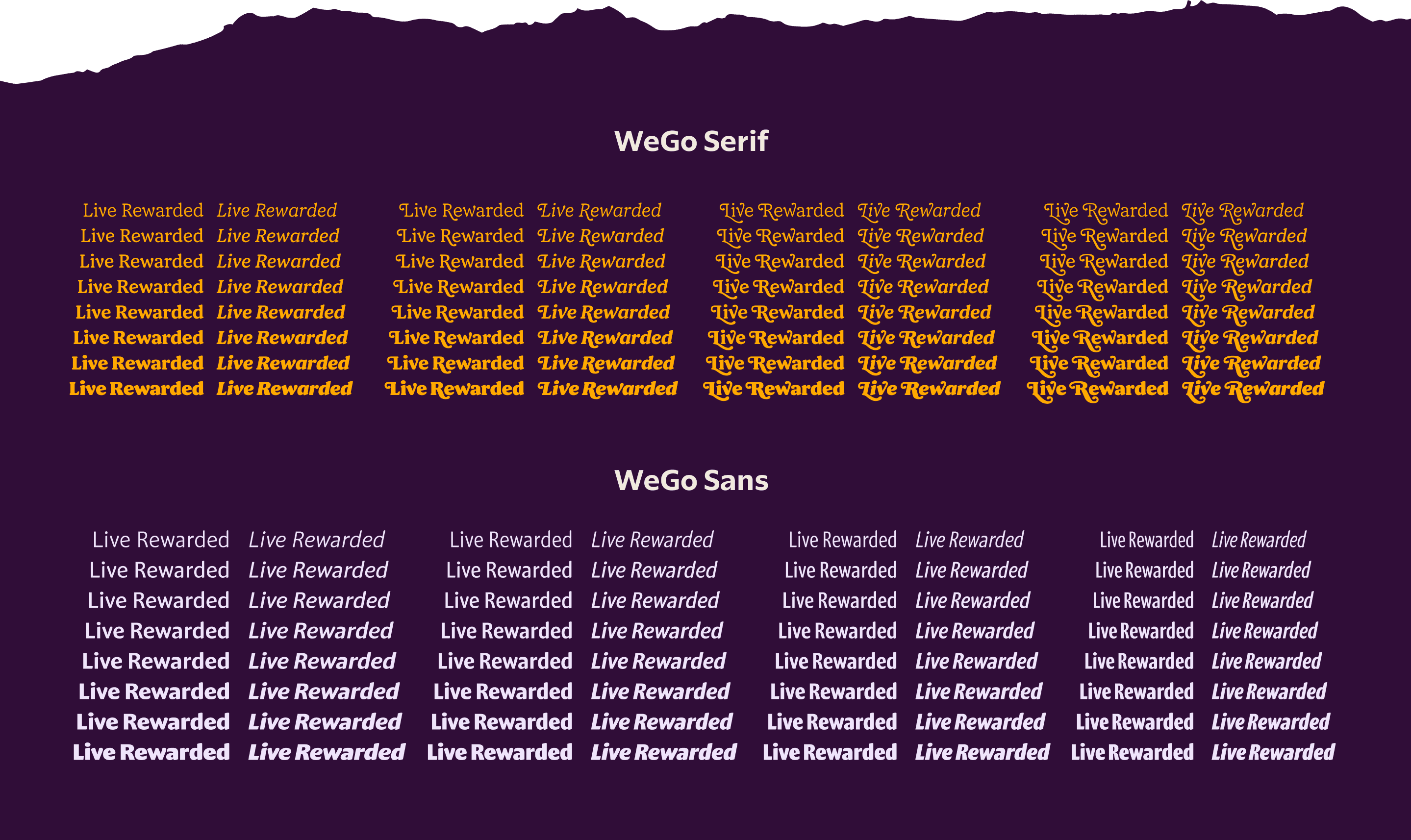
FIG. 16 — A full family chart of WeGo Serif showing the varying levels of swash ‘volume’ (top), and WeGo Sans showing all four of its widths (bottom).
As we worked toward completion of these font families for Fetch, Jane and Danelle began to write and design a custom User Manual for WeGo Sans & WeGo Serif as part of the final delivery. This guide covers all the features included in the WeGo Fonts, including things like the proportional and tabular figures, dynamic fractions, case-sensitive punctuation, small caps, language support, and the extensive swash system of WeGo Serif. Fetch’s User Manual also shows how to access all of these features across various apps, including Figma and the Adobe Suite. These custom guides, including the one for Fetch, are a time-saving resource for onboarding new team members in addition to being an ongoing reference material. They can even be integrated into a wider Brand Guidelines document if desired. We deeply believe in including these guides with every font delivery to ensure our clients get the best use possible out of their custom font families.

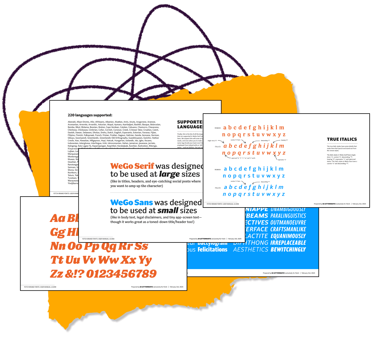
FIG. 17 — Samples from the custom User Manual delivered as part of WeGo Sans and WeGo Serif, showcasing all the features of each style.
In total the Lettermatic team worked on over 25,000 glyph drawings for this project, placing over 425,000 bezier points, and reviewing over 40,000 kerning pairs. WeGo Sans and WeGo Serif combined have a total of 80 unique static styles, in addition to the variable fonts which have even more options and flexibility.
The Fetch team explained to us that their co-founders (Wes Schroll and Tyler Kennedy) had once considered naming the company WeGo, before landing on Fetch, and they wanted to use that name for the new custom typefaces. Hence was born WeGo Sans and WeGo Serif, the companion type families for the new typographic face of Fetch’s visual identity and product. We are grateful to Erin Fuller and the talented Fetch creative team for the opportunity to work on these new typefaces and contribute something to their brand with a long shelf life. We can’t wait to see what they use these new fonts for next!