THE MAKING OF


A LETTERMATIC CASE STUDY: CALIFORNIA ACADEMY OF SCIENCES
by Riley Cran

Typeface design has a way of being constantly referential; we're always looking back to the past. Whereas graphic design is perhaps 200 years old (if we're being generous), the art of drawing Latin letters is easily 2000 years old. A 1,900 year old source, the Trajan Column, is still regularly referenced by modern typeface designers. In the 19th century, the Slab Serif was born, a new genre of serif with 'lower contrast' (less differentiation between thick and thin), and it has since become a mainstay of our typographic repertoire. The SONY and I ❤️ NY logos wouldn't be quite the same if they were not set in Slab Serifs, for instance.
My journey to designing a new Slab Serif called Bezzia began in 2017. I received an email from Laurel Allen and Kristina Fong at the California Academy of Sciences. Founded over 160 years ago, the California Academy of Sciences is one of the most respected natural history museums on the planet, and their beautifully designed location in San Francisco's Golden Gate Park houses an enviable collection of a particular sort. Whereas I sometimes think I am peculiar for cataloging hundreds of books on type and lettering on the walls of my home, I am outdone significantly in niche collecting by the Academy, whose many collections contains literally millions of ... dead things in jars. Put another way, they are scientific specimens of animals, insects, birds, deep-sea fish, and essentially anything you can imagine that once walked the Earth, soared in the skies, or swam in the ocean. Together, their 46 million specimens add up to a critical record of life on Earth, which scientists use to better understand and protect biodiversity around the world.
Information
- Released:2021№ of Fonts:14Lead Designer:Riley CranClassification:Slab Serif№ of Families:1Language Support:Heather Cran & Dave BaileyContributing Designers:Heather Cran, Dave Bailey, Danelle Cheney
Many of the animal specimens are preserved in alcohol, inside jars on carefully organized storage shelves in their massive special collections. You can't really label the exterior of a jar of alcohol, without the alcohol eventually finding a way to separate a jar from its adhesive label. As a solution, they've stored the tags and descriptive info, often thermoprinted on paper, directly in the alcohol itself with the specimen. And the industry term for the most important of these specimens—the ones that define and establish new species—is, funnily enough, ‘type specimen.’

](/_next/image?url=https%3A%2F%2Fcdn.sanity.io%2Fimages%2Fblwjvcya%2Fproduction%2Fc3822cee4f87a6fed942feddcf39a9f96656767d-1441x941.png&w=3840&q=75)
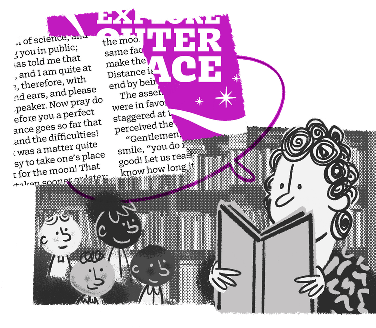
FIG. 1 — Illustration by Marisol Ortega
Laurel and Kristina had come to realize that alongside amassing this world-class collection of natural history artifacts and 'type specimens,' they had indirectly assembled another 'type specimen' collection: the letters themselves. Going back nearly 200 years, these letters inside the jars float with star fish, octopus, snakes, and lizards. Laurel and Kristina wondered if there might be an opportunity to design new typefaces inspired by these various labels and letterforms; naturally, I was excited at the prospect immediately.

](/_next/image?url=https%3A%2F%2Fcdn.sanity.io%2Fimages%2Fblwjvcya%2Fproduction%2Fc8eac003b5cf4b5de2b3623aa44d0921e714336f-1441x854.png&w=3840&q=75)
FIG. 2 — Illustration by Marisol Ortega


Often typeface designers can be found taking photographs of the letters above a building entrance, or of an old sign weathered on the side of a building, and are used to getting odd looks. I imagine the staff at Cal Academy weren't used to hearing designers say they would like to see the tiny labels in the jars, rather than the 'lure' of an Anglerfish. But at each department of the Special Collections, the staff were warm and welcoming, giving us a wonderful tour and helping us find what we were after. Initially I thought 'they must never open these jars right?', only to see Ichthyology Sr. Collections Manager Dave Catania immediately open a jar and pull out a fish, reaching down for the paper tags in the bottom of the jar, and laying them out on a table. Like the rings of a tree, you could follow the Academy's labelling back to the turn of the century. Typewritten tags, each adding some information, spanning back decade by decade, all left in the jar in a state of redundancy, each typeset differently.

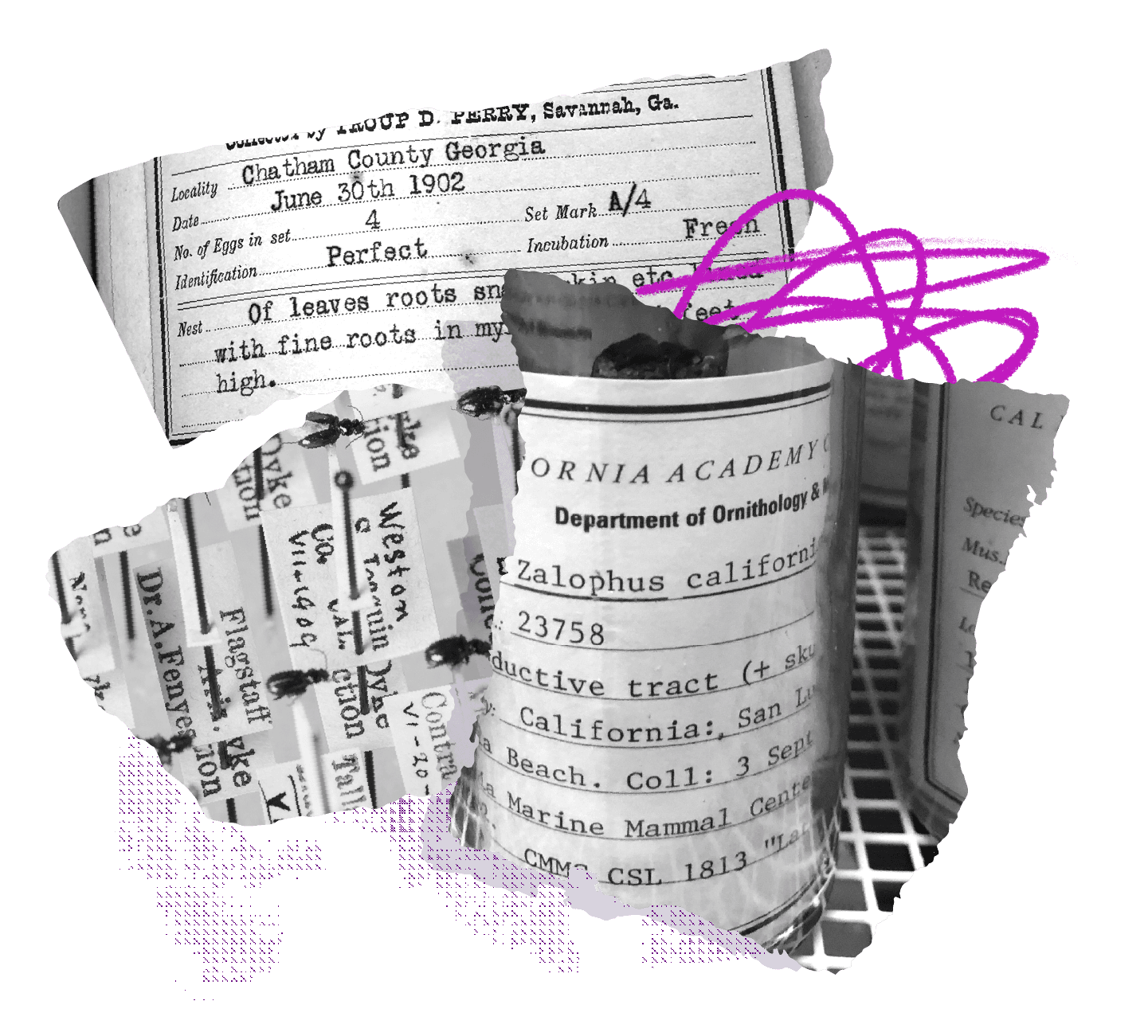
FIG. 3 — Specimens found during the visit to Cal Academy.
Eventually we found our way to the entomology section (the study of insects), where Entomology Collections Manager Chris Grinter showed us a cabinet of specimens awaiting cataloging. In an institution this large, similar to the function of a very large library, it sometimes takes decades just to get around to identifying and filing a particular specimen in the right spot. It was in this cabinet the curator produced a box of newspaper scraps, each carefully folded into a sort of origami packet, sealed with a small piece of scotch tape. Left unopened since the 1960s, he began to open each of them, from which would fall a paper tag, and (in this case) a package full of dead insects. Turning over the paper label, we saw the typewritten description of which insects these were, where they were found, and by whom. The person who found them is apparently one of the most prolific Academy-related entomologists of his era, Mr. Paul H. Arnaud. Many of the insect specimens in their collection were caught by him, and apparently these newspaper scraps being provided by him came as no surprise to the Academy’s staff.

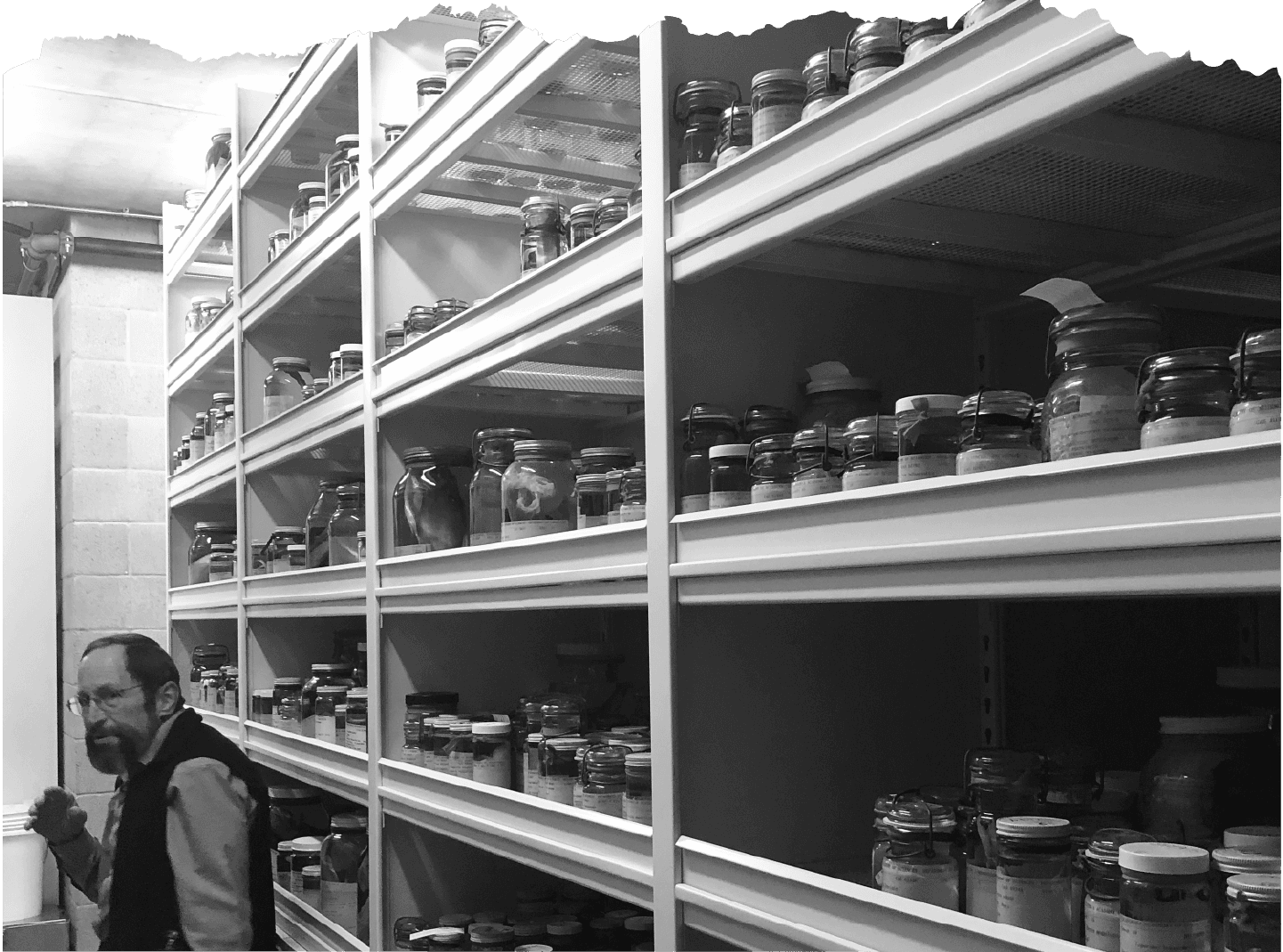
FIG. 4 — Ichthyology Sr. Collections Manager Dave Catania

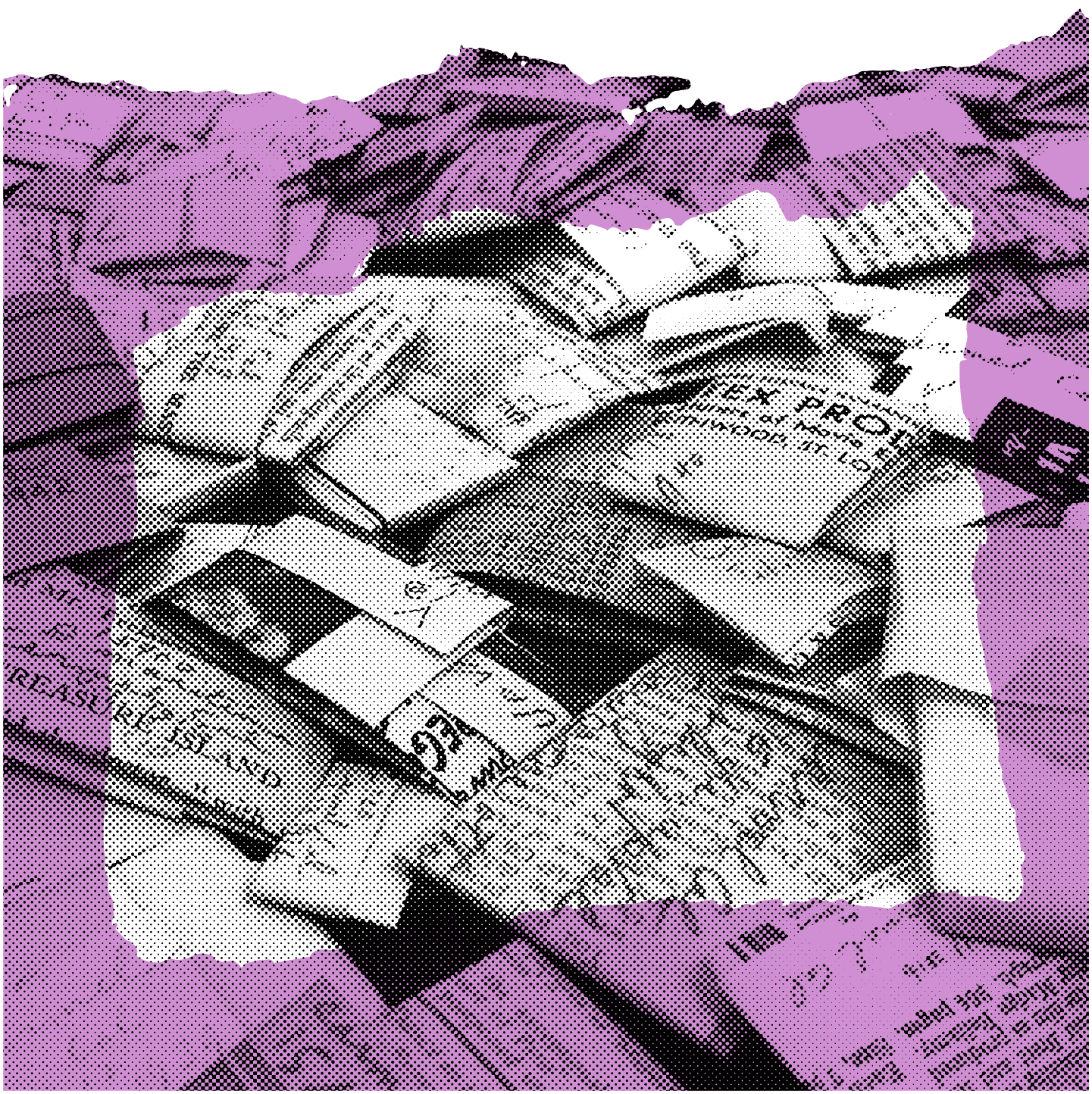
FIG. 5 — Folded paper wrappers from the special collections.
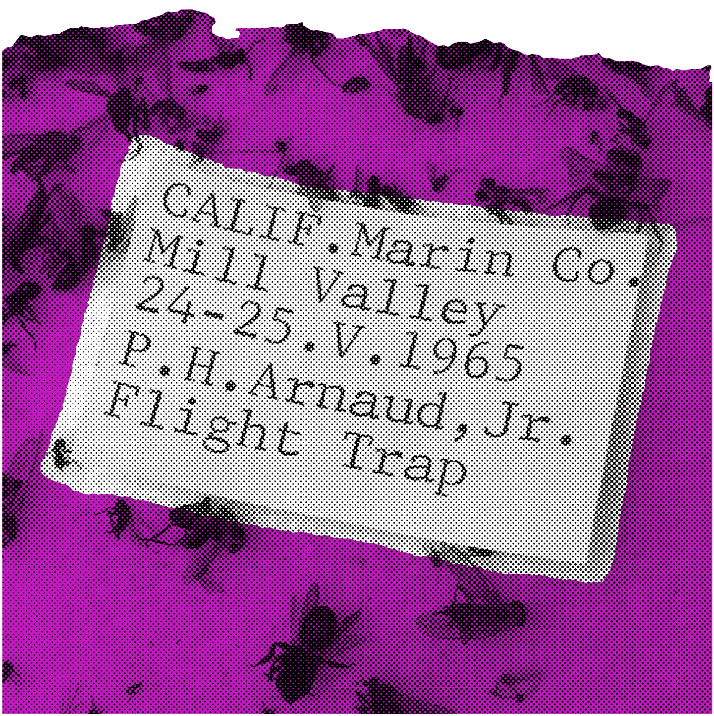
FIG. 6 — The typewritten label that inspired Bezzia.
We saw so many intriguing letterforms on the visit, which lasted several days. We documented letters embossed in metal, old handwriting on ledgers, and even some obscure decorative metal type samples on the pages of a massive oology tome. Oology, I learned, is the study of eggs.
When I got home and reviewed the thousands of photographs we had taken on our cellphones, it ended up being the typewritten label accompanying the insects that stood out to me. I had never seen that particular typewriter face before, and I was intrigued by some of the characterful details it included. In particular, the letter 'a' had this funny, unusually characterful stance to it. In place of a traditional 'termination' at the top of of the 'a,' this design seemed to just have a big ol' hook, that dangled down. It had a sort of ... casual tone to it, while remaining very functional.
I wondered; was this the intent behind this 'a' drawing? Or was this something that happened coincidentally when the original idea of the typeface was coated in ink and crushed into a tiny paper label?
Typewriting has a way of turning subtle details into blobs of ink, and much of the subtlety of a typewriter typeface is translated by the medium, becoming rounded and blobby. These imperfections are so prevalent that many contemporary typewriter-inspired fonts try to mimic the printed result, rather than the original intent. I saw these letters a bit differently, and created a self-imposed brief: What if I were to imagine that the original design HAD intended for the 'a' to be casual, cheeky and characterful? And without consulting a specimen of this typewriter typeface, what if I took these forms on the paper tag as inspiration, and imagined the rest? What if I presumed the rest of the design had these sorts of details, too?

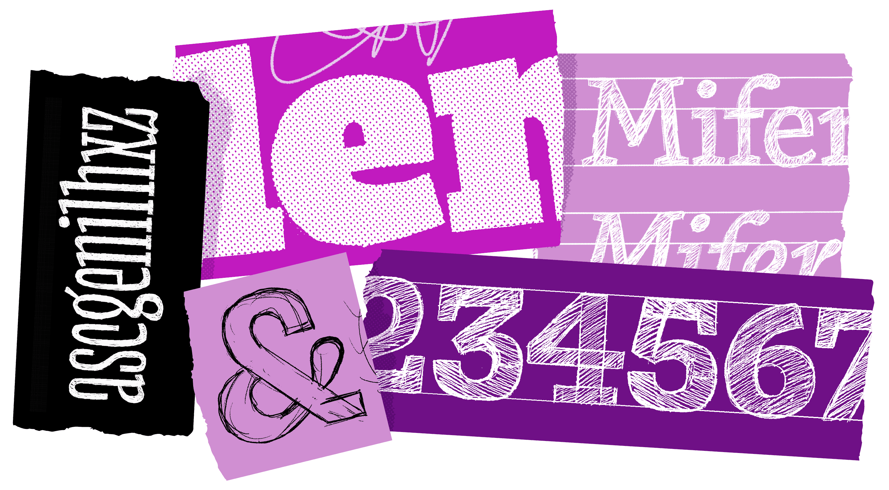
FIG. 7 — Process sketches by Riley Cran.
Whereas with most typeface projects I begin with a huge phase of research, tracking down any relevant specimen I can, I purposefully didn't seek to find out what typewriter typeface this was that I was taking inspiration from. I knew that part of the fun was to imagine what it must look like, from this limited selection of letters, and I wanted to arrive at a result of my own, making assumptions and using my instincts as I went. I loved the lowercase 'g' on the printed tag, where the connection of the bowl and tail was sort of vague, almost like it could be one continuous shape. During our stay in SF, I bought a copy of Bruce Kennet's book on the legendary lettering artist William Addison Dwiggins, and found a drawing of a 'g' inside that seemed to do just that - a gradual connection between bowl and tail, rather than an abrupt one. So I took that as a sign, like a 'yes — and' improv for my process; this new design could have a 'g' like that too.
The 'squared out' superellipse curves of the 'c', and its dangling 'sans serif hook', were easy to imagine in the context of an 's' and 'a' drawing. So I drew those too.

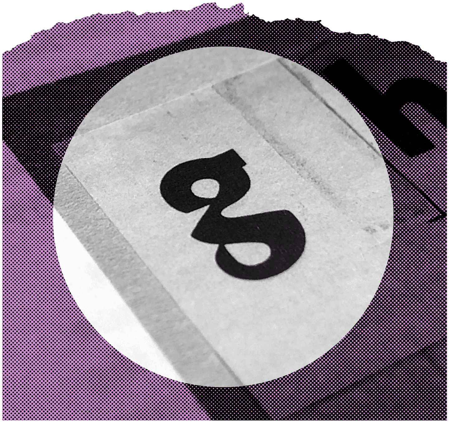
FIG. 8 — W. A. Dwiggins' drawing of a lowercase 'g' in his Metroblack typeface, couresty of Bruce Kennet's book: W. A. Dwiggins: A Life in Design


Eventually through my drawing and experimenting with these details emerged a theme; lots of mechanical, systematic details, punctuated in almost equal measure by organic, round details. Things that seemed machine-made and 'perfect', interspersed amongst things that felt human and handmade. This new design had a rhythm, like someone sitting at a drum kit, the sequence of beats making a set of words seem to dance. There was a tool kit of shapes to work with, and any time I felt I was in a bind, with a letter feeling too dull and not 'alive' enough, I could reach for those organic shapes found elsewhere. The repertoire of shapes in this design seemed to give itself permission to be overly rational in some moments, and expressive in others. I was connecting dots, more than inventing the wheel.

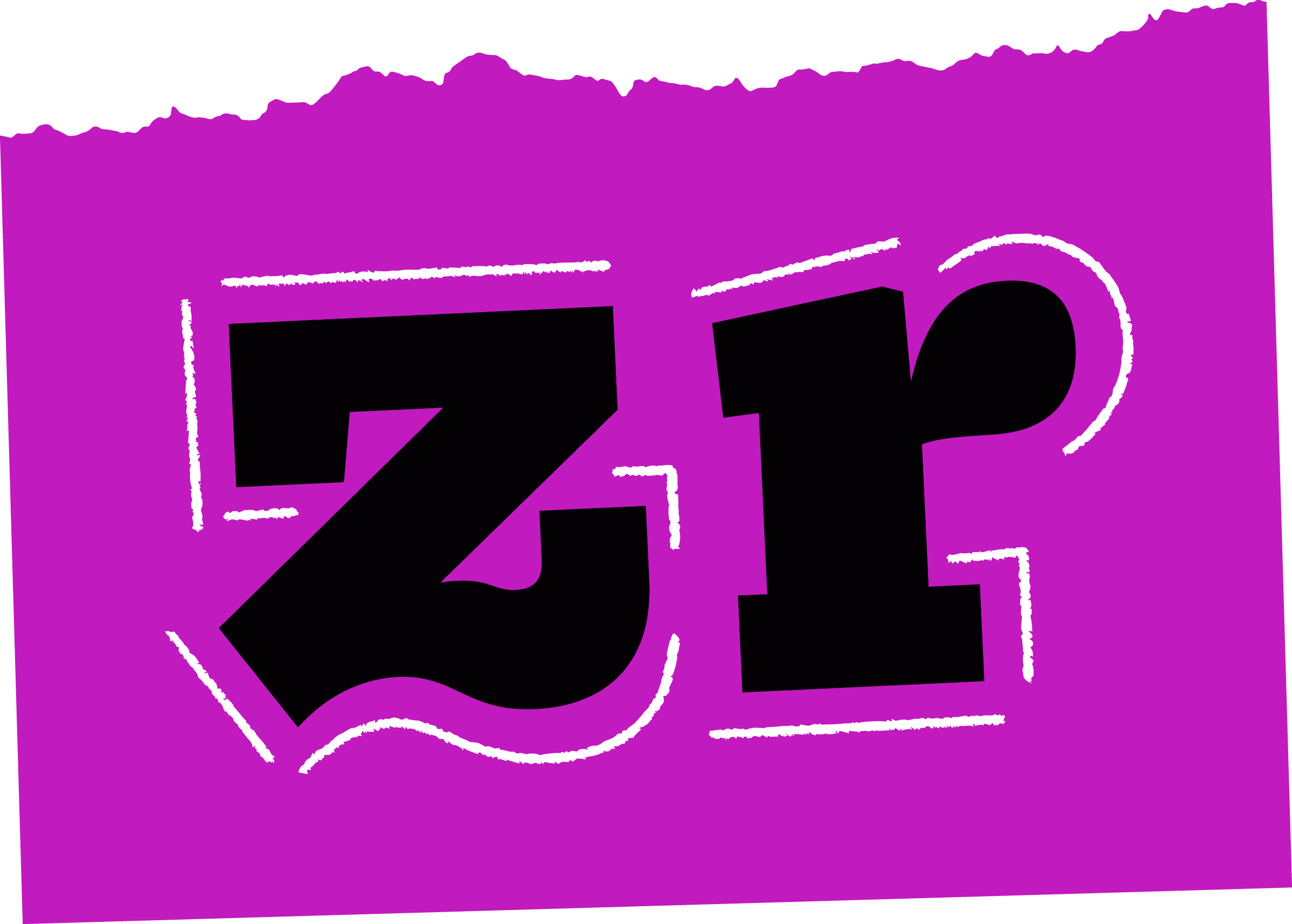
FIG. 9 — We think "z" and "r" show off the juxtaposition of mechanical and organic details nicely.
Drawing the boldest variation of something is always one of my favourite parts of the process. There's a real challenge to making letters feel 'natural' despite their absurd density at that end of a type family, and I enjoy the challenge. One detail I have observed over time, particularly in Slab Serifs, is the tendency for bold weights to 'leave out' one serif on letters like 'h' and 'n', in order to keep the counter space open. As Bezzia gets bolder, it will forget a serif here and there, to improve the reading experience.
The capital 'C' and 'S' mimic the lowercase construction, bringing some of the casual tone into the capital drawings. A serif design often has some kind of distinct termination on these letters, but this design just doesn't. They are effectively sans serif letters, quietly hiding amongst the serif ones.


FIG. 10 — A specimen showing all the styles of Bezzia.
I pushed the x-height of the letters taller, and found the various expressive details handy in this bolder end of the family, they helped me draw myself out of tricky challenges, just as they had helped the reading rhythm of the 'regular' weight. In this way I often feel that typefaces are like puzzles, which I am meant to solve. Rather than a finished crossword or a checkmate in chess, the result is, itself, a tool.
I enjoyed leveraging the repertoire of shapes into the number designs, including lining figures, old style figures, 2 styles of enclosed figures, and fractions. The arbitrary fractions in Bezzia make use of a 'split bar' construction, which makes them a bit more sparkly and a bit more interesting, even in the typographic details that are often considered more 'functional' than 'fun'.
I found a fun way to get the shapes working together in the ampersand. I'm always excited at the outset to draw an ampersand, but I find myself pulling my hair out by the end of it. I liked the fun construction of this one, allowing the 'hook' to shine through as it does in the lowercase.


Dave Bailey and Heather Cran did a beautiful job adding language support to Bezzia, letting the design speak more than 100 languages. Amongst my favourite words to proof is 'alþjóðleg' (Icelandic for 'international'), as the word happens to use both of the Iceland-specific glyphs in the character set (the thorn and eth).
Naming a typeface is a fun challenge. Digital typefaces are comprised of Bézier curves, a mathematical formula for describing curvature, named after their inventor Pierre Bézier. The original insects which the paper label accompanied were from the Diptera order. How fitting, then, that we would learn of a genus within Diptera called 'Bezzia,' a perfect name for this new slab serif.
During the design process, my wife and I became interested in the 'true crime’ documentary craze, and found ourselves watching shows like The Jinx and Making a Murderer. One of the primary reasons I am interested in these series is the frequent enlarged scans of newspaper headlines, typewritten documents, and other ephemera with letterforms that tend to be shown alongside the story unfolding.
Every now and then I would see some typewritten text flash across the screen and say to Heather “I think that's the typeface from that label at Cal Academy!” Eventually I decided, Bezzia having been finished, that I should find out which typewriter face it was that P.H. Arnaud had used and I tracked it down; the (evidently once very popular) IBM typewriter face called Prestige Elite, designed in 1953 by Clayton Smith.
](/_next/image?url=https%3A%2F%2Fcdn.sanity.io%2Fimages%2Fblwjvcya%2Fproduction%2F696fceab7d637d91252d293272c82adbaee78989-1441x902.png&w=3840&q=75)
FIG. 11 — Samples courtesy of our friends at Cambridge Typewriter

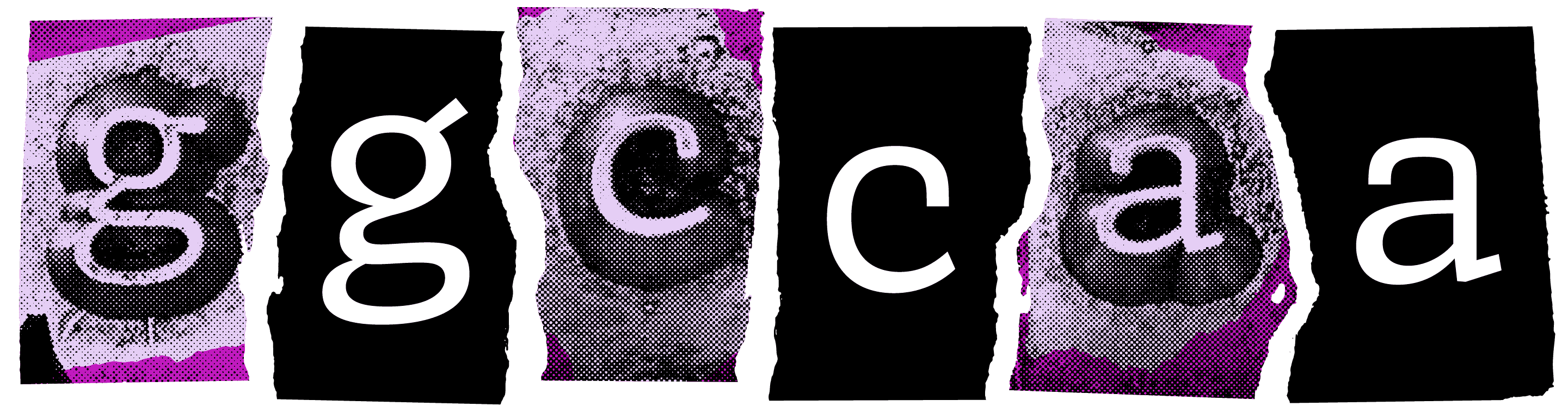
FIG. 12 — Comparisons between the Prestige Elite typeface, and Bezzia.
Once I found a specimen of Prestige Elite, I couldn't help but smile as I looked at the details. The 'hook c' wasn't quite the same shape that I had eventually drafted for Bezzia. The 'g' didn't do that 'bowl to tail as one shape' thing at all. In fact, virtually no details are shared between the two. One typewritten label, wrapped up next to some dead flies for 50+ years, was a key into a larger process; something for my brain to make assumptions about, and run with, towards a new creation with its own voice.
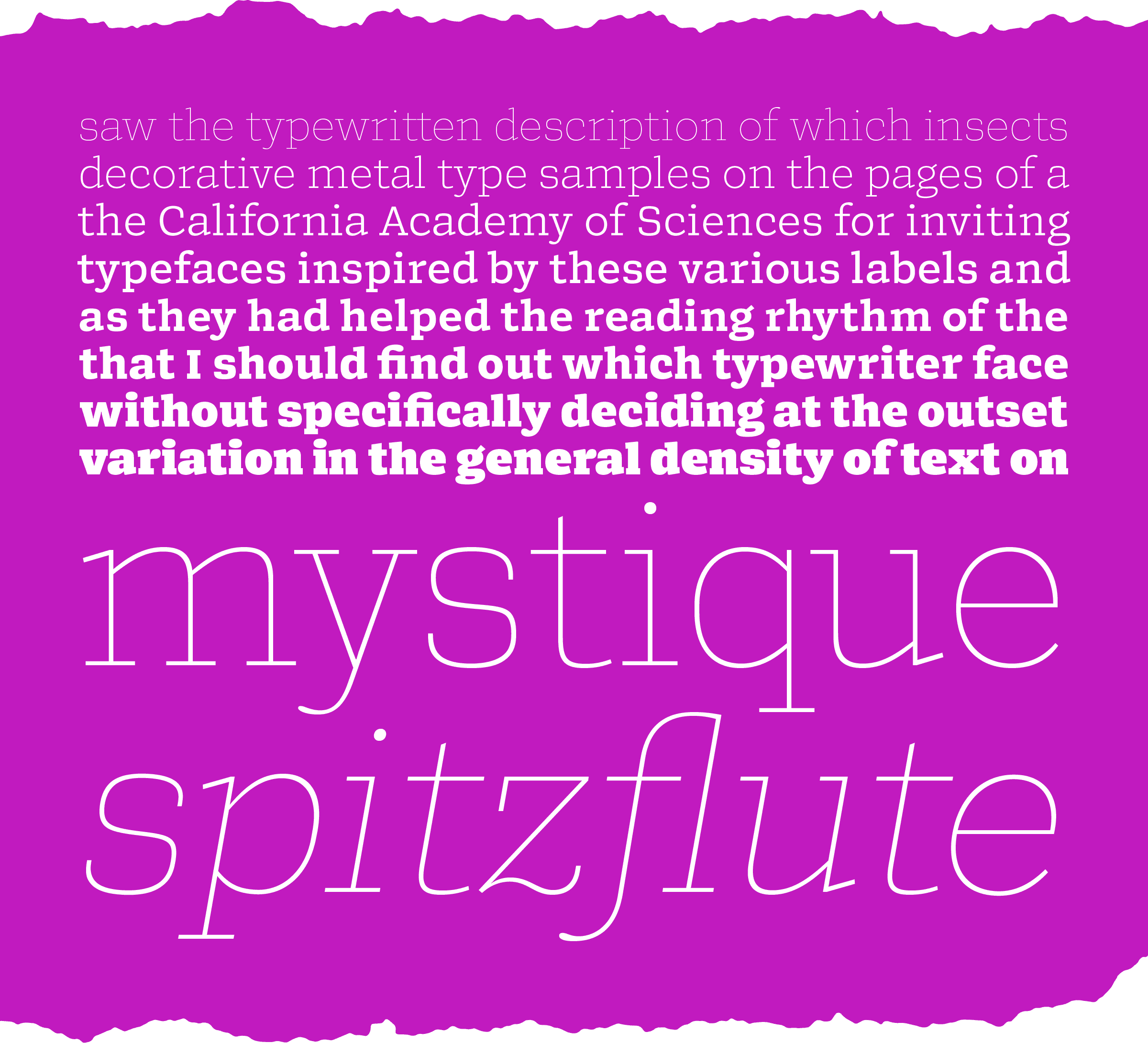
We are proud to introduce Bezzia, and we can't wait to see how you use it in your design work. See it in action for yourself.
Myself and my colleagues are very thankful to everyone at the California Academy of Sciences for inviting us to visit. It was a chance to see something that few are ever able to, and it is not something I will soon forget. For more information on the Academy, visit their website!

Buzz Worthy
Bezzia is a natural selection for your next project.
We made this for you.