Custom Fonts For


A LETTERMATIC CASE STUDY: THE HOME DEPOT

At Lettermatic, we’re always impressed by brands who ask the most from their typefaces. Great typography that spans physical locations and digital presence is no small feat, and requires both a skilled team and excellent typefaces. When The Home Depot approached Lettermatic for custom typefaces, we were excited for the opportunity to create a toolkit of fonts that works as hard as the beloved DIY brand.
Information
- Released:March 2026Classification:Grotesque Sans № of Styles:70№ of Widths:4№ of Families:2Director of Brand Design & Creative:Matthew JansickTypeface Director:Riley CranTypeface Designer:Danelle CheneyCase Study Design:Lauren DickensCase Study Editorial:Jane Solomon and Danelle Cheney
Lettermatic created two custom typefaces for The Home Depot. We like to think of these designs as cousins. While they pair well together and speak the same visual language, they are purpose-built for very specific roles within the brand’s large presence. Together, these two type families have 7 weights, 4 widths, speak over 200 languages, and include several custom features that makes the day-to-day typographic work of The Home Depot’s talented team more seamless.

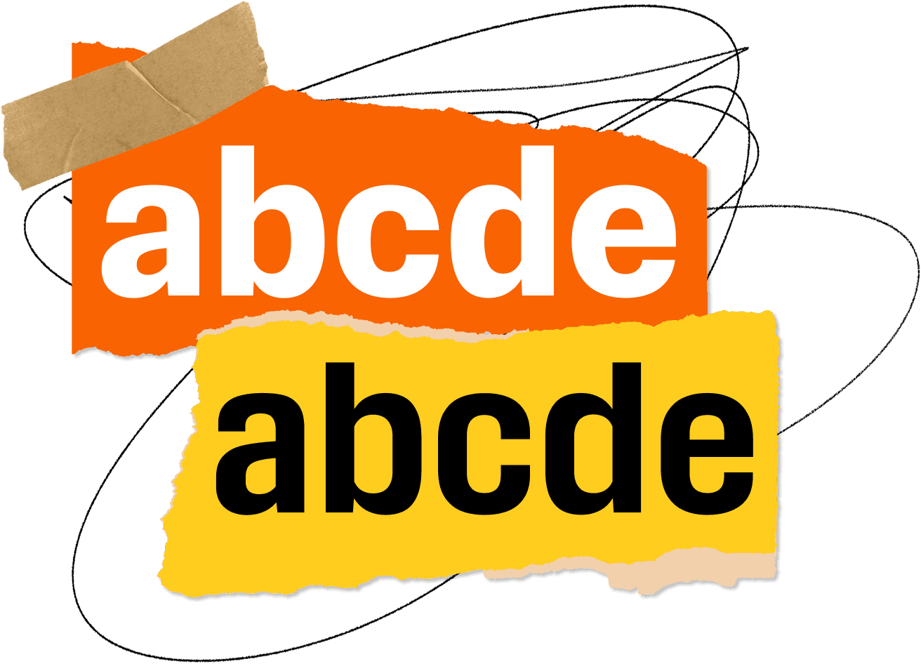
FIG. 1 — Sawdust (above) and Sawdust Display (below), the two typefaces Lettermatic created for The Home Depot team.
Lettermatic’s work with The Home Depot kicked off when Matthew Jansick, Creative Studio at The Home Depot approached Riley Cran about creating custom typefaces. In the pursuit of asking the most of a typeface that any brand can, the design team at The Home Depot wanted a new typographic look for their multinational brand with features tailor-made to their brand voice. With countless touchpoints that include in-store wayfinding signs, price tags, printed catalogs, apps, a vast web presence, it was clear that what Lettermatic built for The Home Depot had to be both extremely hardworking and flexible to span the entirety of the brand’s needs.
The Home Depot was the perfect candidate for a custom typography solution due its reach and myriad typographic applications. Here at Lettermatic, we were excited to jump in and start making functional and beautiful fonts for this distinguished household brand.

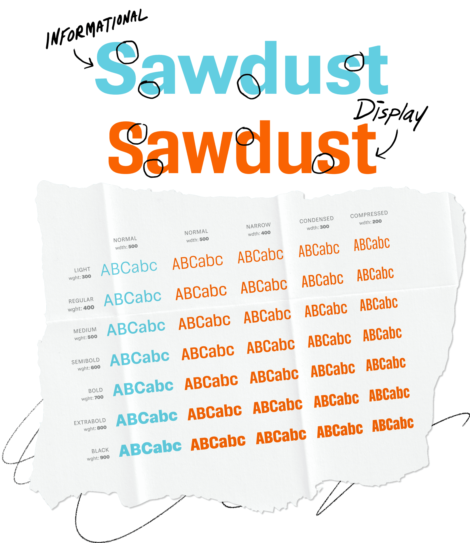
FIG. 2 — Sawdust and Sawdust Display shown across a range of widths and weights.

In any Lettermatic custom typeface project, our first step is to determine scope based on brand touchpoints, along with the types of reading the brand is asking of their audience. We call these ‘reading modes.’ In order to determine a brand’s reading modes, we ask ourselves questions such as: How large is the typography in the physical space? How far away is the reader from the typography? How much text is the reader navigating in one interaction?
Riley Cran and Danelle Cheney, typeface director and typeface designer respectively, identified three reading modes for The Home Depot’s brand typography, both in the physical world and in its digital presence: large point sizes read close up, small point sizes read close up, and large point sizes read from far away.

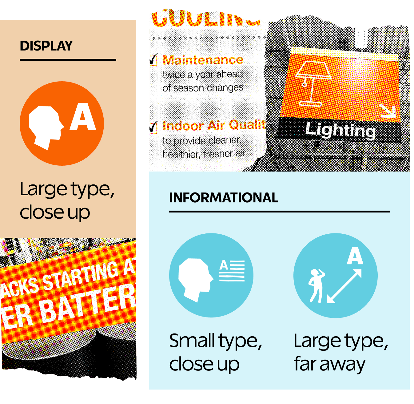
FIG. 3 — Distinguishing reading modes is an important part of Lettermatic’s process so that we understand the contexts in which the typefaces will be used.

Within these three reading modes, two of them are more similar functionally than might appear at first glance: small point sizes read close up, and large point sizes read from far away. Both of these reading modes require the viewer to distinguish type at a small size, with the only difference being physical location in space. Imagine racing through an airport to catch a flight: the wayfinding signs you can see down a corridor are small at a distance, and delivering critical information to you. You’ll want to read these signs fast, with no stopping to investigate if that character is a “B” or an “8”.
The same goes for a brand like The Home Depot, who needs to be able to share technical specification details quickly and easily with their audience (”Is that a style B, or style 8?”). From this, we knew that the custom typefaces for The Home Depot needed to include a hyper-legible workhorse family that would serve these two modes: small point sizes read close up, and large point sizes read from far away.
The final reading mode, large point sizes read close up, serves a different purpose for a brand’s audience. This is where brand voice and character is paramount: eye-catching advertisements, seasonal graphics, posters, large headlines on a page for hierarchy, and in-store standing display banners. Because of this, we knew that the custom typeface brief for The Home Depot also needed to include a characterful brand voice that felt distinctively Do-It-Yourself. Satisfied that two typefaces could serve all the necessary reading modes, Lettermatic and The Home Depot agreed on the custom typeface brief: one distinctive typeface for displaying brand voice (the first reading mode), and one workhorse typeface for cases where information was the top priority (the second and third reading modes). We referred to these throughout the process as the display and informational designs.
The Home Depot’s first custom typeface, officially named Sawdust Display, is for large point sizes read close up. You’ll see this typeface in headlines on The Home Depot website, app, and in printed materials like catalogs, on packaging, display banners, and as eye-catching titles for seasonal campaigns.
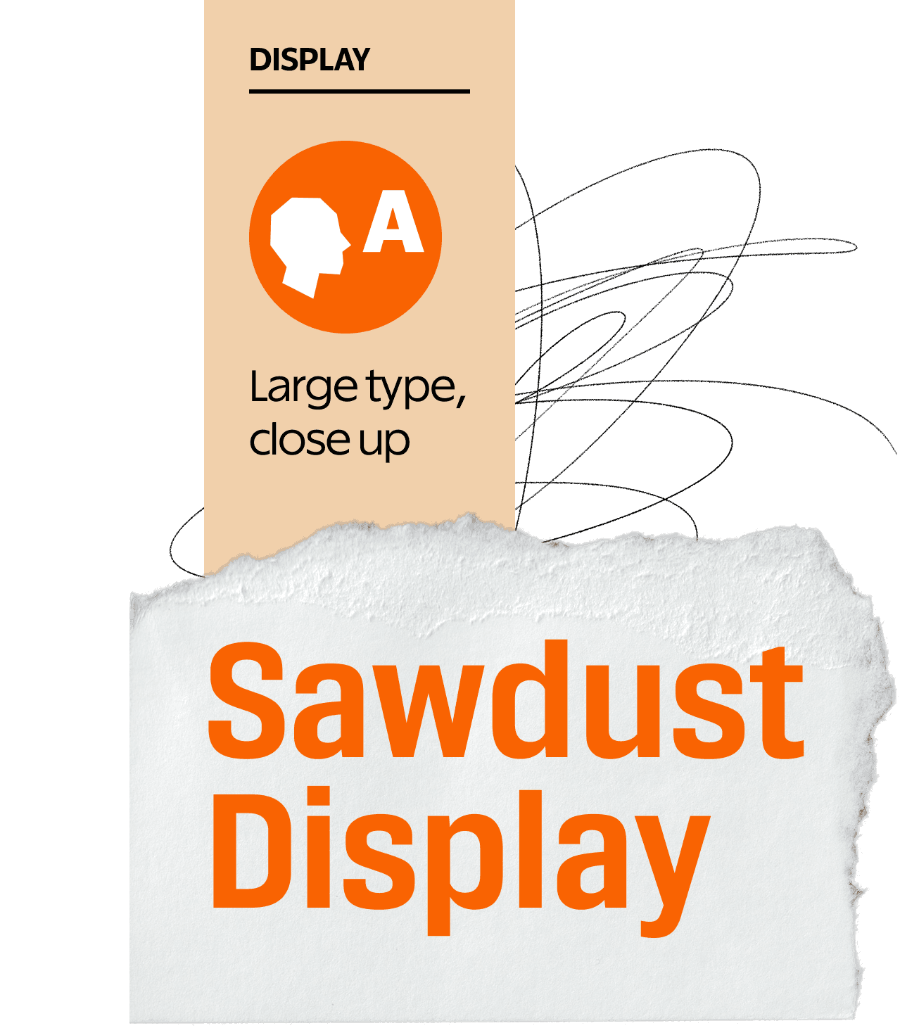
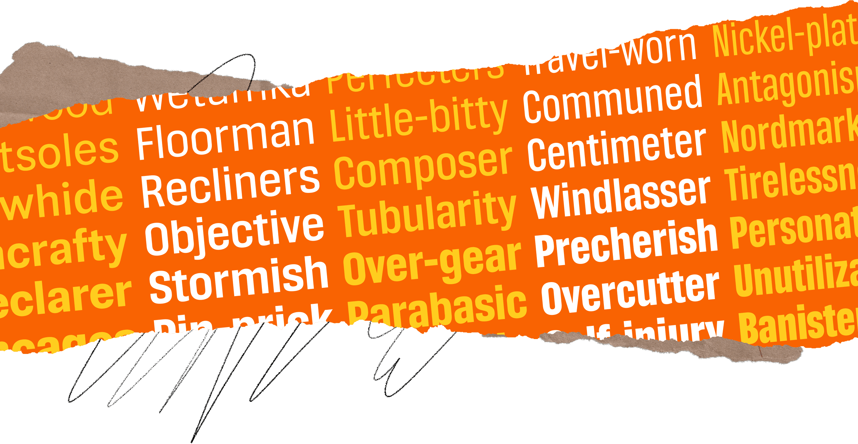
FIG. 4 — Sawdust Display, intended for headlines, advertisements, and eye-catching brand typography for the first reading mode Lettermatic identified for The Home Depot: large point sizes read close up.
The Home Depot’s second custom typeface, named Sawdust, is meant for small point sizes read close up and large point sizes read from far away. You’ll find Sawdust in body text online, in printed materials like catalogs as descriptive product paragraphs, and other small print throughout the brand experience. Sawdust was also designed to be extremely legible on wayfinding signage in stores (maximum readability when seen at a distance), along with detailed text on other in-store signs.
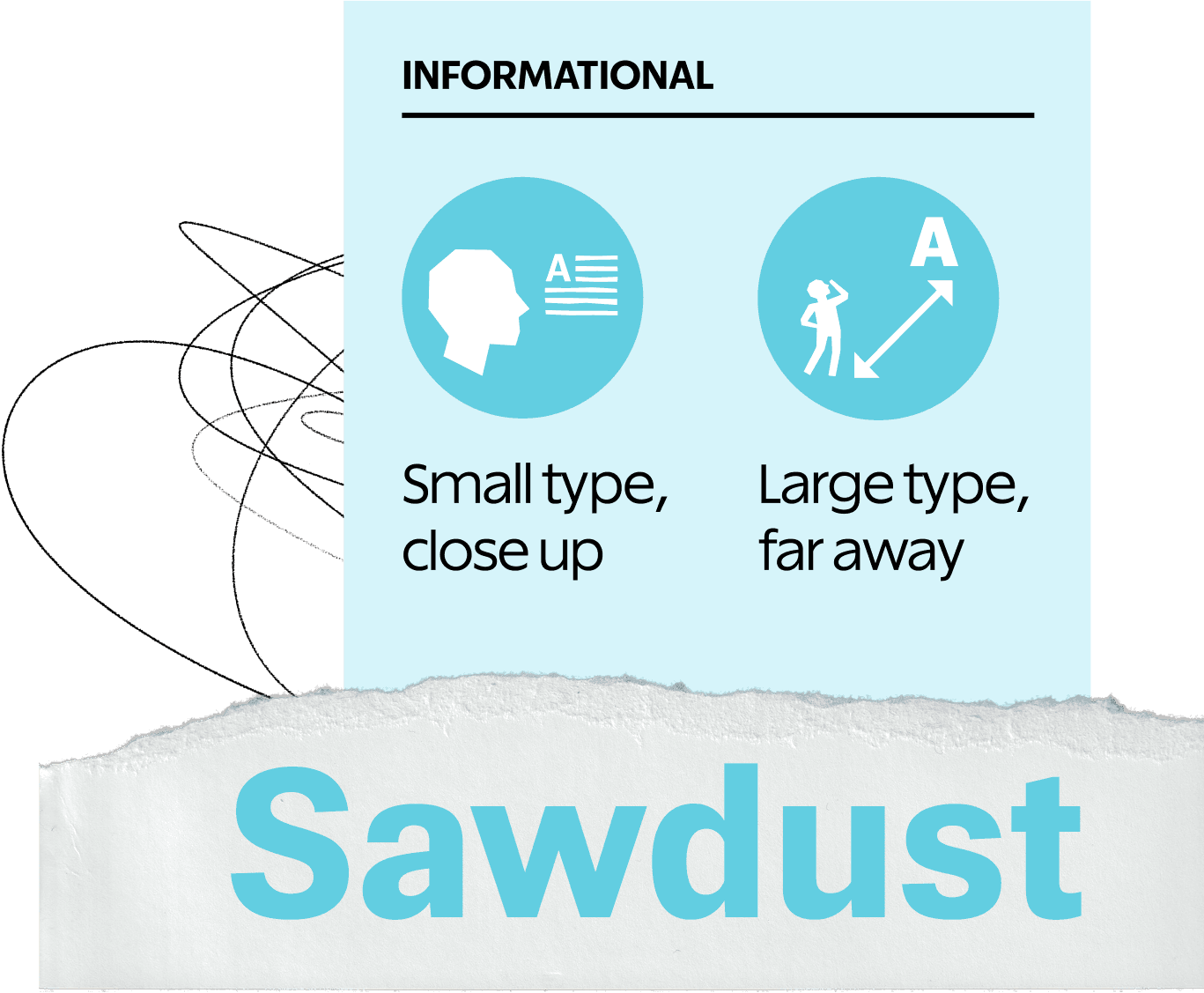
FIG. 5 — Sawdust, meant for long form body copy, descriptive web text, and in-store signage seen at a distance for both the second and third reading modes Lettermatic identified for The Home Depot: small point sizes read close up, and large point sizes read from far away.
The Home Depot brand has a well-earned reputation of being solid, sturdy, and dependable. Riley and Danelle wanted to ensure this established tone carried through the custom typefaces they created for everyone’s favorite DIY superstore. Aside from their famously stenciled logotype, the aesthetics of Home Depot’s typography fall firmly into the tradition of grotesque letters. The grotesque type genre is considered rational, a typographic term referring to letters that feel like they were constructed with a ruler and precise measurements, rather than by a spontaneous human hand.
The earliest grotesque letters were created by designers who literally cut serifs off existing designs in the late 19th century. They gained their name due to their strangeness in the typographical landscape of the time: readers of the time thought these new letters looked disgusting, or grotesque. Over the years, grotesque letters evolved into what is now one of the most popular type genres in use. Modern audiences will recognize the name Helvetica, first released in 1957, as one of the most well-known exemplars of this genre. Other popular grotesque typefaces include Univers, and Folio, also released in 1957.

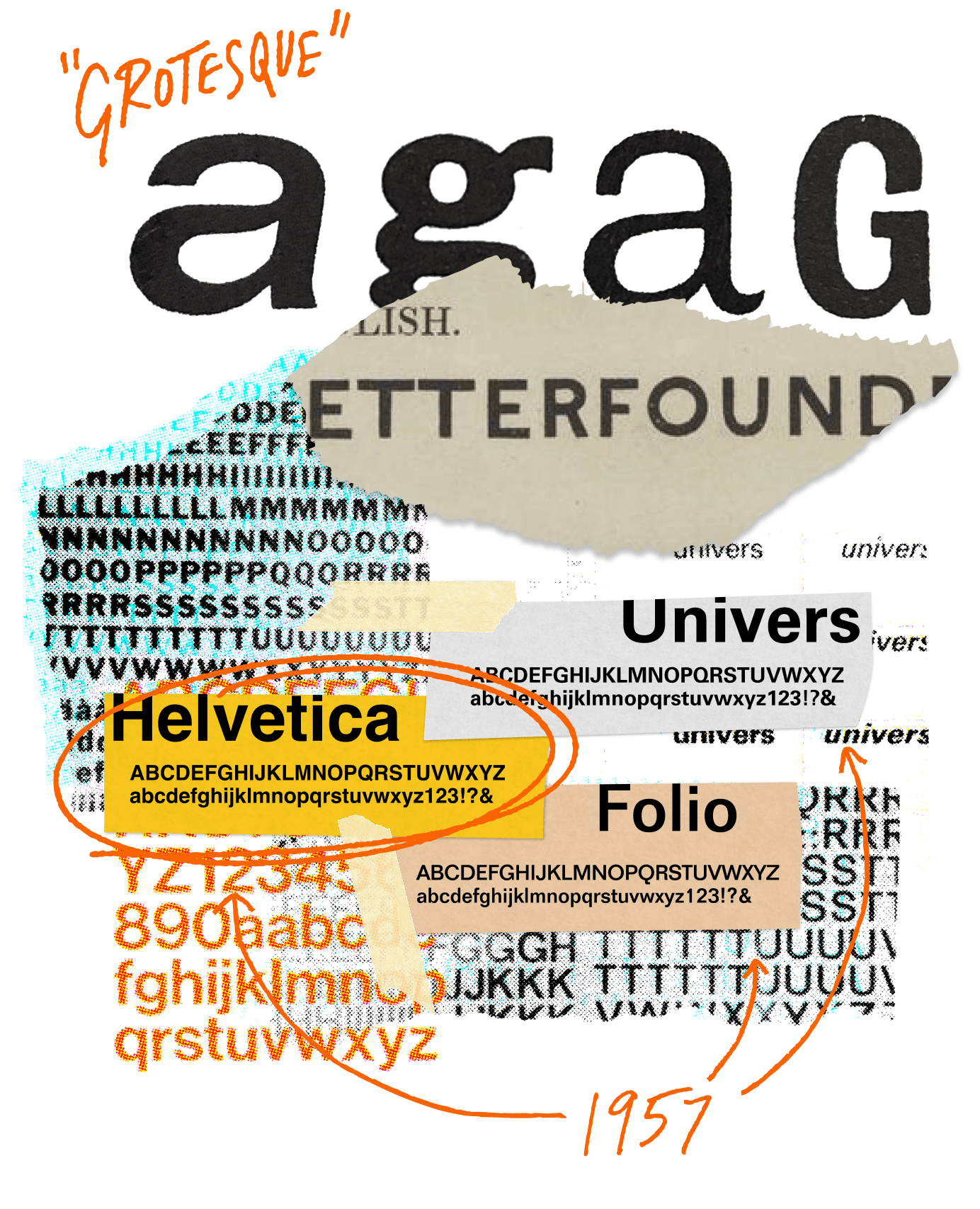
FIG. 6 — Examples of some well-known Grotesque typefaces.

Riley and Danelle’s process started with gathering inspiration from historical uses of grotesque letters. There were also field trips to Danelle’s local Home Depot to see what the typography was doing for the store, and to help us dream up ways in which we could add functionality and legibility to the brand’s type toolbox. Danelle conducted a thorough audit of existing uses and custom needs, combing through a huge collection of materials to review layouts and special characters The Home Depot used in their designs, along with the most commonly used styles and lockups.
The next step was the sketching phrase. Riley started this process by drawing a full alphabetic range of Sawdust (the hyperlegible informational style), and one style of Sawdust Display (the eye-catching display style). Danelle then took these initial drawings and ran with them, finishing up sketches and adding weights and widths for both styles. In the digitization phase that followed, Danelle expanded the character set, added language support, and built advanced features customized to The Home Depot’s needs.

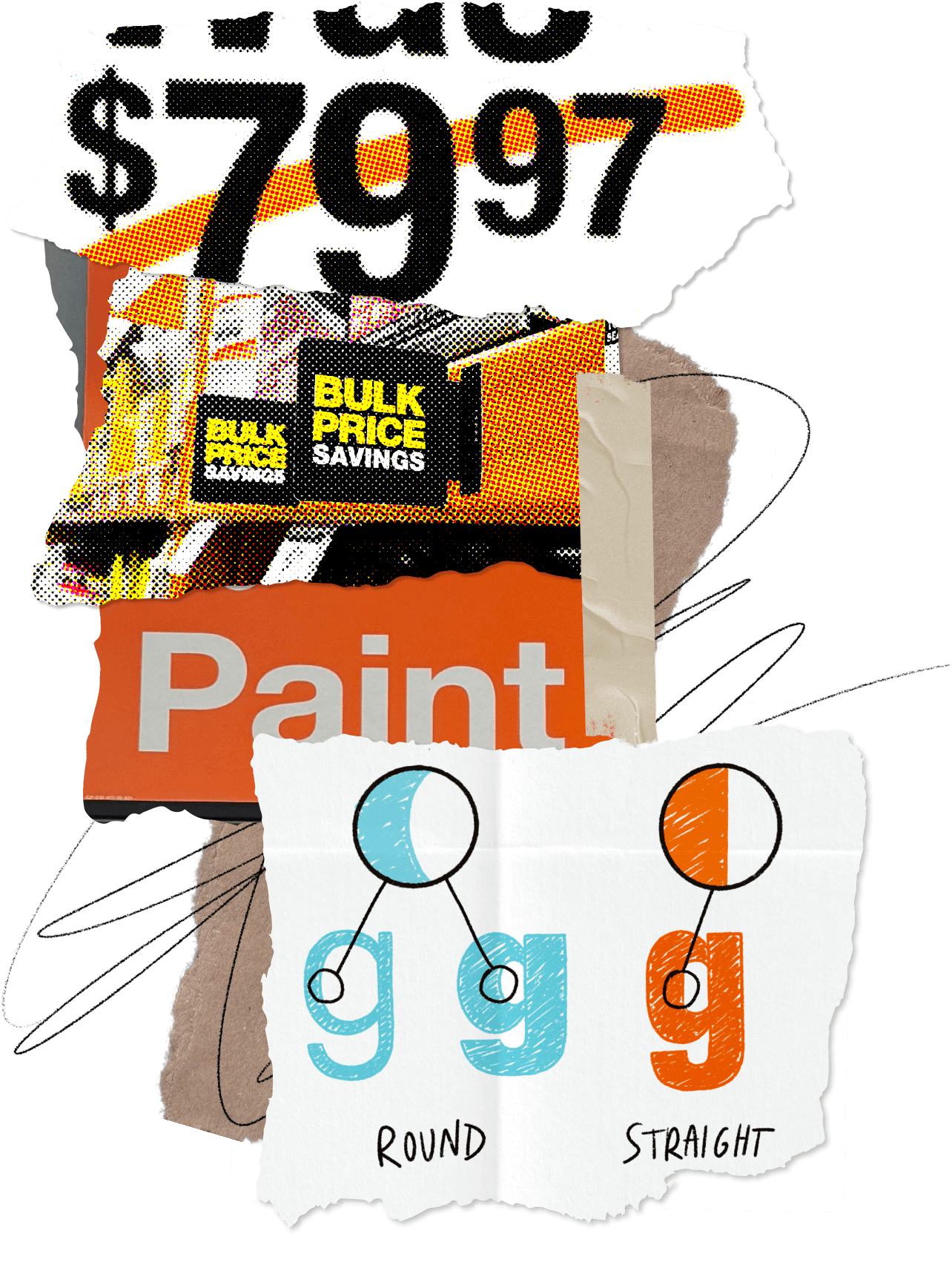
FIG. 7 — Lettermatic looked closely at The Home Depot’s design materials to ensure we were creating something useful and impactful for their team.

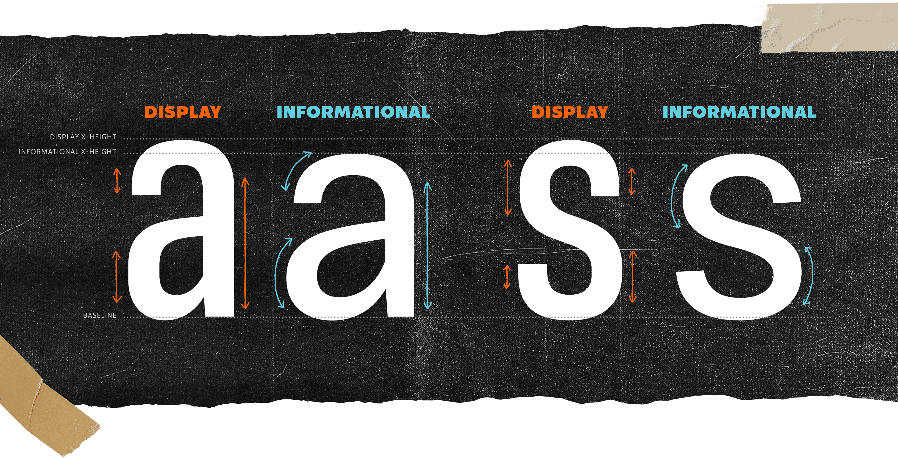
FIG. 8 — Although they share some DNA, the constructions of the Sawdust Display (the eye-catching display typeface) and Sawdust (the reading-forward informational typeface) are purpose-built for different roles with The Home Depot’s brand.
The two designs are cousins. They share some ideas, but they’re built from different components. Take for example the ‘a’ and ‘s’ in Sawdust Display versus Sawdust. The display style is generally made of more angular shapes and has a taller x-height, with larger flat segments built into the forms. The informational style is constructed of flowing, round shapes, has a wider body overall, and doesn’t include the flat segments like the display style.
These differences play an important role in the character and legibility of these two typefaces at their respective reading modes. The sides of Sawdust Display have straight segments in them so you can space the letters very closely to make eye-catching, brick-like headlines: an inevitable choice for the build-it-yourself brand. The lower x-height of the informational style, Sawdust, helps readers quickly disambiguate letters from each other to better process the information being presented at a glance, whether its close up at small point sizes or from a distance at larger point sizes.
An important feature in the brief for The Home Depot’s new typefaces from the beginning was variability. Lettermatic felt that these new type families should give the talented team at The Home Depot full access to the weight, width, and italic range of each design. This means the design team can always fine-tune the look and feel of the typefaces using sliders to visually pick the exact weight, width, and slant based on context. This functionality is especially useful, for example, when you’re stacking words in a brick-like layout and want all vertical sides of the words to align. It gives the design team at The Home Depot much more precise control when typesetting, compared to a limited number of weights and widths found in a typical font file.

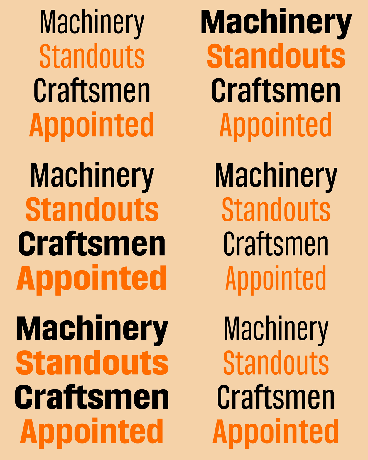
FIG. 9 — Sawdust Display shown in its range of weights and widths.
Aside from full variable ranges, The Home Depot’s custom typefaces include several features tailor-made for their needs. When auditing materials, Danelle and Riley noted that The Home Depot often uses a pricing and discount layout reminiscent of hand-painted price advertising with a larger number for dollars and smaller numbers for cents that are lifted off the baseline. In typical fonts, this styling requires a designer to size and format each element of these prices separately. After consulting with The Home Depot team on their in-house typesetting styles, Danelle built a custom feature in The Home Depot typefaces called smart pricing. This feature allows a user to type $9.95, activate smart pricing, and see both the dollar sign and 95 cents scale down and lift themselves off the baseline.


FIG. 10 — Lettermatic created custom features for The Home Depot’s design team that makes their day-to-day work lower friction, like these prices that automatically typeset themselves.
The smart pricing feature also includes commonly used offer terms, so a user can also type something like Up To 35% Off and the words will automatically resize and format as they type. Features like smart pricing can unify in-house typesetting, where the exact size and placement of the cents lifted from the baseline is built into the fonts themselves, rather than maintained across documents and manually verified in each layout. This sort of feature is very rewarding for Lettermatic to implement because it takes a common time-consuming task in the design process and makes it a breeze, allowing designers to focus on other aspects of the design work that require their dialed-in expertise.

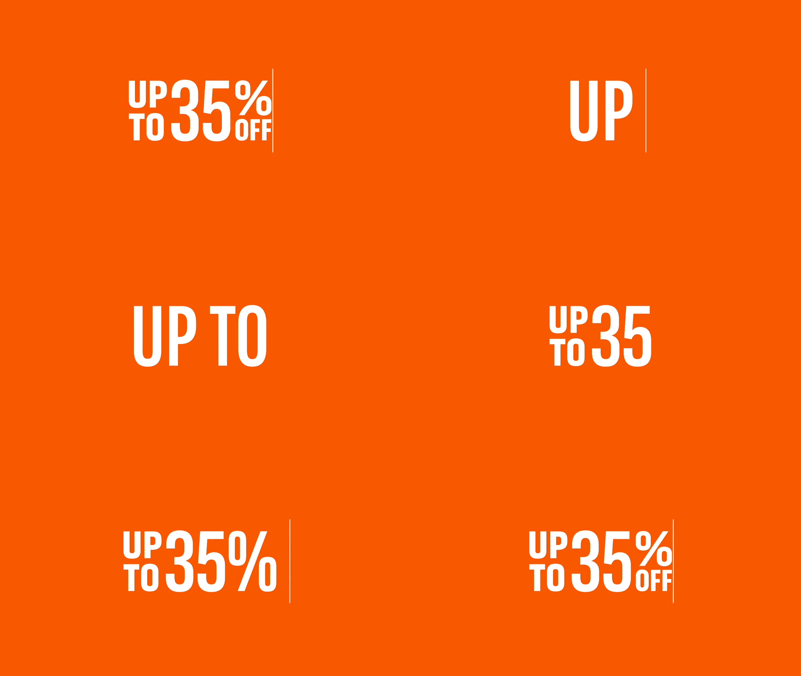
FIG. 11 — The custom smart pricing feature in Sawdust and Sawdust Display also includes special offer typesetting that automatically typesets in The Home Depot’s house style.
Danelle also added a custom feature which automatically adjusts the copyright and registered marks based on which letter they’re following. If a user inputs a letter without an ascender like a followed by one of these symbols, the mark positions itself at the x-height. If the user types a capital letter followed by the symbol, the mark will re-position itself at the cap height. These contextual symbols are another feature that are rewarding for Lettermatic to implement, because it allows the team using the typefaces to have a more seamless typesetting experience.


FIG. 12 — Small details like this contextually-aware copyright symbol go a long way to ensure execution remains consistent across a brand’s many uses.
In Lettermatic’s audit of The Home Depot’s typography uses, Danelle came across an assortment of custom glyphs used in long-form content for special offers. She wanted to be sure that these unique symbols were in easy reach of The Home Depot design team due to their frequent use, and wouldn’t require the teams to need supplemental symbol kits. This is another small change that can make a big impact for a team whose work is as far-reaching as The Home Depot’s.
Many of the team members at Lettermatic began their careers as graphic designers and understand what it is like to have a font in a brand kit that doesn’t include all the features or even glyphs you reach for every day in your work. We always aim to make custom typefaces that empower teams to do their best work. You wouldn’t send your best race car driver out on the track with a V4 engine; similarly, we want the creative teams we work with to have typefaces that perform at the highest level while they make world-class design.

Sawdust and Sawdust Display also include one of Lettermatic’s favorite features: a time-sensitive colon. When used in sentences, lists, and similar formats, colon symbols are aligned to the baseline, like the period. When a colon appears directly between two numbers, it looks best vertically centered against the numbers. The colon in Sawdust and Sawdust Display knows if it is being used to write a time, and simply centers itself vertically without any need for users to change the settings. Other special features built directly into the type families include punctuation alternates for all-caps typesetting, alternate zero forms with slashes for extra legibility in mixed-use contexts, dynamic fractions, and a full suite of tabular numbers with accompanying punctuation.

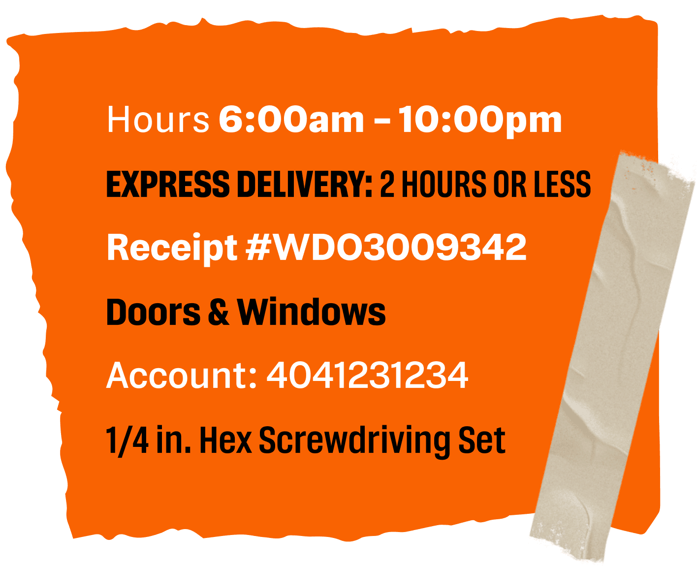
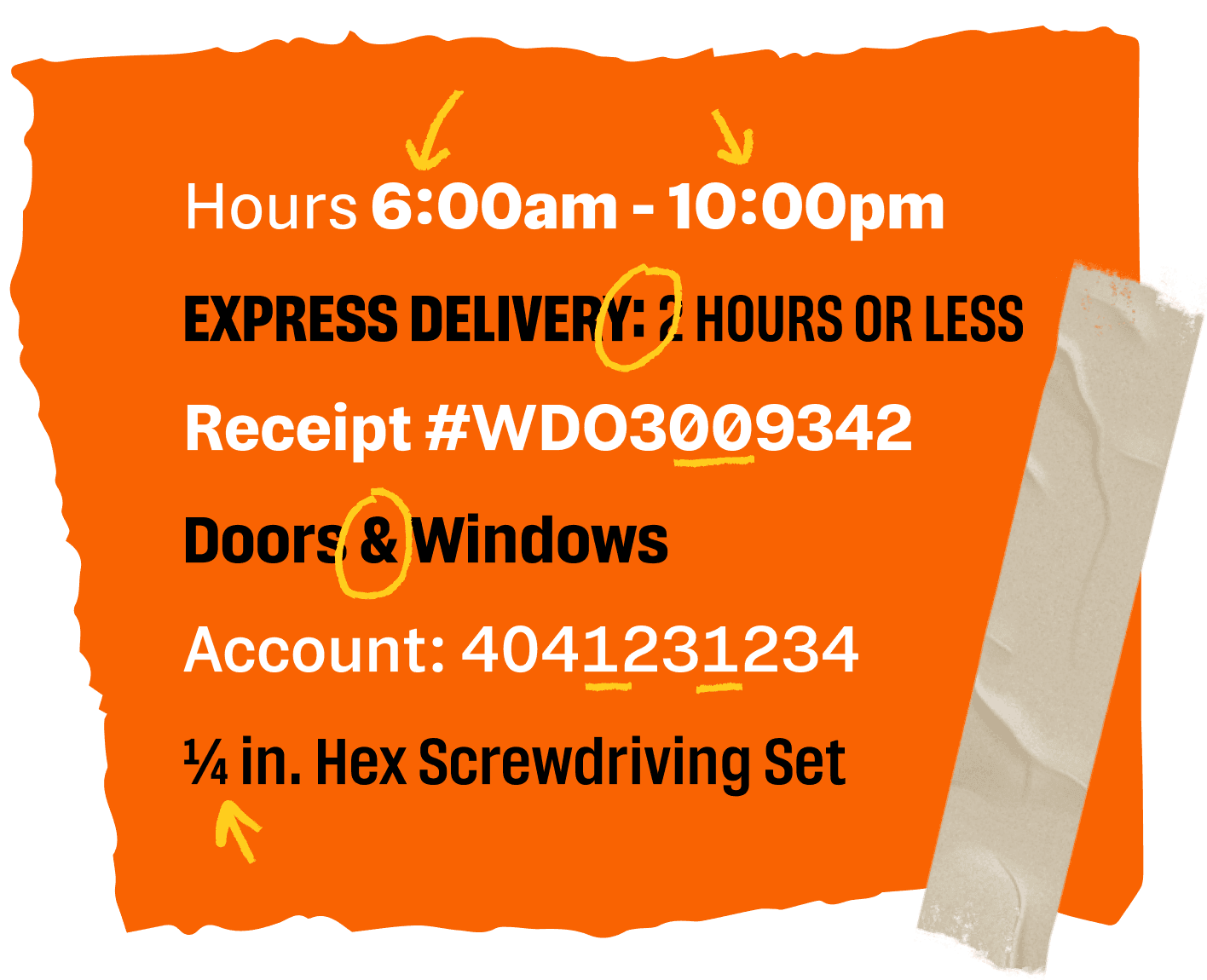

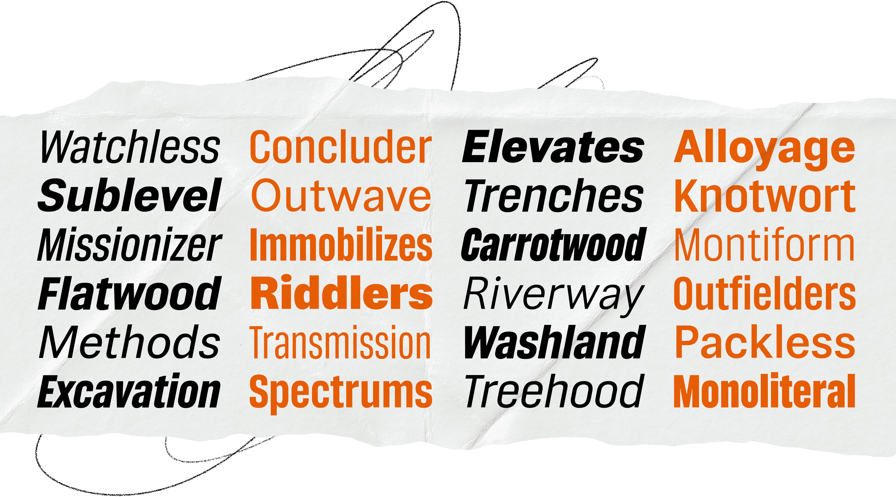
FIG. 13 — Sawdust and Sawdust Display work together to create a robust and adaptable typographic system.
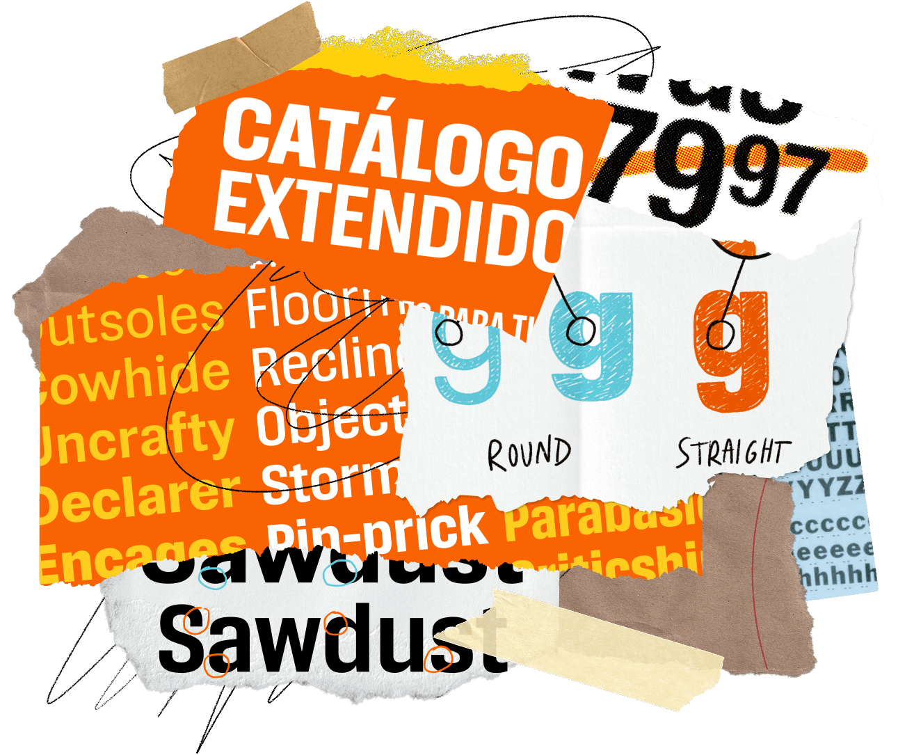
A final and very important feature of The Home Depot typefaces is comprehensive language support. Sawdust and Sawdust Display both speak over 220 Latin-based languages. The talented team at The Home Depot noted it was especially important that the typefaces support Spanish in order to successfully communicate with all The Home Depot’s customers. As part of our work, Lettermatic tested Spanish typesetting frequently throughout the design process to ensure that our goal of an eye-catching display family and extremely legible informational typeface extended seamlessly into Spanish-speaking content. Careful attention was given to the accent marks and punctuation used in Spanish to allow Sawdust Display to satisfyingly typeset like bricks in all-caps headlines no matter the language.


FIG. 14 — Consistency across all languages is crucial for a large brand like The Home Depot.

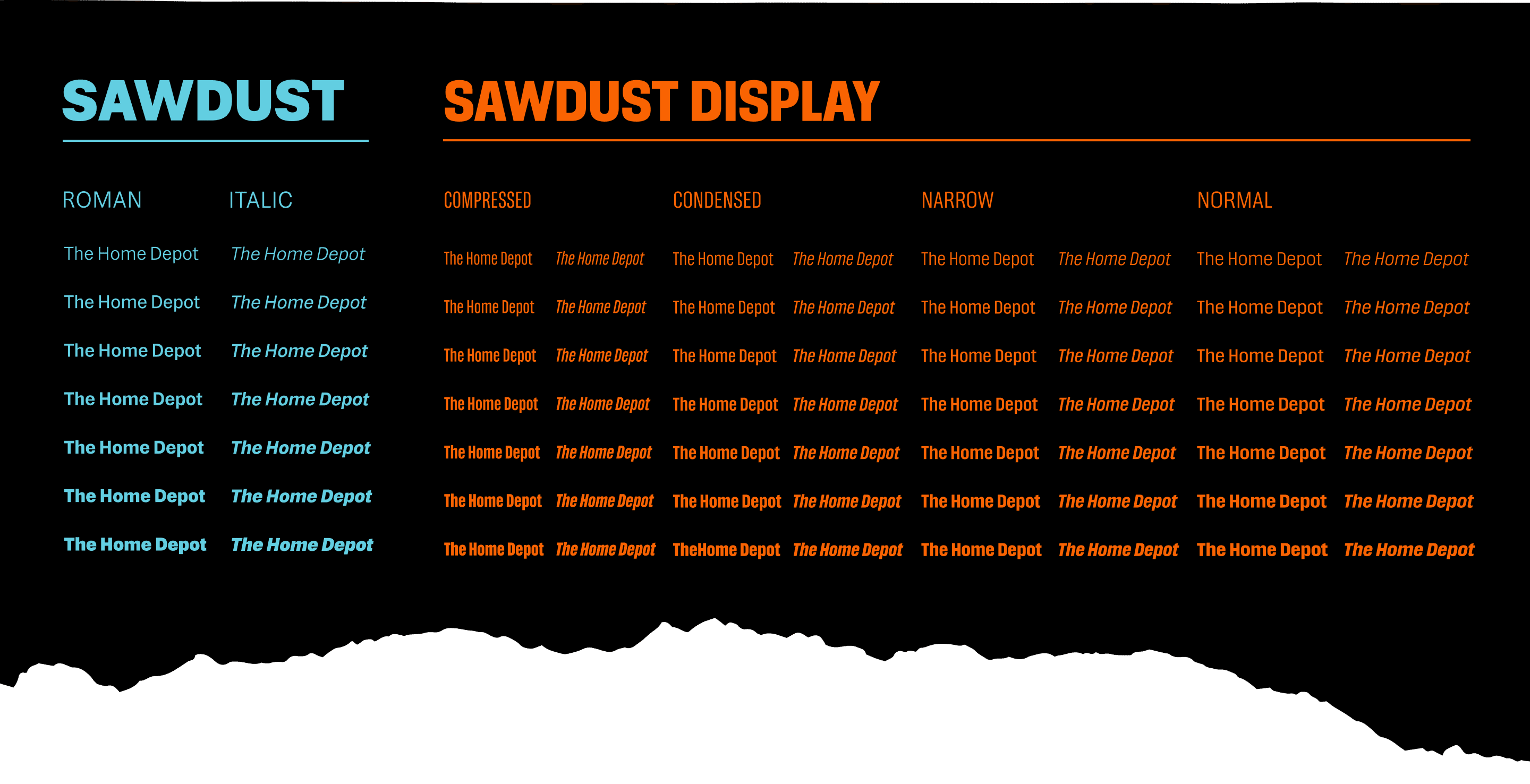
FIG. 15 — Sawdust and Sawdust Display across their full range of styles, including italics. Together, these typefaces include 70 unique styles in the static typefaces, with the variable families adding even more options.
By the end of our work with The Home Depot, the Lettermatic team created over 40,000 glyphs, carefully placed over 350,000 bezier points, reviewed 39,000 kerning pairs, and made many, many store runs for both research and personal DIY projects. Sawdust and Sawdust Display have a total of 70 styles in the static typefaces, with an even higher range of styles available through the flexibility of the variable typefaces.
Creating custom type families for brands who ask the most of their typefaces is one of our favorite briefs here at Lettermatic. It’s a joy to collaborate with our clients to understand their individual typographic needs, and deliver expert solutions that are functional, user friendly, and pleasant to read for their audience. We are grateful to Matthew Jansick and the entire creative team at The Home Depot for the opportunity to work with them to create a brand asset with such a long shelf life. All of us here at Lettermatic are very excited to see the letters we crafted in person the next time we visit The Home Depot to pick up supplies for our DIY projects.